| Edition: Enterprise | Audience: All Users |
Creating a Standard Trend
Here is an example of a Standard Trend that you can create using Trends. This trend chart shows 1st Interviews and CV Sent records added in the last 6 months for the London team.
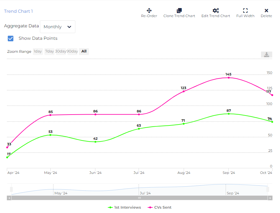
To create this trend chart, the following settings were used:

In the top left corner of the trend chart you have more options to adjust how the data is displayed.
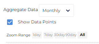
- Aggregate Data: Determines the date granularity for the visualisation, aggregating all data within that unit (week, month etc.). For clairty, try to pick an aggregation which displays no more than ~30 data points. In the example above, we've chosen to aggregate the data monthly.
- Show Data Points: This toggle displays and hides the values for the data points on the trend line itself. This is useful if the specific numbers are of interest beyond the shape of the trend itself.
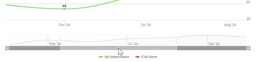
- Zoom Range: This option allows you to zoom into certain time increments. It will expand the zoom range (the bottom bar with the blue line) to 1,7, 30 or 90 days. You can scroll the zoom bar in this bottom section.
Was this helpful?