| Edition: Growth, Corporate, Enterprise | Audience: All Users |
OnPoint Report Navigation
This article explains how to sort and navigate your OnPoint reports. For help with building, saving, and sharing your report see OnPoint Report Options
Ratio Setting
Once you have added a Ratio, use the  icon on the column to configure how you want the ratio to be displayed:
- Percentage: Displays the ratio as the relevant percentage (e.g. 15%)
- Normalised: Displays the ratio to 1 (e.g. 1:2, 2.4:1)
- Fraction: Displays the ratio to the lowest whole denominated fraction (e.g. 10/13)
- Decimal: Displays the ratio as a decimal instead of percentage (e.g. 0.15)
- Absolute: Displays the ratio exactly as it exists as two numbers (e.g. 54/103)
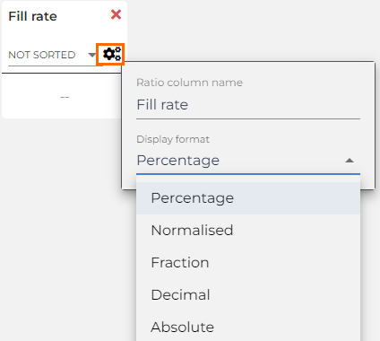
Use the Add Ratio option to create new and unique ratios for your report.
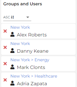
Display Groups and Users'Hierarchy
This option allows you to see the Group Hierarchy that the user is assigned to. If the Group Hierarchy is considerable it will truncate with ellipses, and show the full name on hover.

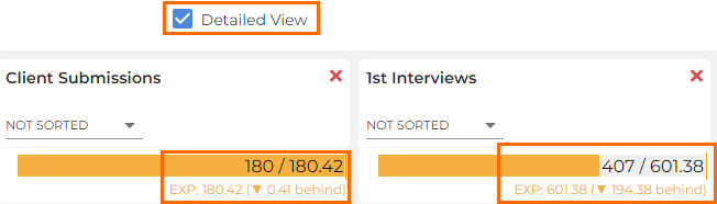
Detailed View
This option allows you to display how far ahead or behind the individual is to the target line. The target line indicates the expected (EXP) number a user should have reached to be on track to hit the target by the end of the selected period.
The user is currently on 75 Client Submissions, but would need to be on 125 right now to be on track to reach 250 by the end of the month, meaning they are 50 behind.
Columns
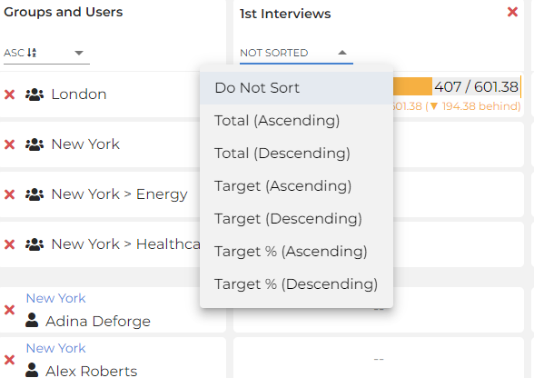
Column Sorting
Click on any column to sort by the Total Achieved Value, Achieved Target Value, or Achieved Target % (in Ascending or Descending order). Target % allows you to compare users against expectation even if they have different target values for the same metric.
Remove Users or Groups
Use the red cross ( ) next to a user or group to remove them from the report.
Data Details
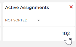
Click on any cell value to see the underlying data details.
Rearrange Columns
Drag and drop columns in the report to rearrange them as required.