| Edition: Growth, Corporate, Enterprise | Audience: All Users |
Using OnPoint for Pipeline Tracking and Ratio Investigation
OnPoint reports can be used for pipeline and ratio interpretation, allowing you to visualise and compare different parts of your business based on volume, performance against target, and efficiency. This article details how to create and organise your report data to highlight pipeline conversion rates and average user ratios.
Group Ratio Reporting
See OnPoint Report Options to help you build your report.
- Select the relevant groups to compare. You can select as many groups or sub-groups as you wish.
- Add in the relevant metrics to see what is being generated per group in the time period.
- Add in a ratio to see how many of "X" generates how much of "Y". A well used example is comparing Activity with Sales.
In the example below, we can see that New York is significantly more effective when it comes to 1st Interview to Placement conversion versus London (1.16 interviews to 1 placement vs 2.33:1) and more than
3 times more effective than Sydney (5.1:1). 
This poses the question “Why is New York so much more efficient with 1st Interviews to Placements that the other offices?”. You can use other areas of Bullhorn Analytics such as Slice & Dice or Trends to help answer this.
User Ratio Reporting
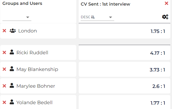
Another useful application for ratios is to compare individual user ratios within their respective groups. This allows you to see the average ratio for a team, and who is above or below this and by how much.
- Select the relevant group to compare and on the pop up select The group, then select All active Users in <Group>.
- Add in the relevant ratios you wish to compare between. In this example we are using CVs Sent : 1st Interviews.
- Load the data for the OnPoint report, then sort the ratio in descending order and choose your preferred display format.