Component Configuration
This functionality requires the 2022.06 GA Release - Package Version 6.28.2 or newer.
Overview
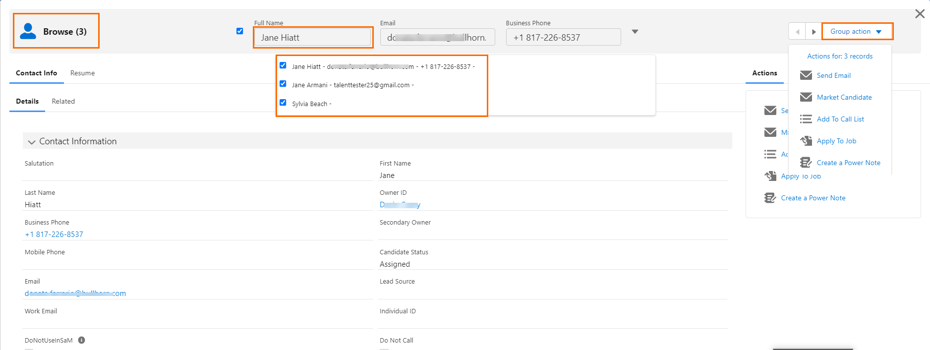
is a Lightning component that can be enabled on any object List View and as an action for in It allows users to select multiple records then review record data and perform actions. has been developed as a generic component that can be added to any List View for managed and custom objects.
This article covers the standard, out-of-the box functionality and configuration as well as the available custom configuration options and examples. This article is intended for System Administrators. For general information on using the feature see Browse Component.
Before You Begin
Out-of-the-Box
Browse can be used with minimum configuration from the following locations:
- Contacts List View
- Call Lists Members
- Job Board Application List View
- Longlist List View
This table shows what is provided in the standard configuration. See Out-of-the-box Custom Metadata Type Settings for the full list of the custom metadata types that come populated by default and control the out-of-the-box configuration.
|
Object |
Tabs |
Actions |
|---|---|---|
|
Contacts |
|
|
|
Longlists |
|
|
|
Job Board Application |
|
|
|
Call List Members |
|
|
|
|
|
|
Custom Configuration Scenarios
To make changes to out-of-the-box , follow the configuration steps provided for these custom configuration scenarios:
- Enable Browse for a packaged or custom object
- Configure a Browse Tab for any packaged or custom object
- Configure a Browse Action for any packaged or custom object
When adding to a new object, you must start by configuring the Generic Browse Supported Objects before configuring Tabs and Actions. For out-of-the-box you will often need to edit an existing setting rather than creating a new one.
There are other minor customizations available for the page:
- Header icon
- Object fields displayed in Navigation Header.
- Object fields shown in Navigation Header drop-down.
- Actions in Group Action drop-down. These can be configured separately from the actions that are added to the Single Action component.
- Tabs added to panels
- Size of left and right panel
Configuration Guide
The steps below are divided into the following scenarios:
- Activate Out-of-the-Box Browse
- Enable Browse for a Packaged or Custom Object
- Configure a Browse Tab for a Packaged or Custom Object
- Configure a Browse Action for a Packaged or Custom Object
See Create a Custom Component for Browse Tabs and Create a Custom Lightning Component to Perform a Browse Action for an example of custom components. Support can provide additional configuration examples if desired.
Prerequisites
- Package Version 6.28.2 or newer.
- Salesforce Lightning and the data model. Only Lightning components are supported.
- Out-of-the-box, any email action used as part of requires the be enabled.
Activate Out-of-the-Box
Add Permission Set
Add the permission set User to relevant Users’ profiles.
Add Button to List Views
Add the button to the List View/page layout for each supported object.
- Go to Setup > Object Manager > Object (see each object below)
- Search Layouts for Classic > List Views and then move the button to the right side.
- Contact: Contact
- Longlist: Longlist (TR1_Opportunity_Discussed__c)
- Job Board Applications: Job Board Application (TR1__Job_Board_Application__c)
- Call List Members: CallList object (TR1__Call_List__c). You can find and add the button in the Related List view for Call List Members on the Call List Page layouts.
Add the Function to
- Go to Setup > Custom Settings > Browse > Manage > Create new mdt setting
- Select the following checkboxes:
- Enable Browse in ATSv2.
- Enable Group Actions
The fields Fieldset Name for Pulldown Fields, Fieldset Name for Header Fields and Left Side Width % can remain empty and will be deprecated/removed.
- Go to Setup > Custom Metadata Types > ATS Action configuration > Manage.
- Enable Browse per Job record type by going to the following records and selecting the Available for Browse checkbox:
- Browse Consulting
- Browse Permanent
- Browse Fixed
- Browse Retained
- Any Browse custom job record type records
Enable Aura to get Files from the Cloudfront Server
This is required if the Org has Pre-Signed URL enabled and if is configured to include the Resume Manager tab.
- Go to Setup > Trusted URLs and add a new Trusted URL:
- API Name: Cloudfront
- Url: Add the cloudfront url for this org here
- The Url can be found in the remote site settings.
- Active: On
- Context: All
- Turn on all the checkboxes for CSP Directives.
- Go to Setup > CORS
- Add a new Allowed Origin:
- Origin URL Pattern: Add the Cloudfront URL for this org here (you can find it in the remote site settings).
- Wait five minutes for these changes to take effect, then test.
uses a newly created Lightning component for the Apply to Job action. The Applicationv2 TR1__BrowseAddToJob fieldset determines which fields are on the page. If picklist fields are recordType dependent, the “Application” record type will be used.
Both these variables can be overridden in the Generic Browse Action for Objects by adding them to the JSON in the Additional Data field available on that .
Example:
{
"fieldSetName":"TR1_AnotherApplicationV2Fieldset",
"recordTypeName" : "Consulting"
}
Enable for a Packaged or Custom Object
The same steps are used to add to a packaged object or to a custom object. The steps in this section are not needed for out-of-the-box unless you want to change one of the settings controlled by the Generic Browse Supported Object.
Create a Visualforce Page
Create a new Visualforce page with the following code, where "YourObjectNameHere__c" contains the API name of the object that will support .
<apex:page standardController="YourObjectNameHere__c" recordSetVar="records" extensions="TR1.GenericBrowseRedirect" action="{!redirect}" sidebar="false" showHeader="false">>
    <script>
        try {
            if('localStorage' in window && window['localStorage'] !== null) {
                if(localStorage['genericBrowseNavigation'] == location.href) {
                    localStorage['genericBrowseNavigation'] = '';
                    history.back();
                }
                else {
                    localStorage['genericBrowseNavigation'] = location.href;
                    location.href = "/lightning/cmp/TR1__GenericBrowse?c__recordIds={!URLENCODE(JSENCODE(urlParameters))}";
                }
            }
        }
        catch (e) {
            location.href = "/lightning/cmp/TR1__GenericBrowse?c__recordIds={!URLENCODE(JSENCODE(urlParameters))}";
        }
    </script>
</apex:page>
Create a Browse Button
- Go to Setup > Object Manager > Buttons, Links and Actions > New button or Link
- Configure as follows:
- Display Type: List Button
- Behavior: Display in Existing window without sidebar
- Content Source: Visualforce Page
- Content: Select the Visualforce page created in the previous step.
- Add this button to the list view of the Object by going to Setup > Object Manager > Search Layouts for Salesforce Classic > List View and click Edit.
Configure the “Generic Browse Supported Objects”
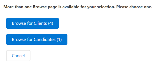
For each Generic Browse Supported Object metadata record you will have to create a set of Tabs and Actions. You can create multiple pages for the same object, based on record type. If you have more than one Generic Browse Supported Object metadata record for an object, Browse will check which configuration to use in the following way:
- If all records you want to over are of the same record type:
- If there is a configuration for this record type, use the matching configuration.
- If there is no configuration with this record type, ask the user which one to use.
- If records have different record types:
- Ask the user.
When asking the user, a pop up will be displayed. Clicking any available buttons will open the matching page.
By default, the text on the button comes from the label of the Generic Browse Supported Object metadata record, which is not translatable. You can give the Configuration Label field the value of the API name of a Custom Label, and it will use the value of that label here instead. If the API name is incorrect for any of them, they will all fall back to the label of the Generic Browse Supported Object metadata record.
Do not create multiple records for the same Object + Record Type combination.
- Go to Setup > Custom Metadata Types > Generic Browse Supported Objects and create a new record for the object you wish to make available for . Use these fields for configuration:
- Object API Name: Contains the exact API name as you find it in the Object Manager Detail page for the object.
- (Deprecated) Unique Name: (API Name: TR1__Objectname__c) Populated automatically. Remove from Page Layout without making changes to the field itself.
- Source: ListView
- Is Active : Enable to use this configuration for .
- Header icon: You can find the available icons in https://www.lightningdesignsystem.com/icons/. Use this format: iconType:iconName (for example: utility:animal_and_nature.) Utility type icons are recommended but other icons will work.
- Enable Group Actions: Selected by default. Uncheck to remove Group Actions from the navigation header for a specific object.
- Record Type: Enter the DeveloperName of the record type to be used. Case sensitive.
- Fieldset to Display: Enter the API name of the fieldset to display fields in the Navigation Header. The fieldset must come from the Object you are configuring for .
- Pulldown Fieldset to Display: Enter the API name of the fieldset to display fields in the Navigation Header drop-down.The fieldset must come from the Object you are configuring for .
- Left Tab Width %: This should contain a number between 1 and 99 depending on your preferred layout. The width of the Left + Right tab is always equal to 100.
After completing the steps above, you will be able to click on the button from the chosen Object’s List View and the page will be launched. You will only be able to navigate through the selected records in the Navigation Header until Tab and Actions configuration is completed.
Configure a Browse Tab for a Packaged or Custom Object
To add, remove, or change settings for a tab in the Tabs section you need to configure the Generic Browse Tab. Each Tab record can only be used for a single Custom Object. To have the same tab in multiple objects, you will need to create multiple records on the , each one referencing the relevant object.
Use these fields for details on the configuration options:
- Label: The name of the metadata record. The tab name on the user interface is controlled by the Tab Label field.
- Generic Browse Tab Name: The unique name of the record. It has no effect on the Browse component.
- Tab Label: The tab name on the Browse user interface. It should contain a reference to an existing Custom Label which makes the tab names translatable. If a label cannot be found, all labels will be shown with "???" around them. For example, "???MyLabel???". Always create a new label for each use within this metadata using this format:
- Custom Label Categories: Generic Browse
- Short Description: Generic Browse tab (or similar meaningful description).
- Generic Browse Supported Object: The object this Tab is used in. This is a lookup to the Generic Browse Custom Object record previously created.
- Used in Panel: Determines if the tab will be displayed in the left or right panel.
- Tab Position: (Required) Any number defining the position of the tab in relation to the other tabs. The tab with the lowest number will be displayed as the first tab on the left. When adding only one tab, enter a 1.
- Tab Type: Can be either RecordDetail or Component.
- RecordDetail: A component showing the details of a record in . The Lookup Field Name expects an Id from a specific object. If the Id is coming from the supported object enter “Id” in this field. If the required Id is from a lookup field, enter the API name of that lookup field.
Example: You have enabled for the Contact object and are adding a tab to display the Contact record detail. Populate the Lookup Field Name field with “Id”. If you instead wish to add a tab that displays the record detail of the Account record associated with the Contact, populate Lookup Field Name with “AccountId”. - Component: Used to show existing or custom components within a Tab. The component name should be entered using this format: "NameSpace:ComponentName" (for example: TR1:GenericBrowseActionsTab)
These existing components are available to be used in Browse Tabs:- TR1:GenericBrowseActionsTab: Show the single record actions list in a Tab (Not object specific)
- TR1:applicationHistoryTable: Show the Jobs a Candidate has been applied to.
- TR1:GenericBrowseResume: Show the Resume Manager
- RecordDetail: A component showing the details of a record in . The Lookup Field Name expects an Id from a specific object. If the Id is coming from the supported object enter “Id” in this field. If the required Id is from a lookup field, enter the API name of that lookup field.
See Create a Custom Component for Browse Tabs for more details and an example of a custom component in .
Record Detail Tab: Logged-in User’s Default Page Layout Related List
When adding Record Detail Tabs in , there are additional steps needed to show the Related List from the logged-in user’s default page layout for any given object. This lets users see the page layout they have configured instead of a default Related List.
Create a new Connected App "Tooling API"
- In Callback URL enter "http://login.salesforce.com/services/authcallback" as a placeholder.
- In Selected OAuth Scopes select full, api, and refresh_token.
- Click Save.
- Navigate to Setup > Auth. Providers and create a new Auth. Provider called "Tooling API Auth".
- Provider: Salesforce
- Consumer Key and Consumer Secret: Add from connected app
- Default Scope: "full" and "refresh_token"
- Execute Registration As: Salesforce Admin user for Bullhorn Recruitment Cloud
- Copy the Callback URL and update the placeholder from Step 1.
- Create "ToolingAPI" named credentials:
- Identity Type: Named Principle
- Authentication Provider: OAuth 2.0
- Authentication Provider lookup: Use Auth Provider created in the previous step.
- Scope: "full" and "refresh_token"
- URL: "%instance_url%/services/data/v41.0/tooling/query" and replace %instance_url% with the org's host url.
- Save and Authenticate as a selected user, making sure to allow access for the app.
Configure a Action for a Packaged or Custom Object
The Generic Browse Actions is used to define actions available in . There are nine actions available out of the box, and both packaged and custom actions can be added here.
The Generic Browse Actions for Objects is a junction object where an association is made between an action and the -enabled object where the action is used.
Preconfigured Actions
Out-of-the-box the following actions are available and already configured in Generic Browse Actions for Objects.
|
Action |
RecordId for Object |
ParentId for Object |
Use |
|---|---|---|---|
|
AddToJob |
Contact |
TR1__Job__c (optional) |
Add application(s) for contact(s) to a Job |
|
AddContactToCallList |
Contact |
Add contact(s) to a call list |
|
|
|
Contact |
Send an email to contact(s) |
|
|
Reject application |
TR1__Application_V2__c |
TR1__Job__c |
Reject/Unreject application(s) |
|
Single Internal Interview |
TR1__Application_V2__c |
TR1__Job__c |
Add an internal interview to an application without updating the stage (single application only) |
|
Group Internal interview |
TR1__Application_V2__c |
TR1__Job__c |
Add an internal interview to applications without updating the stage (group of applications) |
|
Move to Stage |
TR1__Application_V2__c |
TR1__Job__c |
Move one or more application to a different stage of the ATS |
|
ATS View Schedules |
TR1__Application_V2__c |
TR1__Job__c |
Show the scheduled Send Outs for one or more applications |
|
PowerNote |
Any Object supported by Powernotes |
Create a new powernote for a record. |
Generic Browse Actions
- Label: The name of the metadata record.
- Generic Browse Action Name: The unique name of the metadata record.
- Component API name: The API name of the Aura or Lightning web component called when the action is triggered.
- Modal Size: The size of the modal (pop up) the component opens in. The picklist values (Small, Medium, Large) follow the standard sizes for Salesforce Lightning Design System modals.
- Icon name: You can find the available icons at https://www.lightningdesignsystem.com/icons/. Use this format: iconType:iconName (for example: utility:animal_and_nature.) Utility-type icons are recommended but other icons will work.
- Hide close button: The component modal is generated with a close button (X) but if the component already has a close button, this option allows you to use that one instead.
- RecordIds parameter name: If your component does not expect the list of record ids to be passed to a parameter called “recordIds”, you can enter the parameter name to use instead.
- ParentId parameter name: If your component does not expect the id of the parent record to be passed to a parameter called “parentId”, you can enter the parameter name to use instead.
You can add your own custom actions to a -enabled object instead of using those offered out-of-the-box. This requires:
- A custom Lightning component to perform the action. See Create a Custom Lightning Component to Perform a Browse Action for more details.
- A Generic Browse Action record that references the custom Lightning component.
Generic Browse Actions for Objects
- Label: The name of the metadata record.
- Generic Browse Action for Objects Name: The unique name of the metadata record.
- Action label name: The action name on the user interface. It should contain a reference to an existing Custom Label which makes the tab names translatable. If a label cannot be found, all labels will be shown with "???" around them, for example "???MyLabel???". Always create a new label for each use within this metadata using this format:
- Custom Label Categories: Generic Browse
- Short Description: Generic Browse action (or similar meaningful description)
- Is Active: Determines if the action is available or not in .
- Action Type: Defines if the action is available in the Group Action pulldown or in a Single Actions Tab. Can be set to Group, Single, or Both.
- Generic Browse Supported Object: A reference to a Generic Browse Supported Objects record.
- Generic Browse Action: References a Generic Browse Action setting. This can be one of the out-of-the-box Actions or a custom one.
- Lookup Field Name: Actions often expect an Id from a specific Object. If the id is coming from the supported object enter “Id” in this field. If the required Id is from a lookup field enter the API name of that lookup field.
- Position: Determines the order the actions are displayed, with the lowest number at the top.
- UI Limit: Enter a value to limit the number of records this action can handle at a time. If a user tries to perform this action as a group action with more records selected, an error is displayed.
- Additional Data: Allows a static way to pass more parameters, if “recordId” and “parentId” (configured in the related Generic Browse Actions setting) are not sufficient. The format of this field should be a JSON string with the name of the parameter used in the component on the left and the value on the right.Copy
{
"useGenericLookup":true,
"hideBackdrop":true,
"location":"browse"
} - Hide Action On Closed Jobs: This field provides the option to disable an action in ATSv2 Browse if it's related to a Job and that Job is closed (introduced in version 6.31.3).
Create a Custom Component for Browse Tabs
These examples show a possible custom component to be used in a Tab.
A Lightning Aura component for use within a tab (component type) should have two public attributes:
- recordId of type String, containing the Id of the record currently selected within .
- tabConfig of type Object, containing data for the TR1__GenBrowseTabs__mdt record of this tab.
As the recordId can change (for example when users click on the Next button in the Navigation Header), there should also be a change handler for recordId on the component that can react to this change.
Example of a Minimal Aura Tab component:
<aura:component access="global">
    <!-- Public attributes -->
    <aura:attribute name="recordId" access="global" type="String" description="Contains the id of the currently selected record"/>
    <aura:attribute name="tabConfig" access="global" type="Object" description="Contains the data of the TR1__GenBrowseTabs__mdt record of this tab."/>
    <!--// Public attributes -->

    <aura:handler name="change" value="{!v.recordId}" action="{!c.onrecordIdChange}" />

</aura:component>
If required, the component can request additional data from its parent component:
- getCurrentRecord: More data of the currently selected record. (Values of all lookup fields + values, drop-down field text, all headerFieldSet fields and values).
- getSingleActions: A list of single actions defined for this generic object.
- getParentId: Id of the parent (if any) of the browse component (e.g. Job when used from )
This additional data can be requested by calling the genericBrowseComponentEvent. As a result the parent will call this tab component using a method that needs to be defined on this tab component.
Example of a Component and Controller requesting additional data:
Component:
<aura:component access="global">
    <!-- Public attributes -->
    <aura:attribute name="recordId" access="global" type="String" description="Contains the id of the currently selected record"/>
    <aura:attribute name="tabConfig" access="global" type="Object" description="Contains the data of the TR1__GenBrowseTabs__mdt record of this tab."/>
    <!--// Public attributes -->

    <aura:handler name="init" value="{!this}" action="{!c.doInit}"/>

    <aura:handler name="change" value="{!v.recordId}" action="{!c.onrecordIdChange}" />
    <aura:registerEvent name="genericBrowseComponentEvent" type="TR1:genericBrowseComponentEvent" />

    <aura:method name="setSingleActions" action="{!c.setSingleActions}" description="receive a list of single actions" access="global">
        <aura:attribute name="actions" type="List" />
    </aura:method>

    <aura:method name="setCurrentRecord" action="{!c.setCurrentRecord} " description="receive data of currently selected record"  access="global">
        <aura:attribute name="currentRecord" type="List" />
    </aura:method>


    <aura:method name="setParentId" action="{!c.setParentId}" description="receive the parentId"  access="global">
        <aura:attribute name="parentId" type="List" />
    </aura:method>

    Check the console for info.
</aura:component>
Controller:
({

    doInit : function(component, event, helper) {
        helper.doInit(component, event, helper);
    },


    setSingleActions : function(component, event, helper) {
        let params = event.getParam('arguments');
        if (params) {
            let  actions = params.actions;
            console.log('setSingleActions',actions);
        }
    },

    setCurrentRecord : function(component, event, helper) {
        let params = event.getParam('arguments');
        if (params) {
            let  currentRecord = params.currentRecord;
            console.log('setCurrentRecord',currentRecord);
        }
    },

    setParentId : function(component, event, helper) {
        let params = event.getParam('arguments');
        if (params) {
            let parentId= params.parentId;
             console.log('setParentId',parentId);
         }
    },

    onrecordIdChange : function(component, event, helper) {
        console.log('onrecordIdChange', component.get('v.recordId'));
    }
})
Helper:
({
    doInit : function(component, event, helper) {
        helper.getAdditionalData(component, event, helper);
    },

    getAdditionalData : function(component, event, helper) {
        let componentName = 'component'+component.get('v.tabConfig').Id;
        let componentEvent = component.getEvent('genericBrowseComponentEvent').setParams({
            request : "getSingleActions",       // Same can also be done with "getCurrentRecord or getParentId"
            source : componentName,
            data : {}
        });
        componentEvent.fire();
    },
})
Create a Custom Lightning Component to Perform a Browse Action
When an action is executed, it opens the component for that action in a new modal and information about the selected records is passed to the component. The custom component can then perform the action it is supposed to do. If a component already exists for an action but you want to use it within you can either directly call that component from by setting the names of the parameters to be used in a Generic Browse Action record. Alternately, if you need to query additional data or perform other actions first, you can create a new custom component that calls the existing component.
A custom component used as a Generic Browse Action should have two public parameters:
- recordIds of type List, containing a list of Ids of the record(s) currently selected within .
- parentId of type Id, currently only used for ATS actions, in which case it is a Job__c Id. If a different parentId was passed to Generic Browse Action initially it will be passed on here too.
The action component can implement a choice of events that close the modal the component is opens in:
Aura:
- GenericBrowseCloseModal: This will close the modal.
- ApplicationRefreshEvent: This will close the modal and also tell the Generic Browse component that the action changed the data of the records, and thus need to be queried again.
myCustomComponent.cmp:
  <aura:registerEvent name="closeModal" type="c:GenericBrowseCloseModal"/>


myCustomComponentController.js:
  closeModal : function(component, event, helper) {
    let closeEvent = component.getEvent("closeModal");
    closeEvent.fire();
  }
Lightning Web Component:
- closeModal: This will close the modal.
- cancel: Same as closeModal.
- closerefresh: This will close the modal and also tell the Generic Browse component that the action changed the data of the records, and thus need to be queried again.
handleClose() {
    this.dispatchEvent(new CustomEvent('closeModal', {}));
}
Out-of-the-box Custom Metadata Type Settings
|
Generic Browse Actions |
AddContactToCallList |
|
AddToJob |
|
|
ATS View Schedules |
|
|
|
|
|
Group Internal interview |
|
|
Move to Stage |
|
|
PowerNote |
|
|
Reject application |
|
|
Single Internal Interview |
|
|
Generic Browse Actions for Objects |
ATS Move To Stage |
|
ATS Group Int. Interview |
|
|
ATS Apply To Other Job |
|
|
ATS PowerNote |
|
|
ATS Add To CallList |
|
|
ATS Reject/Unreject |
|
|
ATS Internal Interview |
|
|
ATS Marketing Email |
|
|
ATS View Schedules |
|
|
Email Applicant |
|
|
CL Add To Job |
|
|
CL Email |
|
|
CL Marketing Email |
|
|
JBA Apply To Job |
|
|
JBA marketing Email |
|
|
JBA Add To Call List |
|
|
JBA Email |
|
|
LL Email |
|
|
LL Add to Call List |
|
|
LL Apply to Job |
|
|
LL Marketing Email |
|
|
ContactMarketingEmail |
|
|
AddContactToJob |
|
|
ContactEmail |
|
|
AddContactToCallList |
|
|
Contact PowerNote |
|
|
Generic Browse Supported Objects |
Application V2 |
|
Call List Member |
|
|
Contact |
|
|
Job Board Applications |
|
|
Long List |
|
|
Generic Browse Tabs |
ATSactions |
|
ATSactions |
|
|
Actions |
|
|
Applicant |
|
|
Application History |
|
|
ApplicationV2 |
|
|
Appv2Resume |
|
|
Candidate |
|
|
Contact info |
|
|
JBA actions |
|
|
JBA Contact Info |
|
|
JBAResume |
|
|
Long List Contact |
|
|
Long List Resume |
|
|
LongListActions |
|
|
Resume |