| Edition: Enterprise | Audience: All Users |
Advanced Trend Options - Data Groups
Advanced Trends give you the ability to plot multiple data groups on the same Trend, opening the possibility to compare groups or timeframes. You can use multiple data groups to measure the same metrics over the same timeframe, and plot a line for every different group you’re interested in by creating a data group for each.
Data Group Options
Adding a Data Group
To add a data group, you have two options:
- + Add a Data Group: Click this button to add a new data group with no options preselected.

- Duplicate: Instead of adding a new group and resetting all the options, click the
 icon when you’ve set up a single data group to perfection. This creates an exact copy of the original (although colours will change to keep them distinct by default). From here, you just need to change one or two options such as the group or team and retain all of the other formatting you’ve already created.
Period on Period
When using data groups across multiple timeframes, you can choose to plot them Period on Period, whereby the timeframes are run in parallel. Comparing 2023 and 2022 with this option selected will display 12 months on the X Axis running from January to December. This allows you to compare performance to a certain point across timeframes, and even identify periods of seasonality within the data.

If Period on Period is not selected, every data point will be plotted as per its KPI date, so comparing 2023 and 2022 would show 24 months on the X Axis.
- When comparing teams of different sizes, don’t forget to set your metrics to compare average per user. This will show you average team performance without skewing the data in favour of bigger teams.
- Although groups and timeframes are the two main uses for Data Groups, don’t neglect the ability to compare different Tags, or even different clients using the options further down the page.
Example
Displayed here is an example Advanced Trend, showing Total Placements across multiple data groups, spanning two teams and two different timeframes.
Using data groups and the Period on Period option, it’s easy to see that the Healthcare team are creating more placements in 2023 and 2022, and perhaps there is a seasonal jump in February (indicated by the 2) for that division.
Comparing teams, it’s immediately clear that Energy had a slower start to the year than Healthcare, but had a very effective March and April.
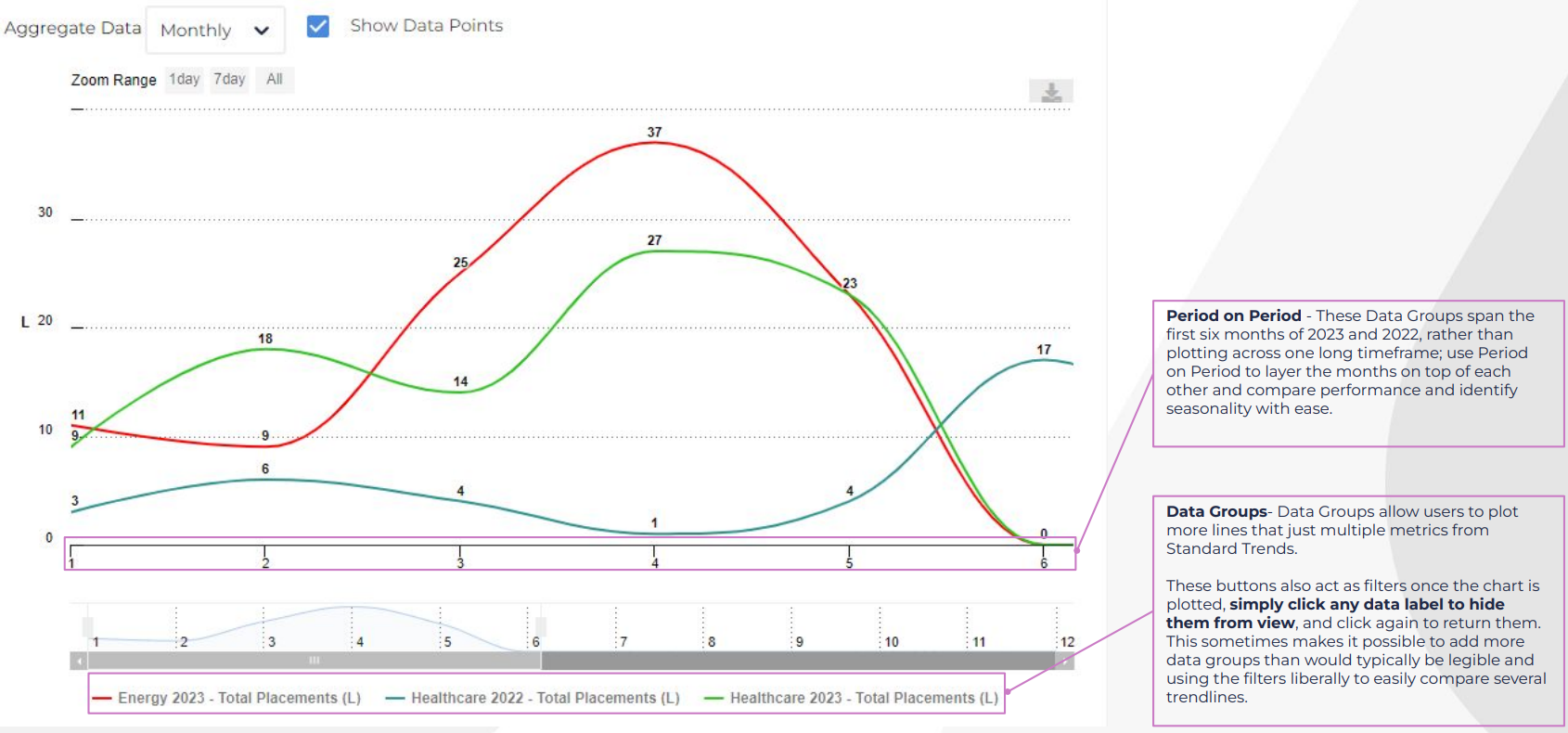
The data groups at the bottom of the chart also act as filters. Simply click any data label to hide them from view, and click again to return them. This makes it possible to add more data groups than would typically be legible and use the filters to easily compare several trendlines.