| Edition: Enterprise | Audience: All Users |
Advanced Trend Options - Metric Options
Advanced Trends give you greater control over how each metric displays on the chart, down to different plot options (including average per head and target) as well as design options such as colour and line style.

Advanced Metric Options
What to Plot
This dropdown gives you four options to determine how you’d like to plot the metric. This can differ by different metrics, and multiple metrics can be selected with different plot options.
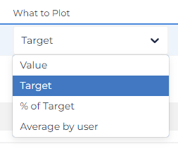
- Value: This will plot the same value as the Standard chart, which is the value of the metric itself as you’d see elsewhere on the platform. The metric value will automatically trend over the selected timeframe over the desired Aggregate Data option.
- Target: This plots the value of the group/user’s target for the selected metric. If the group does not have a target. a value of 0 will be plotted. Multiple targets starting and finishing over a timeframe will be reflected across the timeframe.
- % of Target: This calculates the proportion of the target value that has been achieved, essentially dividing ‘Value’ by ‘Target’ to give a percentage of target attainment. For example, a value of 80% means that the group is 20% below their target.
- Average by user: This calculates the value divided by the number of users active in the group across the timeframe. Multiple users leaving and joining the group during the timeframe are accounted for and ‘pro-rated’. This is the best option to compare groups of different sizes for average metric performance.
How to Plot
If you selected Value, Target, or Average by user in the What to Plot dropdown, you'll see the following options:
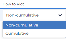
- Non-Cumulative: This plots the metric in the ‘standard’ way, showing the value of the metric across the timeframe, fluctuating up and down.
- Cumulative: This plots the running total sum of the value of the metric over the timeframe, so the line can only go up. By the end of the timeframe, the plotted value will be the total for the entire timeframe.
If you selected % of Target in the What to Plot dropdown, you'll see the following options:
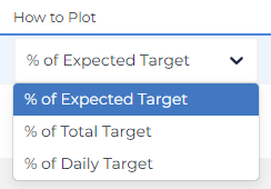
- % of Expected Target: Presents current performance trajectory based on the percentage of the target expected to be achieved within the selected timeframe. Best used with ongoing targets.
- % of Total Target: Looks at the cumulative total target over the selected timeframe.
- % of Daily Target: Looks at the non-cumulative total target over each increment of the selected timeframe, so you’ll see fluctuating values on a week-to-week/month-to-month basis.
Design Options
These options determine how the line presents visually on the trend chart. This lets you customize the appearance of different metrics or match company brand guidelines.
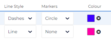
- Line Style: This modifies the line itself, whether it manifests as a solid line, a dashed line or dots.
- Markers: This adds small icons at each datapoint to more easily distinguish them on the Trend.
- Colour: This allows you to select the colour of each line and distinguish them from others.
- When plotting the metric and its target, a solid metric line and dashed/dotted target line of the same colour is a great way to compare reality from target.
- Don’t overload a Trend chart with too many lines. Even distinguishing colours can be difficult to read when there are too many metrics plotted.
Y-Axis
This lets you determine which of the two Y-axes the metric plots on.
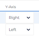
Setting metrics on both left and right will cause a second Y-axis to appear with a different scale. This is particularly useful when plotting metrics in a different scale to each other; such as revenue which may plot in the thousands to placements which may be double digits. Make sure to use this setting otherwise out-scaled metrics will be illegible on the trend chart.
Examples
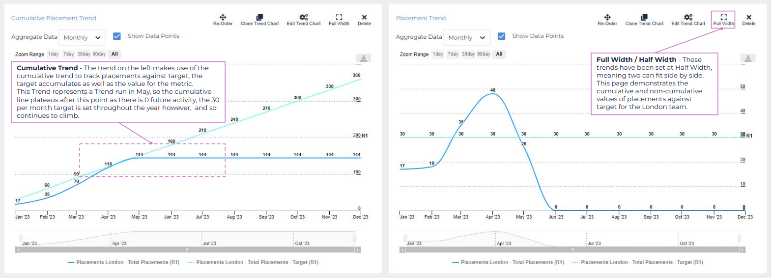
Below are two example Advanced Trends, showing Placements against target for 2023. One shows cumulative performance whilst the other shows performance and target monthly. Different colours and line styles were used to distinguish targets from reality.
Both Trends convey the same information, but they can be used to complement each other. For example, the cumulative chart demonstrates that London was behind its overall target prior to April. The non-cumulative chart demonstrates the significance of April’s performance, with a month significantly above target.