| Edition: Enterprise | Audience: All Users |
OneView Clickthrough Features - Trend Chart
This feature is only visible if you have the Trends App permission. If you need access to Trends, contact your Bullhorn Analytics administrator.
The Trend Chart clickthrough feature is a simplified version of the main Trends that focuses on the data for the selected metric and the timeframe selected. It allows you to visualise performance over time and against targets (if applied to the metric you are reporting over).
Using Trend Chart
To access the Trend Chart clickthrough feature, click into your desired OneView metric and select Trend Chart along the top of the clickthrough window.
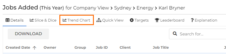
The top of the window displays the metric, timeframe, and user/group data available for the Trend Chart. This is based on the filters set on the OneView.
If you have the Trends permission, you can click Edit in Trends App to open the main Trends app and pull through your current report.
Viewing the Trend Chart
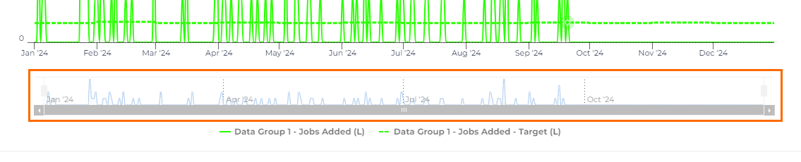
Use the sliders along the bottom of the window to zoom in on specific timeframes in the Trend Chart.
Hover the cursor over any element of the chart to view the data point.
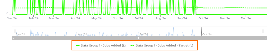
Click on items in the Legend to hide / display data.
Display Options
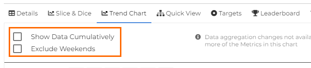
- Checking the Show Data Cumulatively option will aggregate data from each increment of the timeframe, essentially looking at total performance over time. The resulting Trend Chart has an increasing gradient for both the action and the associated target, if there is one.
- Leaving this option unchecked will show the total activity (and target) for each increment of the timeframe with no aggregation.
- Checking Exclude Weekends removes the weekend dips in a non-cumulative chart to keep the trend fluid in the report. If a user does create any activity on a weekend, the data will still be included, even if Exclude Weekends is selected.
Example
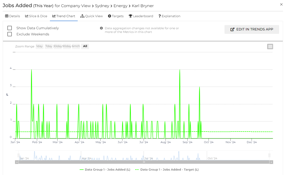
In this example, we are looking at Jobs Added for Karl Bryner using This Year as the timeframe. The screenshot below shows a cumulative view of Karl’s performance over the year for Jobs Added against his target line:
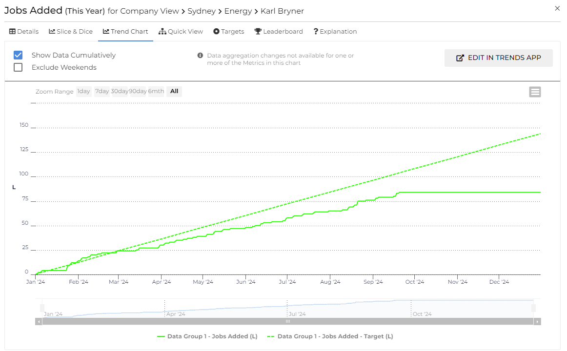
The Trend Chart shows that Karl is below target over the year, so this indicates either room for improvement or an opportunity for some more realistic targets to be put in place by his manager for this activity.
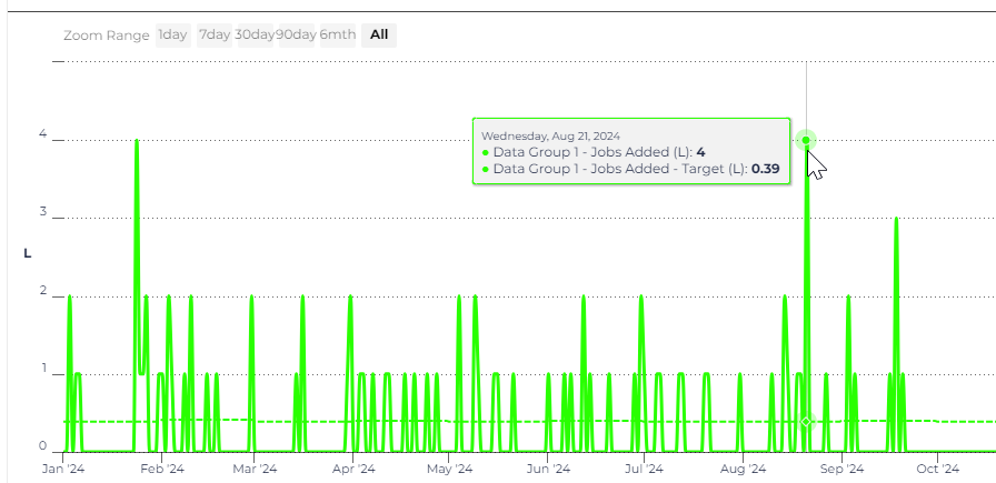
The screenshot below shows the same Trend Chart, but displayed non-cumulatively, so you can see Karl's performance on a week by week basis: