| Edition: Enterprise | Audience: All Users |
Slice & Dice Report Building Options
This article covers the different report building options in Slice & Dice. For information about the filtering and display options, see Slice & Dice Navigation.
Slice & Dice offers different chart presentation options such as heatmaps and bar or line charts, as well as different options for displaying your data such as the sum, count of unique values or statistical functions such as Average or Standard Deviation.
Report Building Options
Chart Type
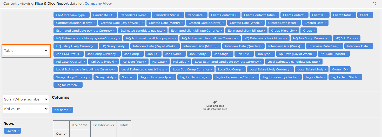
Click this dropdown to select from a variety of default chart options, including different tables, bar charts, heat maps, and more.
Variables
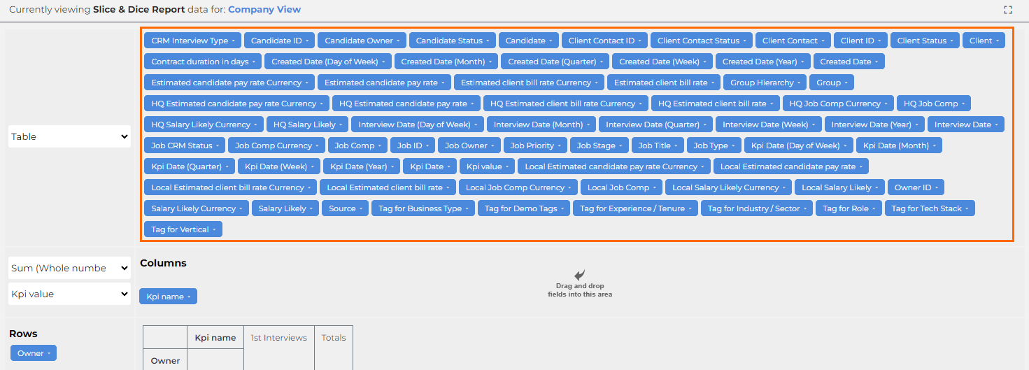
These icons represent variables that can be dragged to display as either a column or a row. The available variables relate to the metrics selected for the report. For more information, see Adding Rows and Columns to a Slice & Dice Report.
Aggregrate Functions
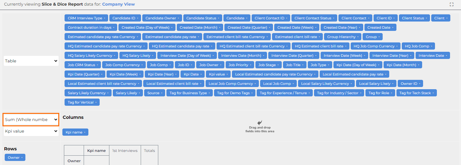
Numeric report values can be aggregated using a variety of standard analysis functions. The aggregate function you select will affect both the rows and columns of the report.
Typically, you'd want to use Sum (Whole Number) to aggregate the data in your report (e.g. Total Sales = $25,650), but you can also select from options such as:
- List Unique Values: Shows all deal values that contribute to the total sales metric (e.g. $10,000, $6700 & $8950)
- Count Unique Values: Tells you how many deals have been made (e.g. 3)
Cell Value Selection
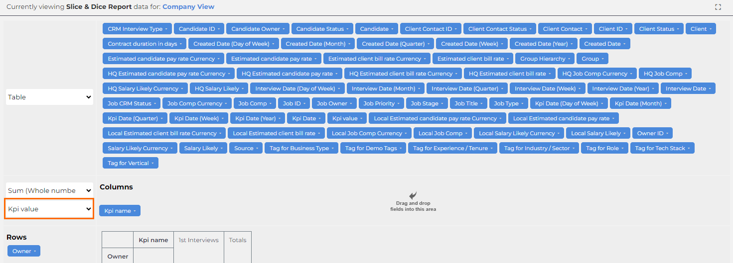
You can choose from a wide array of values to present in each cell. For example, Candidate Name or Start Date. By default, you would use KPI Value. This will show the aggregate value in the cells, for example, "5 1st Interviews".