Creating & Editing Analytics Dashboards Pt1.
Overview
This article will detail the steps required to create a new Analytics Dashboard.
In this article we will replicate the process to create one of the Default Dashboards - User Activity, adding the data source, display widgets and data bindings to replicate this Dashboard. We hope that by running through the steps to build a Dashboard that you already have some experience with will aid you in building Dashboards of your own.
Further articles in this series will detail how to recreate other Default Dashboards, introducing more advanced options such as enabling master filters and drill downs.
Click here for a full overview of Dashboards Feature.
If you are an experienced user of other Dashboard Applications you can view a technical guide here.
This article covers:
- Dashboard Overview
- Creating a New Dashboard
- Adding Widgets
- Configuring Combo Filter Widgets
- Configuring Bar Chart Widgets
Dashboard Overview
This Dashboard displays an overview of all Activities from all Professional Users, broken down into 2 bar charts showing Records Created and Actions & Activity:
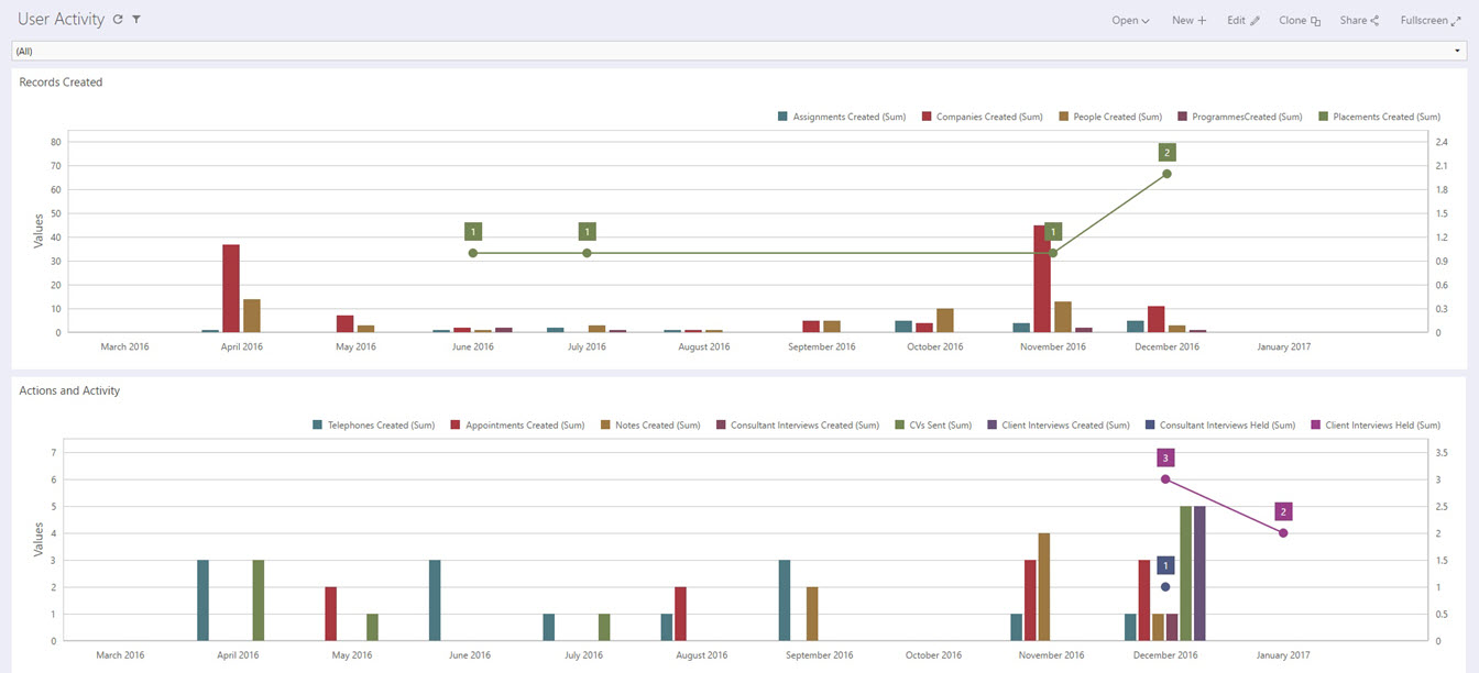
The combo box drop down filter allows a User to filter on all Users or by a particular User. The bar charts display a combination of bars for Records and Actions created and lines for Placements created and Client Interviews held.
Creating a New Dashboard
Permission Required: Please note, Creating a Dashboard requires the "Create Dashboards" permission.
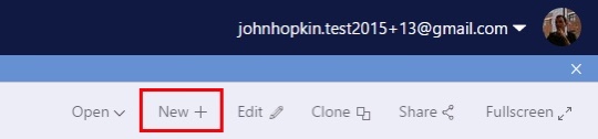
To create a Dashboard, open Analytics Dashboards and click New+:
You will be prompted to enter a name, then select the Data Source you wish to use for this Dashboard:
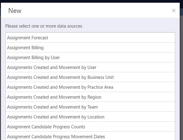
Each data source contains an optimized field list which has been designed for use in a specific Dashboard.
If you feel that there are certain fields missing from existing data sources or data sources which need to be added, please raise an idea detailing the data source to the Invenias Ideas Portal.
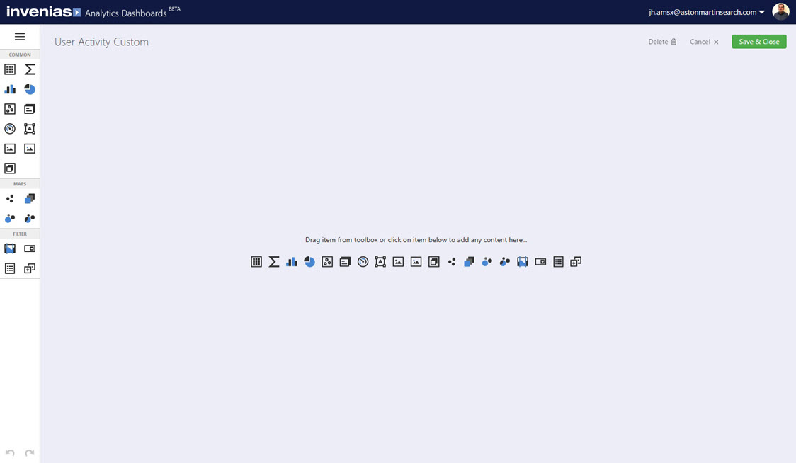
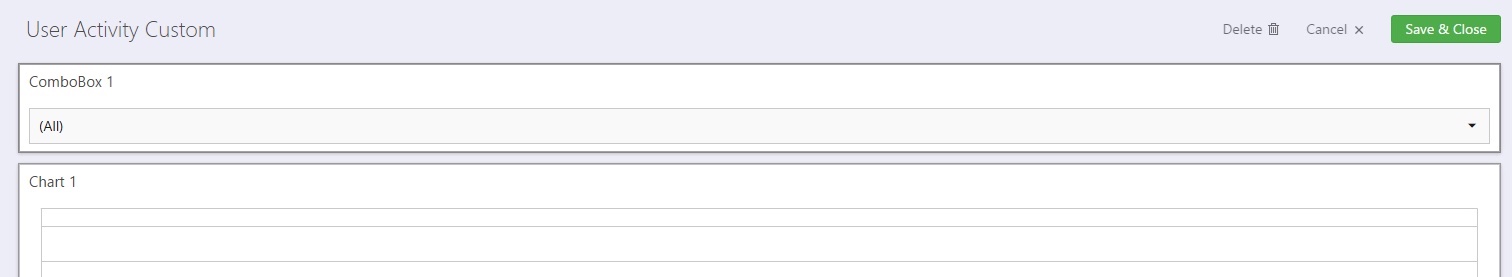
Select the data source User Activity (12 Months), the Dashboard Editor will then load as shown below:
Adding Widgets
You can now construct your Dashboard using a range of display widgets such as bar charts, pie charts etc. For a full list of the available widgets which can be incorporated into a Dashboard click here.
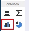
You can add a widget using the shortcuts in the centre of the window or through the button panel on the left hand side.
Start by adding 2 bar charts into the Dashboard by clicking the bar chart icon twice in the menu on the left:
This will add the two widgets into the previously blank dashboard. We need to re-arrange the layout from the default stacked arrangement to make the charts appear side by side. Click into either of the charts then drag it to reposition by clicking into and holding the left mouse button on the move icon (shown below), which is visible in the centre of the widget:
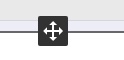
Drag and move the chart so they are arranged stacked, rather than side by side, then let go of the mouse button to drop it into place:
Next add a combo box drop down filter by clicking the icon below:
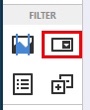
Drag and drop this widget to the top of the Dashboard:
We have now added all the required widgets to this Dashboard, now we can bind some data to these widgets.
Configuring Combo Filter Widgets
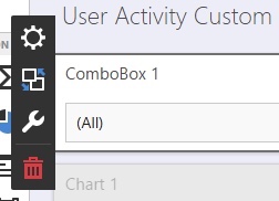
Click into the combo filter and you will see the following 4 options.
 Select Data bindings for this widget. - The options here will vary for the different widget types.
 Interactivity options. Set Master Filters, Drill downs etc.
 Display options e.g. caption for this widget.
 Remove the widget from this Dashboard.
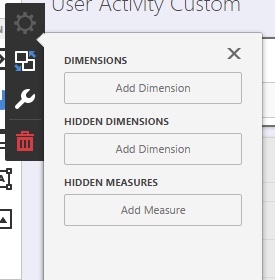
Click into the data binding cog to reveal the following menu:
Some of the terminology used for data binding will be familiar to any user who has experience of using other Dashboard applications or some of the more advanced chart options in Excel.
- Dimension = A field to display in the widget, typically a grouping of values. E.g. Number of Note Actions. Click here for a full technical explanation of this term.
- Hidden Dimension = A field which doesn't appear visually in the widget but can be used for more advanced hidden filtering and sorting.
- Measures = Measures are used to summarize data against grouped dimension values. Click here for a full technical explanation of this term.
Some of the other widgets will display further options such as:
- Series = A grouping of values. Commonly used in bar and pie charts. Click here for a full technical explanation of this term.
- Arguments = X axis on bar charts.
- Values = Y axis on bar charts.
Click Add Dimension and select the field "Name". This is the only binding required for this widget.
This will mean the combo filter will list the names of all Invenias Users, meaning the user can filter the Dashboard by a particular Invenias User or all Users.
By default the combo filter widget automatically acts as a Master Filter for the other widgets in the Dashboard, meaning all other widgets will respond to the selection made in this filter.
If you wanted a particular widget to ignore a Master Filter, click into the Interactivity options for the widget and ensure that Ignore Master Filter is set to ON.
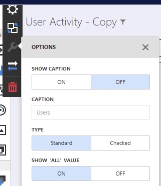
For this particular widget we will turn the caption off, click into the options menu, then click Show Caption - Off. If you prefer, you can set this to ON and add a caption of your choice in the text field.
Configuring Bar Chart Widgets
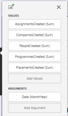
We can now set our data bindings for the 2 bar charts. Click into the top bar chart and into the settings cog, and add the following values and arguments:
The default display type for a value is a bar, however you can choose from numerous different types. Click into the value PlacementsCreated (Sum) and you can see the available display types shown below:
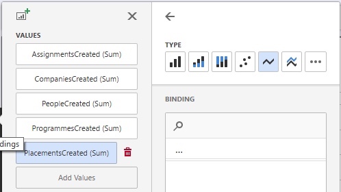
Select the line type, as shown above. This means that this value will be drawn as a line and not a bar.
In the options tab, set the following options for this widget:
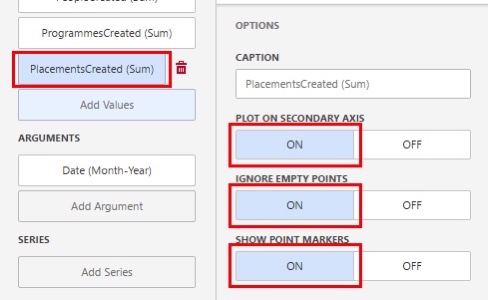
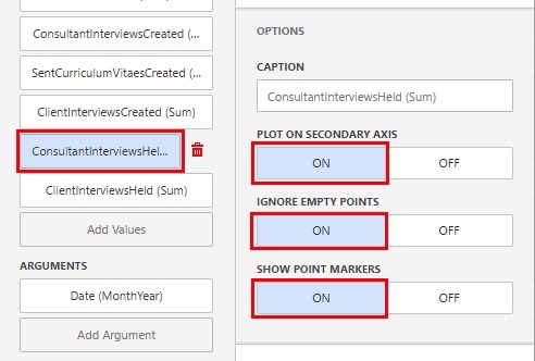
Plot On Secondary Axis = The secondary axis is the right side of the bar chart. Selecting this to ON will mean that the data displayed for this particular field will not be displayed using the scale set to the primary axis on the left side of the bar chart. As the number of placements will likely be much smaller than the number of records created, plotting them against the typical quantity of records created will make them very hard to visualize, meaning that selecting a secondary axis is the correct setting for this widget.
Ignore Empty Points = Setting this to ON will not plot 0 values for this field on this chart.
Show Point Markers = Setting this to ON will show labels on the chart for each point value.
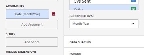
The argument is the data item shown on the Y Axis. In this example we want to show the values by Date and group by Month - Year. Change the Group Interval option to Month-Year:
For the second bar chart, add the following values and Arguments:
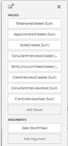
Click into the value ClientInterviewsHeld (Sum) and select the display type of Line. Repeat this for ConsultantInterviewsHeld (Sum).
Under the options tab for each of these Values, set the following options to ON, similar to the settings made in the previously Bar Chart above:
These widgets are now configured with the correct data bindings.
Click Interactivity on the Bar chart to reveal the following menu:
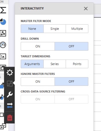
In this example Dashboard the combo filter acts as a Master Filter for all other widgets.
You can set this widget as a master filter if you wish by clicking MASTER FILTER MODE Single (only supports a single selection of a value in this widget as a Master Filter), or Multiple (allows the user to click multiple values to filter on).
This Dashboard can now be Saved and Shared with other Users in your organisation if you wish.
The next article details how to configure some of the more advanced options such as configuring drill downs and setting master filter options, by reproducing the Default Dashboard - Candidates by Progress Status by Company.