Creating & Editing Analytics Dashboards Pt3.
Overview
This article follows on from Creating and Editing Analytics Dashboards Pt2 and continues to introduce some more of the advanced options available in Dashboards. In this article we will replicate the Default Dashboard - Assignment Forecast.
This Dashboard will show further examples on how to create a Dashboard with multiple widgets, drill downs, grouped filters and grids.
Click here for a full overview of Dashboards Feature.
This article covers:
- Dashboard Overview
- Creating a New Dashboard
- Group Combo Filter Widget
- Grid Widget
- Pie Chart Widget
- Bar Chart Widgets
Dashboard Overview
This Dashboard (Assignment Forecast) display's an overview of Assignment Forecast Revenue, with numerous Master filter widgets, displayed using chart and grid widgets, along with pie charts to break down revenue by Region, Owner and Forecast:
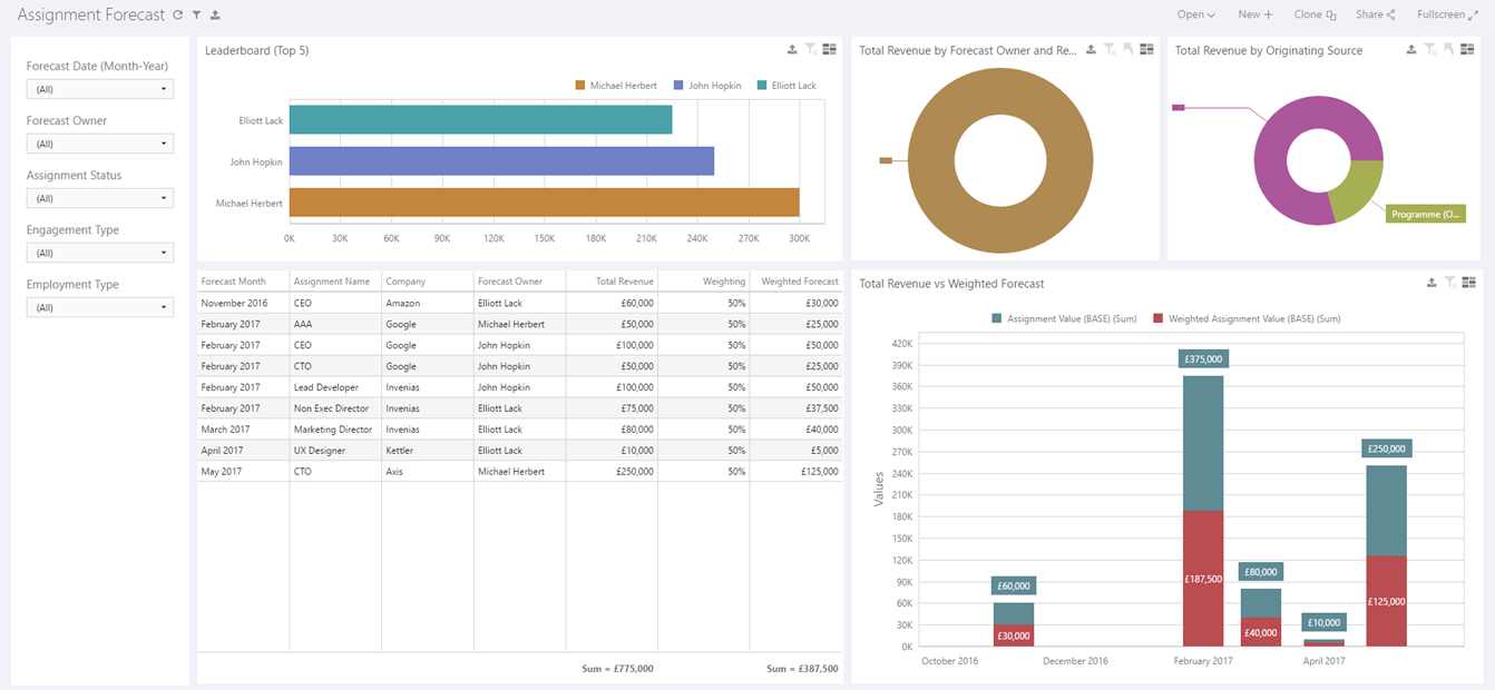
The widget on the far left is a group of combo filters which acts as a master filter for the rest of the widgets, allowing a User to filter down on Date, Owner, Assignment Status, Engagement Type and Employment Type.
All other widgets including the grid and pie charts also act as Master Filters, effecting all other widgets in the Dashboard.
Creating a New Dashboard
Permission Required: Please note, Creating a Dashboard requires the "Create Dashboards" permission.
Create a new Dashboard using the steps explained in the previous article, selecting the Data Source - Assignment Forecast.
Each data source contains an optimized field list which has been designed for use in a specific Dashboard.
If you feel that there are certain fields missing from existing data sources or data sources which need to be added, please raise an idea detailing the data source to the Invenias Ideas Portal.
Now this Dashboard has been created with a Dataset selected, we can proceed to add the required Widgets.
Group Combo Filter Widget
The main filter in this Dashboard is a number of combo filters grouped together into a single Dashboard widget.
To create this group of filters, first click the Group Icon:
Now we have added a group to this Dashboard we can add some Combo Filters into the Group by clicking Add Combo Filter:
Drag the Combo filter into the Filter Group. Repeat this 5 times to add 5 Combo filters in total:

As we have yet to add other widgets into this dashboard the Group Widget will occupy the entire page. Once we have added other widgets later in the article we can rearrange the widgets to the layout in the earlier screenshot of the default Dashboard.
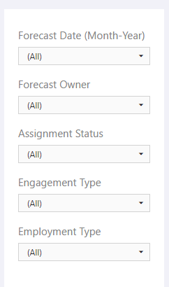
We want to include the following filters in this group:
- Forecast Date
- Forecast Owner
- Assignment Status
- Engagement Type
- Employment Type
Filter 1
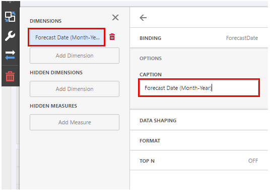
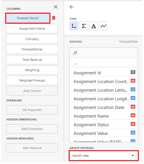
Click into the first combo box and bind the Dimension ForecastDate and set the Group Interval to Month-Year:
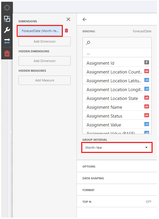
Update the Caption for this Widget in the Options menu to "Forecast Date (Month-Year)":
Filter 2
In the next combo filter Bind ForecastOwner as a Dimension, then update the caption to "Forecast Owner".
Filter 3
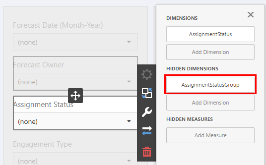
In the next combo filter Bind AssignmentStatus as a dimension and update the caption to "Assignment Status". In this Dashboard we only want to show Assignments with a Progress Status in the Status Group of Opportunity. We can achieve this by applying a filter to this Combo widget and use this filter as a hidden Dimension. Set AssignmentStatusGroup as a hidden dimension:
Then click DATA/FILTERING:
Then Click to Set Filter Criteria to open the Filter Editor, add the following filter:
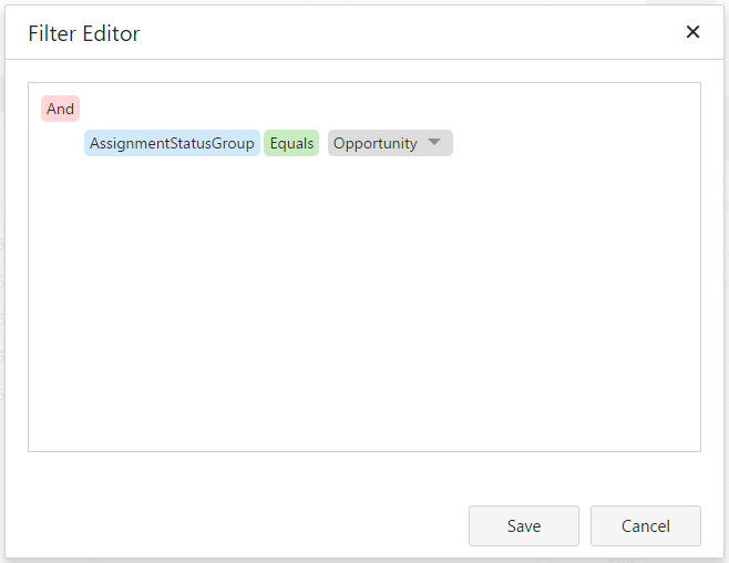
By using a Hidden Dimension, the filter can be applied to this widget without any reference to it in the dashboard.
This means that this combo widget will only include Assignments from the Status Group of Opportunity.
Filters 4 & 5
For the remaining 2 filters left in this group, bind Engagement Type as a Dimension to the first, then Employment Type to the second, updating the captions to reflect the Dimension titles.
Options and Interactivity
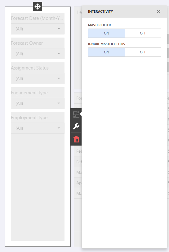
As we will be adding other Widgets to this dashboard which act as Master Filters we want to ensure that Filters in this Combo group aren't affected by them.
Click Interactivity on the widget on the Group level, not on an individual widget and set Ignore Master Filters to ON:
Under the options menu on the group level, ensure that SHOW CAPTION is set to OFF, or switch it to the ON setting and add a caption of your choice.
Grid Widget
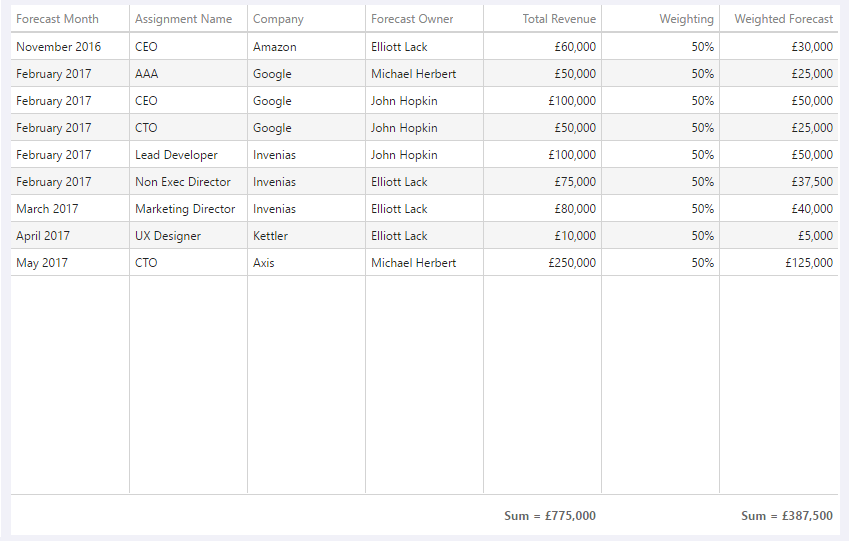
This grid displays a list of Assignments with columns to display detailed Forecast information, see example below:
We want to add a column into this widget of Weighting, which will show as a % which requires a calculated field to be created. The existing field in the data set for Weighting is a decimal value and we want to change this to a % when displayed in this grid.
Click into the Menu in the top left of the Dashboard Editor, click DataSource and then click to Add a new Calculated Field. In the resulting window update the Field with the following settings:
[Weighting] / 100
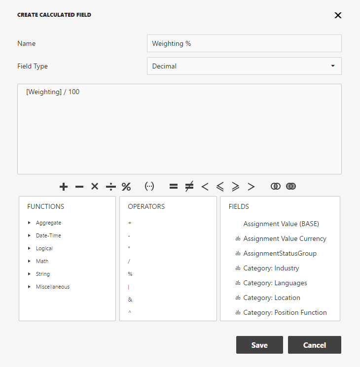
Save this field and click Save again to return to the editor.
Now we are ready to add the Grid widget into the chart by clicking on the Grid Icon and dragging it into the Dashboard:
Now we can bind some Data to this table. We will specify which columns are added and in this example, change the labels on the column headers to make it clearer to the end user what the columns represent.
Firstly add ForecastDate as a column into the Widget, set the Group interval as Month-Year, and update the Caption to Forecast Month although you can change this to your preference:
Add the Following columns into the Grid:
AssignmentName (change caption to Assignment Name), CompanyName (change caption to Company) and ForecastOwner.
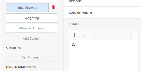
Add AssignmentValueBase as a column and ensure the Type is set to "Measure". The type is the highlighted section shown in the screenshot below:
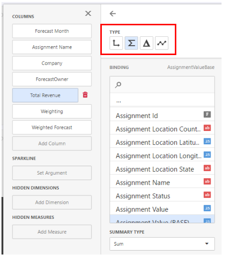
With this type selected, you now can see the Summary type field, ensure this is set to "Sum". On the Options tab, change the Caption of this field to Total Revenue.
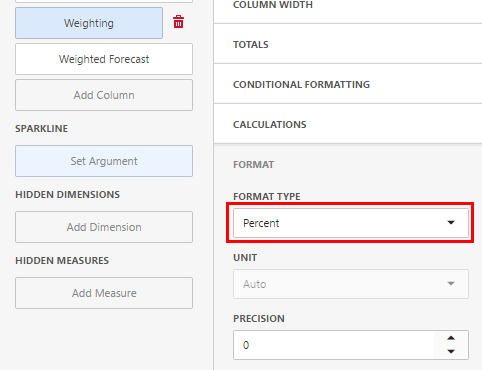
Now we need to repeat the steps explained above for 2 more columns. Add Weighting% as a Column, change the Type to Measure, set the Summary type field to "Sum" and update the Caption to Weighting.
In the Format tab, change the Format Type to Percent and update the Precision to 0.
Add WeightedAssignmentValue as a Column, change the Type to Measure, set the Summary type field to "Sum" and update the Caption to Weighted Forecast.
We want to display a Sum Total under the Columns for Total Revenue and Weighted Forecast:
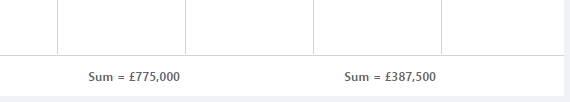
Click into each of these columns and click to the Totals Tab, click + icon and change the Total type from Count to Sum:
Finally you can add a caption of your choice to the grid or choose to hide the caption if required by clicking into the options menu for the grid.
Pie Charts
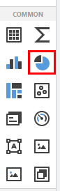
Next we can add the 2 Pie Chart widgets into the Dashboard. Click and Drag 2 Pie Chart widgets into the Dashboard:
Pie Chart 1
This chart will display the Total Revenue by Forecast owner, with an additional drill down for Region.
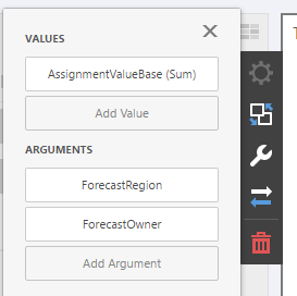
Bind AssignmentValueBase as a Value to the first Pie Chart, using a Summary Type of Sum.
Bind ForecastRegion and ForecastOwner as Arguments for the Pie Chart.
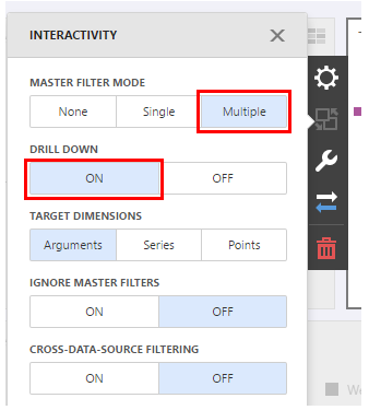
In the Interactivity menu, ensure that Master Filter Mode is set to Multiple and Drill down is set to ON.
Finally update the Caption for this Chart by clicking into the Options menu and updating the caption to Total Revenue by Forecast Owner and Region
Pie Chart 2
This chart will display the Total Revenue by Originating Source, with a drill down into Source Record, to show Records.
Bind AssignmentValueBase as a Value to this Pie Chart, using a Summary Type of Sum.
Bind Originating Source and OriginatingSourceFrom as Arguments for the Pie Chart.
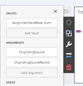
In the Interactivity menu, ensure that Master Filter Mode is set to Multiple and Drill down is set to ON.
Finally update the Caption for this Chart by clicking into the Options menu and updating the caption to Total Revenue by Originating Source.
Bar Charts
Click and drag 2 Bar Charts into the Dashboard:
Bar Chart 1
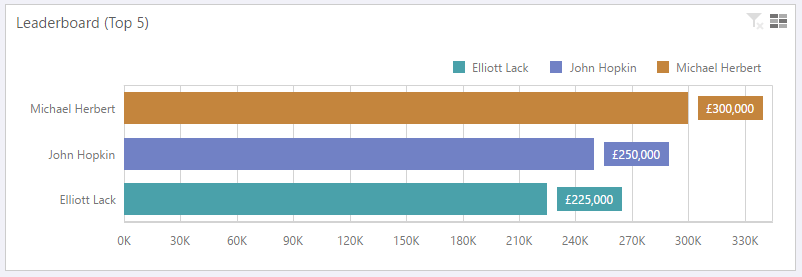
This chart will display a leader-board of the top 5 best performing Professional Users, based on their Total UnWeighted Assignment Forecast Revenue.
Bind AssignmentValueBase as a Value and update the caption to Total Revenue (Unweighted).
Expand the Point labels tab and set Show Point Labels to YES.
Next Bind ForecastOwner as an argument and expand the TOP N tab. Set TOP N Enabled to ON and the Mode to Bottom:
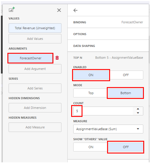
This will sort the forecast owners to show Users with the highest amount of Forecast Revenue from top to bottom, if you prefer to sort in the opposite direction, select the mode as TOP.
Set the Count to 5, this will limit the number of ForecastOwners displayed to the top 5 only. Ensure the Measure is set to AssignmentValueBase (Sum). As we only want to see the top 5, set SHOW OTHERS VALUE to OFF. If this is left on, all other Forecast Owners outside of the top 5 will be displayed in an aggregated column.
Next, change the orientation of the Dashboard from the Default setting to draw the chart from the left hand side of the widget by clicking ROTATIONON.
We can also make the display more visually interesting by clicking into the coloring section of the Options menu to add the setting below:
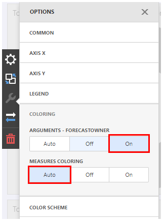
Now the coloring will be different per Forecast owner, note that the legend will update automatically too.
Bar Chart 2
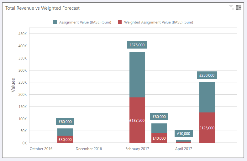
This chart will display the Total Revenue of all Assignment vs the Weighted Forecast Revenue, broken down on a Monthly basis:
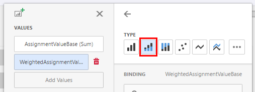
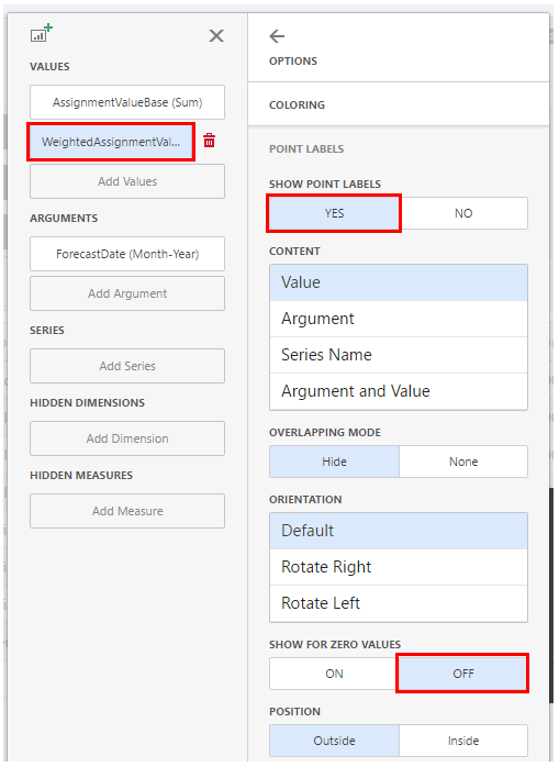
Bind AssignmentValueBase and WeightedAssignmentValueBase as Values to this chart.
For the value WeightedAssignmentValueBase (sum), we want to use the Type of Stacked as apposed to the default type of Bar:
Under the Point Labels tab, Set Show Point Labels to YES for both values.
Also change the setting in TOP N for SHOW FOR ZERO VALUES to OFF, in this chart we want to hide any data with a value of 0.
Bind ForecastDate as an argument for this chart, using a Group interval of Month Year.
In the interactivity menu set the Master Filter Mode to Multiple.
Finally let's update the caption in the Chart options menu to Total Revenue vs Weighted Forecast.
This Dashboard is now complete.
To reflect the layout of the default Dashboard that we are basing this Dashboard on, you will likely need to re-arrange the widgets by dragging and dropping them into the relevant location on the page.
More articles will be added in the future to describe more advanced dashboard creation.
Invenias Professional Services are happy to engage with you to Create Custom Dashboards for your specific requirements. Please contact inveniassupport@bullhorn.com or call on +44 (118) 310 0800 to discuss further.