Default Analytics Dashboards
Overview
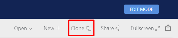
This article explains in detail the Default Dashboards which are included with the Analytics Dashboards feature. Default Dashboards are not editable. In order to make changes to any of these Dashboards, you will first need to Clone the Dashboard, then you'll be able to access EDIT MODE. Refer to the Working with Analytics Dashboards and the Creating & Editing Dashboards articles to learn how to make edits.
Most of the default dashboards that are displaying Financial data are consuming the BASE VALUE. These value fields use the Exchange Rates, that you can set on Currencies in Systems Preferences, to convert each value into a preferred Base currency. This preferred Currency is identified in Systems Preferences by setting the Exchange Rate on that Currency to 1.00. Please refer to Working with Analytics Dashboards to learn more about making basic changes to Dashboards.
This article covers:
- Assignment Average Timings Dashboard
- Assignment Billing Dashboard
- Assignment Forecast
- Assignment Weighted Opportunity Forecast
- Candidates by Progress Status by Company
- Candidates by Progress Status
- Client Interviews
- Meetings by Attendees
- Telephone Calls
- User Activity
- User Activity - Compare Users
- Downloads
Assignment Average Timings
Note that this Dashboard utilises dates that are tracked using Version History, but this relies on your database having Record Status and Candidate Progress Tracking enabled, as well as having your Assignment Statuses located in the correct Assignment Status Groups.
This dashboard uses the Assignment Progress Data Source to show average Time Since Start, Time from Start to End, Time to First Interview and Time to Offer for Assignments. This Dashboard is filtered to only load data on Assignments that were created in the last 3 years.
We would always encourage you to work with Milestones to track the Start and End of an Assignment. The Missing cards will show a count of Assignments that don't have a Start Milestone or an End Milestone and these cards can be used to filter the dashboard by clicking on them.
If you are not using Milestones, the calculated Start will use the later of the Date Created and the Date Active (the date the Assignment Status was set to a Status in the Active Status Group). Likewise, in the absence of an End Milestone, End will use the date that the Assignment was moved to an Assignment Status in the Completed Status Group if there is no Milestone. The First Interview dates are the dates that the first Client Interview or Consultant Interview Actions were held. Offer pulls from the data that the first candidate was moved to either a Progress Status in the Offer or Placement Progress Status Group.
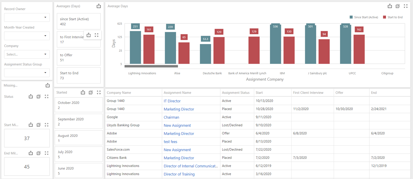
The dashboard can be filtered by the month the Assignment Record was created, Record Owner, Assignment Company or Assignment Status Group using the filter widgets in the top left. The Started cards also show counts of Assignments by each month and these cards can be used as a Master Filter.
The "Average" time statistics use Calculated Fields to display the number of days from Start Date to Today (for Assignments with an Active Status), Start Date to the first Client Interview Action in the Journal, time from Start to the the first Offer or Placement Progress Status is selected in the Candidate Grid and time from Start to End.
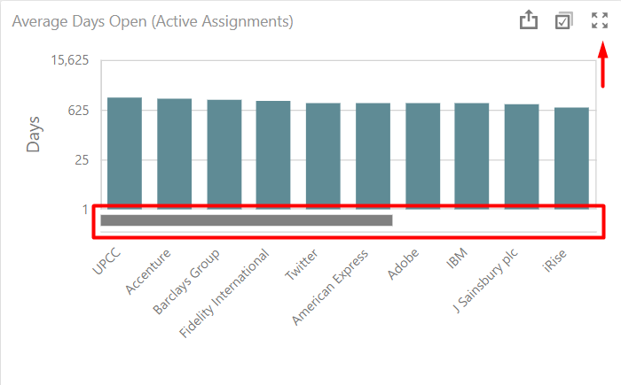
The "Average Days" bar chart displays average time to stats by Company and Assignment (double click on a company to drill down to the Assignments). This chart shows Companies with the most Assignments left to right and has a scroll bar at the bottom to scroll through the chart. The statistics displayed are average time to the first interview action, average time since start (only for Active Assignments) and average time . Use the Maximise button in the top right-hand corner of the widget, to work with these particular charts in full-screen.
The grid displaying all Assignments sorted by Assignment Company with the Assignment Status and some of the date fields. There is a hyperlink in the Assignment Name to open the Assignment Record in the Desktop Professional Application.
Assignment Billing
Note you must have the Billing feature enabled for this dashboard to function. You must also have a Base Currency selected in System Preferences with a value of 1. The currency symbol in use on this Dashboard can be selected in the Edit menu options for this Dashboard. If you have multiple currencies enabled, they must also have an exchange rate added against them in system preferences to avoid the Base Value displaying as zero.
This dashboard uses the Assignment Billing Data Source to display information using Billing Events from all Assignments, converted into your Base Currency.
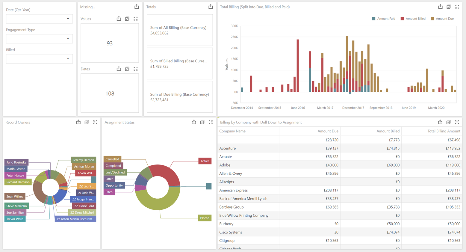
You can use the filter to filter all display widgets by Date taken from the Billing Event (either Due Date, Billed Date or Paid Date depending on the status of the Billing Event), Record Owner of Assignment, Engagement Type, Is Billed or Is Paid. The Pie Chart widgets display Total Billing Values by Record Owner and Assignment Status, these widgets can also be used to apply filters.
The "Events Missing" Cards show counts of the number of Billing Events missing either a Billing Value or a Date, these cards can be used as filters to identify the relevant Assignments.
The Total Billing bar chart displays all billing events split into Due, Billed and Paid. Clicking into any of the segments in the bar chart will filter the other widgets. The Date that the Amount is shown in is again taken from the Billing Event (either Due Date, Billed Date or Paid Date depending on the status of the Billing Event).
The two pie charts display the percentages of Total Billing Value by Record Owner and Assignment Status and these widgets also act as master filters for the other widgets.
The grid displays a breakdown of Amount Due, Billed and Total Amount broken down by Company. Double-clicking on a Company in the grid will Drill Down into the Assignments for that Company, with the Assignment Name operating as a hyperlink to open the Assignment Record in the Invenias Professional Desktop application.
Assignment Forecast
Note that this Dashboard relies on Assignments having a Forecast Owner assigned. You must also have a Base Currency selected in System Preferences with a value of 1. If you have multiple currencies enabled, these must also have an exchange rate added against them in system preferences.
This dashboard uses the Assignment Forecast Data Source to show the Unweighted (Total Assignment Value) Assignment Forecast information from all Assignments converted to your Base Currency (this is the Currency in Systems Preferences with an Exchange Rate set to 1.00). This Dashboard can be cloned to give you separate Dashboards that are filtered by Status Group (Opportunity, Active, Lost or Completed) like the Weighted Opportunity Forecast Dashboard does. The Dashboard contains a filter widget that you can use to apply filters to the dashboard to show Assignments with a Status in specific Assignment Status Groups. Refer to the Working With Analytics Dashboards article to start to learn how to edit these Dashboards. A useful edit might be to add a Master filter using Assignment Status Group so you don't have to apply the filter each time you use the Dashboard.
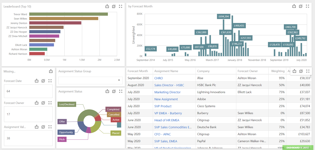
The Forecast Month bar chart shows the Unweighted Base Currency Assignment Values by Forecast Month. Selecting the bar representing a month will filter the whole Dashboard by Assignments with a Forecast Date in that month. The Leaderboard bar chart shows the Unweighted Assignment Value broken down by Forecast Owner.
The grid shows a list of the Assignments and the Assignment Name contains a hyperlink that you can click on to open the Assignment Record in the Desktop. There is Conditional Formating applied to the grid to show highlighted in green the Top 15% by Assignment Value.
The pie chart shows the Unweighted Forecast Value (Base) by Assignment Status. Both of these widgets can be used to filter by Forecast Owner or by Status. Above the pie chart is a filter widget that can be used to filter the whole dashboard by Assignment Status Groups, these are tied to your status and can be set up in Systems Preferences.
The "Missing" Cards show counts of the number of Assignments missing either an Assignment Value (Base), a Forecast Owner or a Forecast Date. These cards can be used as filters to identify the Assignments with missing data.
Assignment Weighted Opportunity Forecast
Note that this Dashboard relies on Assignments having a Forecast Owner assigned. You must also have a Base Currency selected in System Preferences with a value of 1. If you have multiple currencies enabled, these must also have an exchange rate added against them in system preferences.
This dashboard has a Master filter to only show Assignments with an Assignment Status in the Opportunity Assignment Status Group and shows the Weighted Forecast for those Opportunities. The "Weighted Value" is multiplying the Assignment Base Value by the probability Weighting on the Assignment to give Weighted and Unweighted comparisons. The data is pulled from the Forecasting tab in all Assignments and uses values converted to your Base Currency (This is the Currency in Systems Preferences with an Exchange Rate set to 1.00):
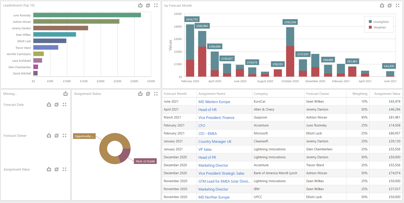
The same Data Source is in use for the Unweighted Assignment Forecast. All widgets are identical with the following exceptions:
- The Leaderboard is showing the Sum of Weighted Base Value for the Top 10 Forecast Owners
- The Assignment Status Pie Chart is also now showing the Sum of Base Weighted Values
- The bar chart is showing the Unweighted value with the Weighted Value as a stacked chart
Candidates by Progress Status by Company
It is important that your Candidate Progress Statuses are aligned to the correct Progress Status Groups for this dashboard to display the data correctly. This can be set in Assignment settings in Systems Preferences.
This dashboard displays counts by Candidate Progress Status Group across all Client Assignments using the Assignment Candidate Progress Counts Data Source. This Dashboard is filtered to only load Assignments that were created in the last 3 years. You might want to edit or set additional Master Filters in this dashboard, learn more about this in the Working With Dashboards article.
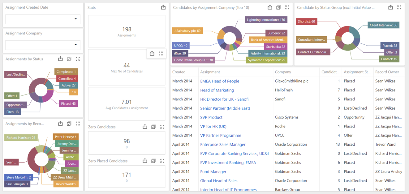
All filter and pie chart widgets except for the Candidates by Progress Status Group act as master filters in this Dashboard.
Candidates by Progress Status Group widget excludes Candidates that are at a Progress Status in the Initial Value or Rejected Status Groups.
Candidates by Assignment Company widget displays the top 15 Client Companies with the largest Total Number of Candidates in Assignments and contains a drill-down allowing you to double click on a Company to see the breakdown by Assignment for that company.
The Card widgets display statistics based on the visible Assignments (after you have applied any filters) showing the total number of Assignments, the maximum number of candidates and the average number of Candidates in any Assignment. The Average Candidates/Assignment Card excludes Assignments where the Total Number of Candidates equals zero. In addition, the Cards displaying the count of Assignments with Zero Candidates or Zero Placed Candidates and those cards also operate as master filters.
The grid is sorted by the date Assignments were created and shows Candidates in Assignments grouped by Client Company.
Candidates by Progress Status
This dashboard displays an overview of Candidate Progress across all Client Assignments. This Dashboard is filtered to only load Assignments that were created in the last 3 years, but the bar chart will initially show all Assignments in that period, so you'll likely need to apply filters using the Assignment Status, Date Created, Client Company or Record Owner widgets. You might also want to edit the date filter or set additional Master Filters in this dashboard, learn more about this in the Working With Dashboards article.
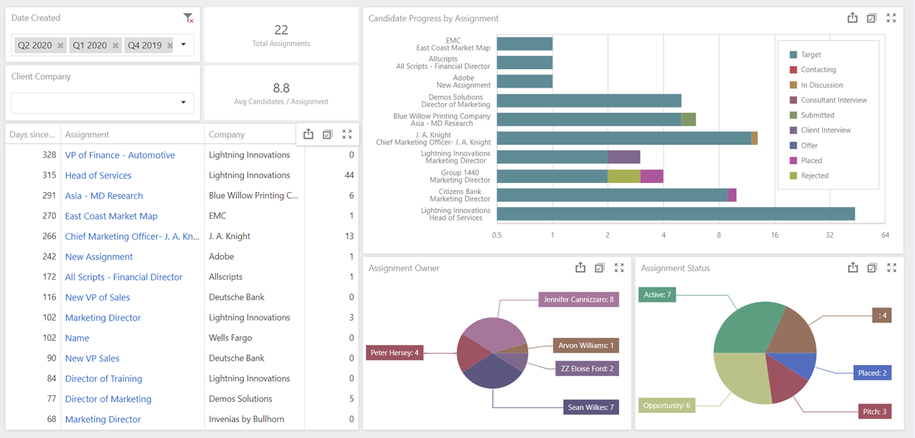
All widgets including the bar chart and the grid operate as master filters, except for the cards.
The bar chart is limited to only show 15 items at a time in Date Created order. There is a scroll bar on the right-hand side of the widget to allow you to scroll up to older Assignments if required.
The cards display statistics based on the visible Assignments (after you have applied any filters) showing the number of Assignments and the average number of Candidates across those Assignments where the Total Number of Candidates does not equal zero (this is applied as an individual filter only in this card widget).
The grid is sorted by the date Assignments were created.
Client Interviews
This dashboard contains an adjustable filter to only show Interviews within the last 13 months and it uses the Client Interviews by Team Members Data Source. This means that every Interview is reported against every User in the Team of the Assignment that the Interview Action is linked to.
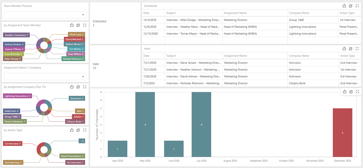
There is also a filter to review only Interview Actions linked to Team Members who have been assigned specific Team Member's Record Management Practice Group. The first Pie charts shows a breakdown the count of Interviews by Assignment Team Member (this can also be used as a filter and Assignments with no Team Members will show as a blank Team Member) and the last Pie Chart shows interviews by Action Type, with these charts also operating as master filters. You can filter by Assignment Name/Company using the searchable dropdown filter and the pie chart below that filter shows the top 15 Companies based on the total number of Client Interviews which can also be used as a master filter.
The grids show the details of the Interviews broken down into whether they are in the past (Held) or in the future (Scheduled) and the counts alongside these grids can be used to filter the rest of the chart. The bar chart shows a breakdown of Interviews by Month, with the option to double click on a month to drill-down into that month to show the breakdown by date. The Series in this Chart is also the Scheduled / Held flag.
Meetings by Attendees
For accurate reporting on Meetings, we would strongly encourage you to adopt the use of Action Types when saving them to the Journal. This dashboard could then have a master filter applied to filter out all meetings with no Action Type. For now, a couple of the widgets have those meetings filtered out, but this has not been applied in the default as a master filter.
This dashboard uses the Appointments by Attendees Data Source to display an overview of all meetings by Attendees, broken down by Attendee, Date and Action Type. The data source for this dashboard is currently hardcoded to only display data for the last 12 months and there is a Master Filter applied to filter our Users who have had their User Account marked as Disabled in User Admin.
The attendees are all Invenias users included in the People field in the Meeting Action when you save it to Invenias. The Creator of the meeting should automatically be added to that field, but on saving this User can be removed.
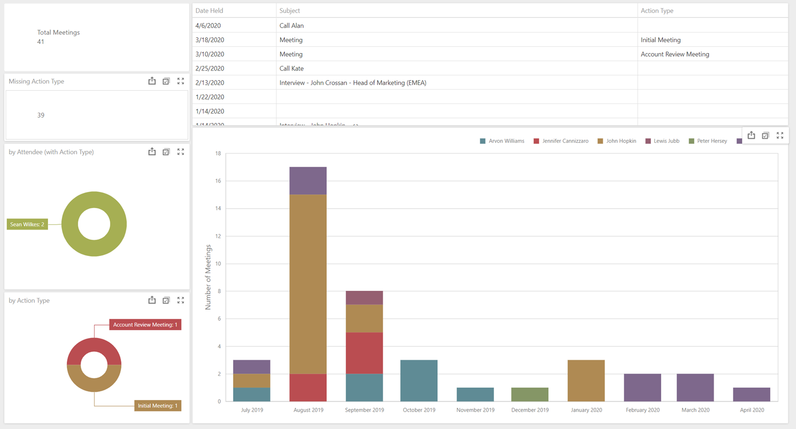
The Missing Action Type card operates as a filter, so you can quickly see the Meetings without Action Types. The by Action Type and by Attendee pie charts have the Meetings with no Action Type filtered out of the widgets and both widgets operate as a Master filter.
The stacked bar chart does not filter out Meetings with no Action Type. This chart first shows a breakdown of meetings by Attendee by Month and Year, with the option to double click on a month to drill-down into that month to show the breakdown by date. Attendee of those meetings is shown as a Series in this chart, with the Legend displayed above the chart.
Telephone Calls
For accurate reporting on Phone Calls, we would strongly encourage you to adopt the use of Action Types when saving them to the Journal. This dashboard could then have a master filter applied to filter out all Phone Calls with no Action Type. For now, a couple of the widgets have those Phone Calls filtered out, but this has not been applied in the default as a master filter.
This dashboard uses the Telephone Calls by Action Type and User Data Source to display an overview of all Phone Calls by User, broken down by Date and Action Type. The data source for this dashboard is currently hardcoded to only display data for the last 12 months. The Action is attributed to the Creator of the meeting.
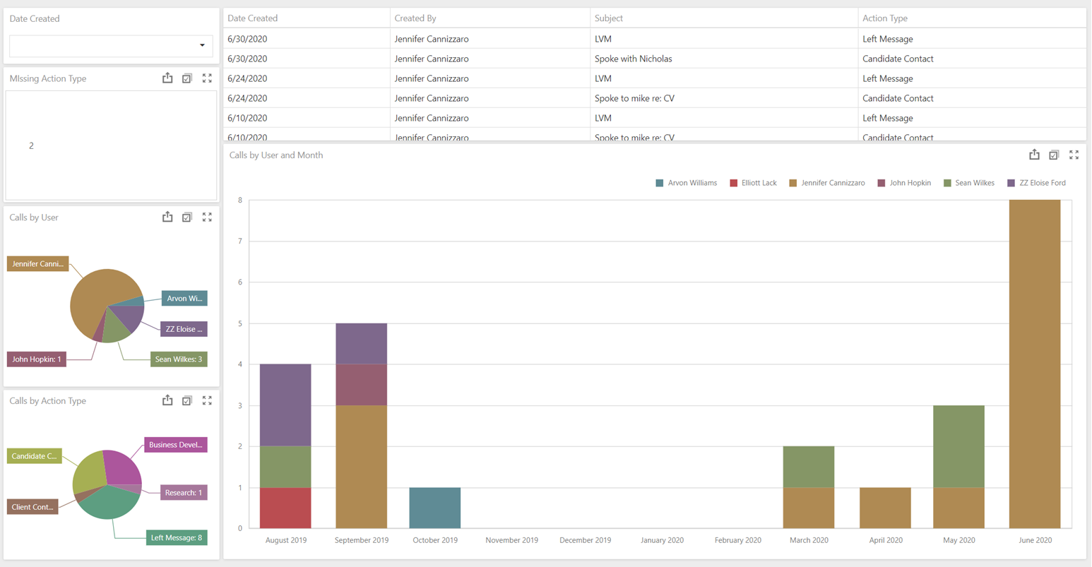
The Missing Action Type card operates as a filter, so you can quickly see the Meetings without Action Types. The by Action Type and by User pie charts have the Meetings with no Action Type filtered out of the widgets and both widgets operate as a Master filter.
The stacked bar chart does not filter out Phone Calls with no Action Type. This chart first shows a breakdown of Phone Calls by User by Month and Year, with the option to double click on a month to drill-down into that month to show the breakdown by date.
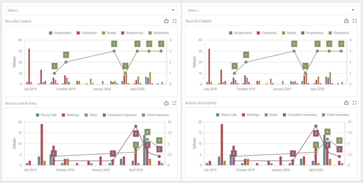
User Activity
This dashboard uses User Activity (12 Months) Data Source to display an overview of all activities from all Professional users, broken down into Records Created and Journal Actions Created. The data in this Data Source is hardcoded to only display data for the last 12 months and returns the counts for each day that a User is active in the system. This means therefore that the data can not be filtered to include Action Types or any other data from individual Actions. Separate Data Sources are available for each Action, some have been built into dashboards such as Client Interviews and Meetings by Attendee, and these include the additional information associated with those Actions such as Action Type.
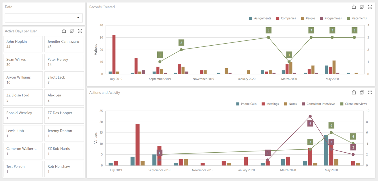
The filter widget in the top left corner can be used to filter by a specific set of months. The Records created bar chart displays a break down of records created from all users. Placements and Interviews Held are plotted as lines on the two charts graph, whereas all other Actions and Records Created are plotted as bars.
The Cards on the left show a count of the number of days in the last 12 months where a User has been active, sorted by most to least active, and these cards can be used as a Single or Multi-Select Master Filter.
User Activity - Compare Users
This dashboard also uses User Activity (12 Months) Data Source to display an overview of all activities from all Professional users, broken down into Records Created and Journal Actions Created. The dashboard is designed to allow you to compare the Activity of two different Invenias users at the same time. The data in this Data Source is hardcoded to only display data for the last 12 months at the moment.
Click into either of the two master filter dropdowns to switch between different users to filter on.
Placements and Interviews Held are plotted as lines on the two charts graph, whereas all other Actions and Records Created are plotted as bars.