Creating & Editing Analytics Dashboards Pt2.
Overview
This article follows on from Creating and Editing Analytics Dashboards Pt1 and continues to introduce some more of the advanced options available in Dashboards. In this article we will replicate the Default Dashboard - Candidates by Progress Status by Company.
This Dashboard will show an example of how to add and use a Calculated Field, Drill Downs and using Hidden Dimensions.
Click here for a full overview of Dashboards Feature.
This article covers:
- Dashboard Overview
- Creating a New Dashboard
- Adding Widgets
- Adding Calculated Fields
- Binding Data to Widgets
- Adding Drill Downs
- Adding Hidden Dimensions
Dashboard Overview
This Dashboard (Candidates by Progress Status by Company) display's an overview of Candidate Progress for all Assignments, broken down into pie charts displaying individual Progress Statuses with a pie chart per Client Company:
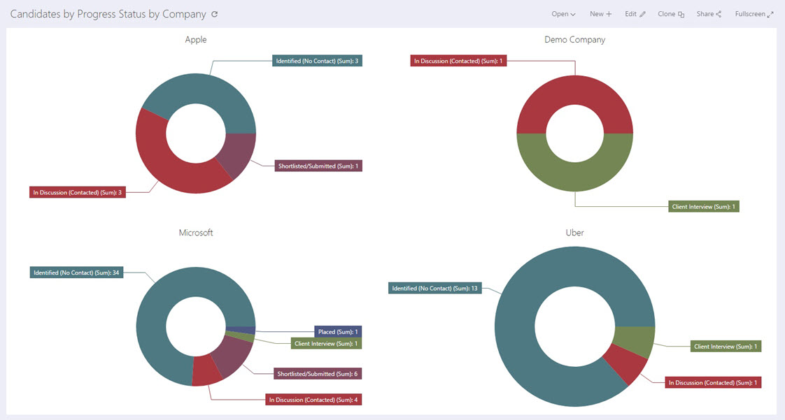
Each Client Company with an Assignment is displayed using a separate pie chart.
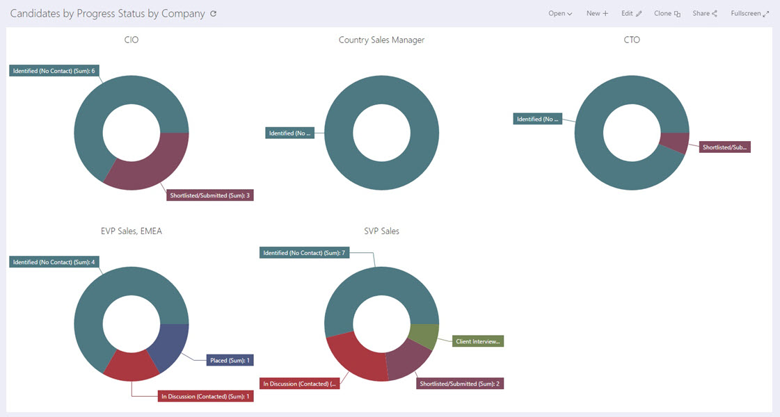
Clicking into any segment of data on a pie chart will drill down to show a pie chart per Assignment for the selected Company:
Creating a New Dashboard
Permission Required: Please note, Creating a Dashboard requires the "Create Dashboards" permission.
Create a new Dashboard using the steps explained in the previous article, selecting the Data Source - Assignment Candidate Progress Counts.
Each data source contains an optimized field list which has been designed for use in a specific Dashboard.
If you feel that there are certain fields missing from existing data sources or data sources which need to be added, please raise an idea detailing the data source to the Invenias Ideas Portal.
Adding Widgets
Add 1 pie chart into this dashboard by clicking the pie chart icon in the widgets panel:
This Dashboard only requires a single pie chart. Before binding data to this Dashboard, we will first run through the process to create calculated fields which we can bind to this pie chart.
In this chart, we want to display Total Candidates by Particular Progress Status groups. To demonstrate the use of calculated fields we will add calculated fields for each of the Candidate Progress Status Groups and make this chart more user friendly by shortening the labels for these fields.
Adding Calculated Fields
There are 9 Status Groups for Candidate Progress Statuses in Invenias, we want to add calculated fields for all of these with shortened labels and combine the 2 status groups for Initial Status and Contact Outstanding Status into a single group for Identified (No Contact).
Click into the hamburger menu:
Then Data Source.
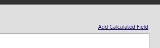
In the following window, click Add Calculated Field:
In the Create Calculated Field window, add the Name and Field Type as shown below, along with [TotalNumberOfCandidatesAtClientInterviewStatus] into the field window to create a Client Interview calculated field:
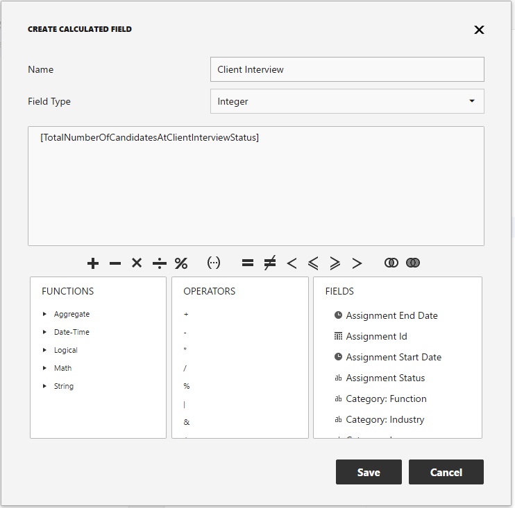
Note the other functions, operators and the fields list available to select from in this window.
Click Save which will close this window.
Add additional calculated fields with the following names and fields, using the same process described above:
- Consultant Interview - [TotalNumberOfCandidatesAtConsultantInterviewStatus]
- In Discussion (Contacted) - [TotalNumberOfCandidatesAtContactStatus]
- Offer - [TotalNumberOfCandidatesAtOfferStatus]
- Placed - [TotalNumberOfCandidatesAtPlacementStatus]
- Rejected - [TotalNumberOfCandidatesAtRejectedStatus]
- Shortlisted/Submitted - [TotalNumberOfCandidatesAtClientIntroductionStatus]
Add a further Calculated field with a Name of Identified (No Contact) but with 2 fields, as shown below:
[TotalNumberOfCandidatesAtInitialStatus] + [TotalNumberOfCandidatesAtContactOutstandingStatus]
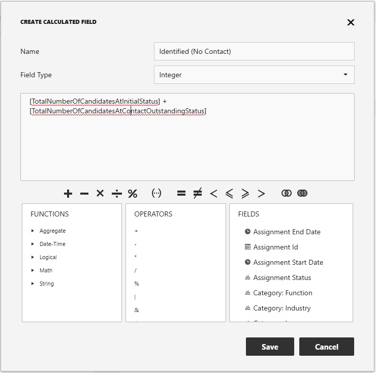
This calculated field will combine all candidates from the initial and contact outstanding status groups together in a single field.
Save this field and then click Save to return to the Dashboard Editor.
Binding Data to Widgets
We can now bind these fields to our pie chart by clicking into the pie chart and the binding menu (as described in the previous article) and adding the calculated fields as values, as shown below:
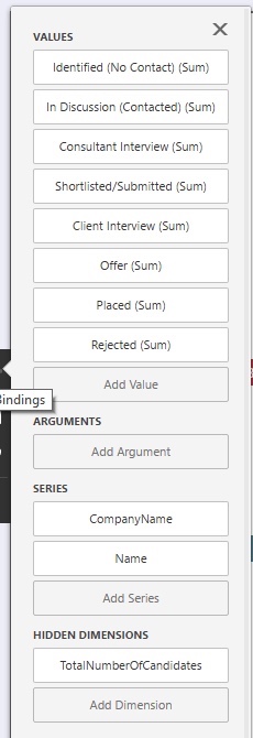
We need to bind some fields to Series for this chart, otherwise the charts will not show the correct data that we want. Add Company Name and Name fields to Series as shown above. The Name field will be used to Drill Down into, as explained next.
Adding Drill Downs
We want this chart to have a drill down when clicking into any segment to show all Assignments for the selected Company. Click to the Interactivity menu on the pie chart and click Drill Down ON:
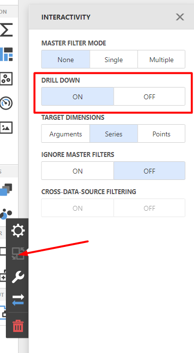
With this option selected, the chart will reference the fields bound to the Series section to drill down on. In our example we set Company Name, then Name. This means on the first level we display charts with a Series of Company Name, then by drilling down, the second level shows a break down by individual Assignments. You can add additional levels if you wish.
Click here for more information about using Drill Downs.
Adding a Hidden Dimension
To keep the charts cleaner, we can add a filter to ensure that only Status groups that have some Candidates included are displayed. We can do this by adding a Hidden Dimension and then adding a filter on the chart.
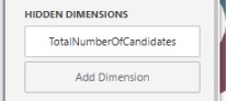
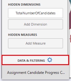
First of all bind TotalNumberOfCandidates as a Hidden Dimension to our pie chart:
We can then add a filter using this dimension by clicking Data & Filtering and Add Filter:
Add the filter shown below by clicking the + icon, then Add condition which is visible next to the word AND, then change the Green Operator to Is greater than, then a value of 1:

This filter will ensure that only Status groups that actually have Candidates with Statuses within these groups are displayed, hiding the null groups and keeping the chart cleaner.
This Dashboard is now complete, you can now Save this Dashboard to exit the Editor and share this with other users if you wish.
The next article details how to configure some of the more advanced options by reproducing the Default Dashboard - Assignment Forecast.