Best Practices to Promote Accessibility
Ensuring accessibility on the web is crucial for providing an inclusive and user-friendly experience for all users, including those with disabilities. This article outlines recommended practices to enhance accessibility and comply with accessibility standards when configuring engagements in Bullhorn Automation.
Engagement Branding Colors
When configuring engagement branding colors, aim for sufficient contrast between text and background colors, and focal elements and background, to improve readability and comprehension. To adhere to best practices, follow the Web Content Accessibility Guidelines (WCAG) standard of a minimum contrast ratio of 4.5:1 for normal text and 3:1 for large text.
Bullhorn Automation uses larger text for headers and regular-sized text for questions and statements.
Understanding Contrast Ratio
4.5:1 Ratio
This is the minimum recommended contrast ratio for regular-sized text (smaller than 18pt or 14pt bold). It ensures sufficient differentiation between text and background for most users, including those with low vision.
3:1 Ratio
This is the minimum contrast ratio recommended for larger text (18pt or 14pt bold and larger). Larger text requires a slightly lower contrast ratio to maintain readability.
How Contrast Ratio is Measured
Contrast ratio is calculated using the following formula:
Contrast Ratio= (Luminance of Darker Color+0.05) / (Luminance of Brighter Color+0.05)
Luminance is the perceived brightness of a color and is represented on a scale from 0 to 1, with 0 being black and 1 being white.
Tools for Measurement
You don’t need to make these calculations by hand. Several online tools simplify the process of measuring contrast ratios. These tools often provide a pass/fail indication based on the specified accessibility standards:
Web-based tools like WebAIM Contrast Checker, Color Contrast Analyzer, and Contrast Ratio provide an easy way to input color values and receive contrast ratio results. In addition, choose colors that are distinguishable by users with color vision deficiencies. Tools like color-blindness simulators can help in understanding how users with color vision deficiencies perceive your color choices.
Creating Accessible Questions
Use Plain Language
When creating engagements, try to use plain language and avoid specialist terms and acronyms where possible.
Use Concise Labels
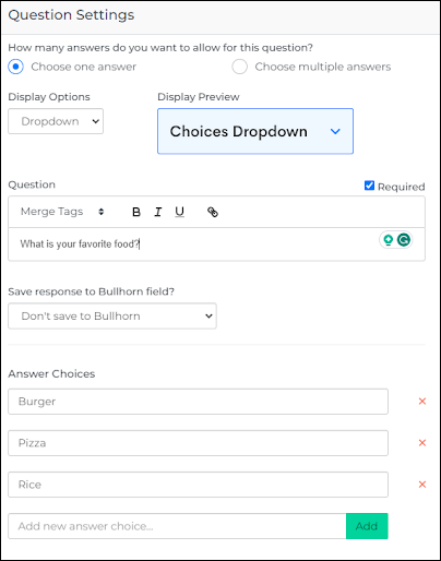
When creating answer choices for questions, try to provide short labels balanced with tone of voice. When appropriate, make the first word or words meaningful to the user.
Screen Readers We Support
Bullhorn Automation engagement questions are supported with the most commonly used screen readers. Two suggested screen readers: JAWS and VoiceOver. For the best survey and chat experience, we recommend using one of our supported browsers; Firefox, Chrome, Safari, and Edge.
The information provided in this article does not, and is not intended to, constitute legal advice; instead, all information herein is for general informational purposes only. The information presented in this article may not constitute the most up-to-date legal or other information. This article contains links to other third-party websites. Such links are only for the convenience of the reader, user or browser; Bullhorn and its Group CompaniesClosed do not recommend or endorse the contents of the third-party sites.