Admin: Omnitable User Guide
Bullhorn Recruitment Cloud’s Omnitable is a generic, reusable component that can be added to pages to show a fully configurable and customizable list of records and actions.
It was designed to mimic and expand upon the existing Salesforce List Views, providing both consistency with the platform native behavior and additional functionality for Bullhorn Recruitment Cloud users.
Customize Columns
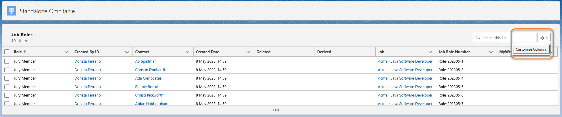
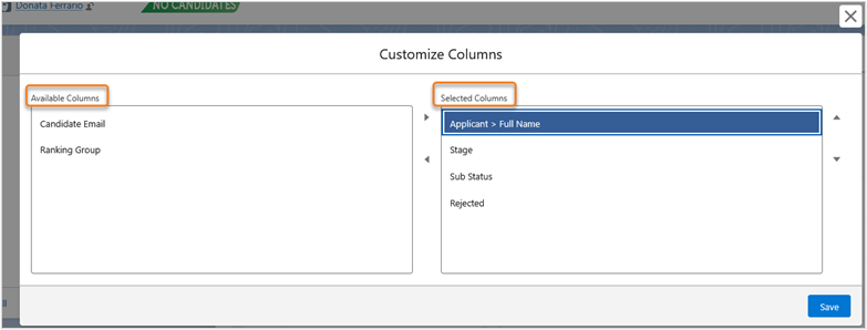
The Customize Column control opens the Customize Columns modal that shows to the user:
-
Selected Columns: the fields shown or moved here will appear on the UI as Omnitable columns
-
Available Columns: a set of fields configured by the System Admin for the specific Omnitable instance and that can be manually added to the Omnitable by the user
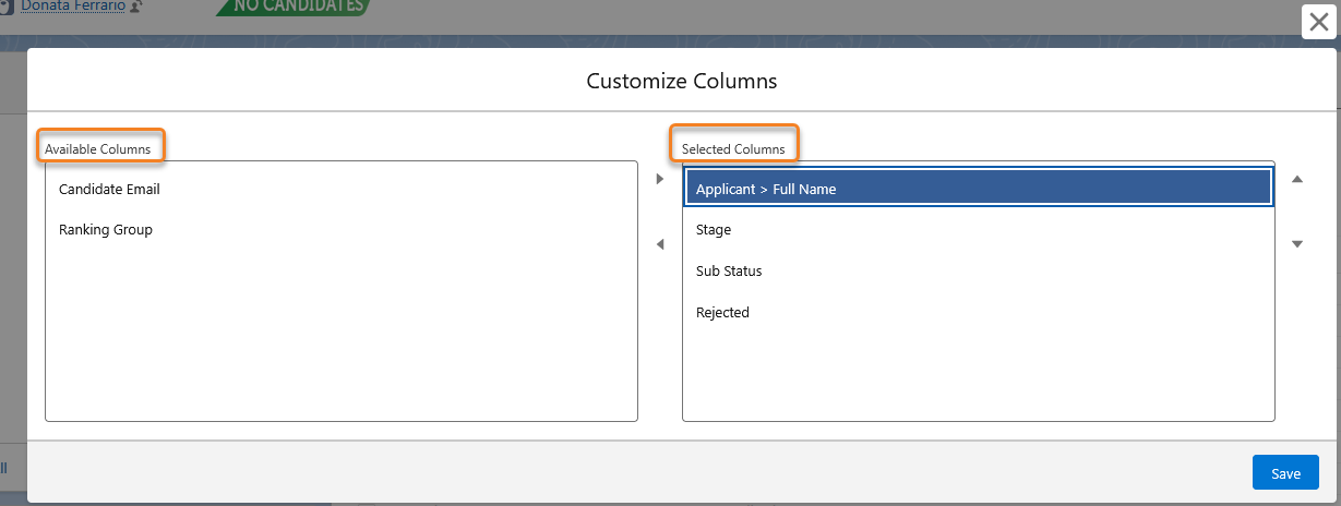
The first time users open the Customizable Columns modal, on the right they will automatically see what's on the page at that time (i.e. the default configuration. On the left they might see the Available Columns list created by their Admin. If not configured, that section will be blank.
- When users save a new column set, the new column configuration is persistent per logged-in user and per record type until a change is made and a new set is saved. Note that the dependency on a record type is only relevant when an Omnitable is added to a record as a related list (so not relevant for standalone Omnitables) and if configuration has been added to relate Omnitable instance and record type
- Only the most recently saved configuration is persistent and once changes are saved there is no way of going back to the original default configuration.
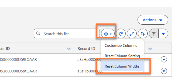
Intelligent Column Resizing for Omnitable
The Omnitable now includes intelligent column resizing, an enhanced user experience based on user feedback.
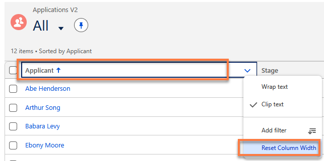
Manual resizing is now possible with the new Reset Column Width button that is available under the Cog settings icon menu and also under the individual column headers.
The enhancements cover five key scenarios:
-
Auto-Fit on First Load - When a user first arrives on an Omnitable page (or resets to default), column widths are automatically calculated based on the content loaded in the current chunk, eliminating narrow or oversized columns on initial view.
-
Manual Resize Preserved - When a user manually drags a column to resize it, that column holds its new width while all other columns remain unaffected.
-
Smart Column Add/Remove - If the user hasn't manually resized any columns, adding or removing a column triggers an automatic recalculation of all widths to fit the updated set. If columns have been manually resized, existing widths are preserved, and new columns are auto-fitted to fill remaining space (or appended if the table is already full-width).
-
State Persistence Across Navigation - Manually resized column widths are remembered when navigating away and returning. If no manual resizing has been done, the page behaves as if it were a first load. This applies to the same Named View; the changes are not carried across different Views.
-
Viewport Responsiveness - Resizing the browser window or zooming applies the same rules — manual widths persist; untouched columns recalculate to fit.
No configuration is required.
Custom Column Renderer
Omnitable supports the configuration of a custom column renderer: essentially a custom component that is used to render the data for a specific column in the table.
In an Applicationv2 Omnitable, the Stage column would normally be a text column: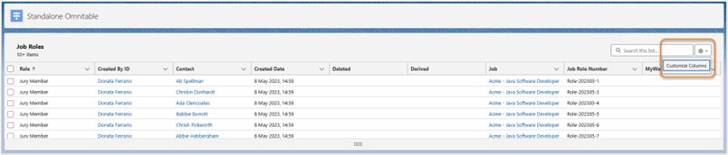
However with configuration it’s possible to replace it with a renderer of the same data that uses a chevron view component to display the stages:
This can also be leveraged to make different Omnitable views available to users
By saving two named views (combination of column set + filtering criteria) with/without the custom column renderer and then switching between the two depending on what data visualization is preferred.
Column Sorting
Sorting Behavior
When users click on the arrow symbol on the right of the column header to sort the content of that column, data across the full dataset (not only what is visible on the table right now) is sorted.
Sorting is based on one field + one direction at a time (EX: Full Name and ASC)
If no configuration is added, no explicit sorting is applied, Salesforce standard sorting behavior applies.
If default sort order is configured in the Omnitable Named Setting Custom Metadata Type, then the table will be sorted by default based on the field and direction specified in the configuration.
After that, when the user changes the sorting behavior by clicking the arrow on the table’s column header, the configuration will be saved into local storage, and applied on subsequent loads of the table. It's important to note that if there are no user preferences saved, we don't save the current default configuration to local storage, as in doing so the user would lose any further changes to the default configuration.
Multi-column Sorting
The multi-column sort icon (↑↓) located in the Omnitable header allows users to sort Omnitable data using multiple columns instead of just one. Here’s how it works:
-
Click on the ↑↓ icon
-
A popup window will appear. Use the + Add a sort column button to add fields to your sorting criteria
-
Select the desired field from the dropdown menu.
-
Choose the sort order (Ascending or Descending) for each column.
-
Click on Apply when you have completed your selection.
There is a five column limit to this configuration.
For example, you might have ordered your table based on Candidate stage, but now you want to have the Candidates in each stage shown in alphabetical order: just add the Applicant’s column to the multi- column sort configuration
-
The multi-column sort configuration is user-specific and Named View-specific.
-
Once you set your configuration, if you refresh the page or navigate away and then back to the same Omnitable Named View, the sorting you configured is maintained.
-
To make changes to your multi-column sort configuration, click on the ↑↓ icon again and add columns, or remove them using the trash can icon.
-
To remove the configuration, click on the Cog settings icon and select Reset Column Sorting - this will restore the default column sorting configured in the Omnitable JSON.
-
Multi-column sorting is available out-of-the-box but if you want to hide the ↑↓ icon , you can change the "headerVisibilitySettings" for this feature to ‘false’ in the Omnitable JSON configuration.
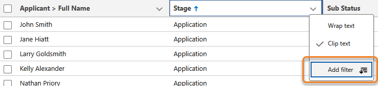
Column Filtering
To search data within the individual columns of the Omnitable, you can add temporary filters on the fly without having to save them.
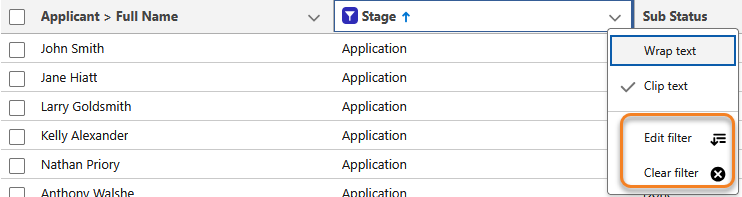
In the column headers drop down (under the arrow), you will see an option to Add filter.
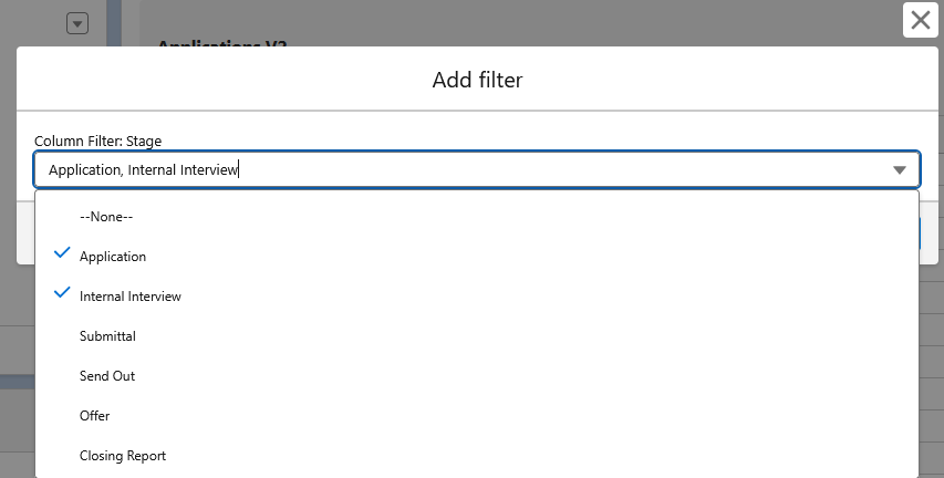
Next, the Add filter modal opens that lets you select the column’s value(s) that you can set as filters. Multiple selection is supported for picklist fields.
When filters are applied, you will see a filter icon appear in the columns being filtered.
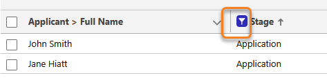
After a filter has been applied, users can either edit or clear the filter if they want to change the selection or remove the filter.
These are the field types supported for filtering:
- Address (only single line address parts: Country, State, City, Zip code)
- Name
- Text (255)
- URL
- Phone
- Pick List (single select)
- Date/Date Time
Data Filtering
When creating a filter for a Date/Date Time column, the Operator dropdown offers: Equals/Not Equals/Less Than/Greater Than/Less or Equal/Greater or Equal/Is Blank/Is not Blank and there are two data inputs for Date:
-
Specific Date: Enter a date /date time using a date time picker.
-
Relative Dates: Choose one of the following:
-
Today
-
Last Week
-
This Week
-
Last Month
-
This Month
-
Last[x]Days
-
Last[x]Weeks
-
Last[x]Months
-
When using the Equals/Not Equals operator for a Date Time field, a specific date search will only return an exact match for Date and Time (down to the minutes and seconds). It is not an efficient filter and it is recommended that Relative Dates options are explored instead.
Filtering Based on Blank/Null Values
You can filter a column to only show records that have a value or records that don’t have a value.
When you create a filter, you will see these two options in the Column Filter modal:
-
Is Blank
-
Is Not Blank
This applies to fields that contain strings, not for example to picklist fields (as you can get the same result by filtering on the ‘none’ value vs all selected values except ‘none’) or checkbox fields, since a checkbox cannot be blank.
Sorting and Filtering Exceptions
Omnitable can't sort or filter columns that contain formulas, custom renderers, or non-text data because it can only work with what's stored in the Salesforce database.
To resolve this, you can now use field overrides in the JSON configuration. You can specify an alternative "sortable" field that Omnitable uses behind the scenes while still displaying your original column data.
Alternatively, you can simply remove the ability to sort/filter a column. This is also possible through JSON configuration. Refer to the Omnitable Configuration Guide article for more details.
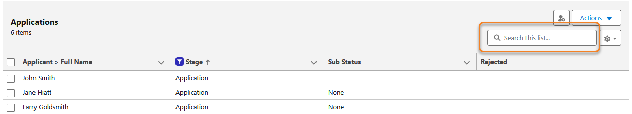
Quick Search
When searching for specific information in the Omnitable, a Quick Search option can be used in order to filter the results.
Quick Search Behavior
- The following field types are supported:
- Address
- Name
- Text (255)
- URL
- Phone
- Lookup. The display value is the name of the related record, and this is used for searching too.
- Special characters are supported and are escaped.
- Minimum value of 2 characters is required for a search.
- The Quick Search input value is trimmed to remove spaces at the beginning and end.
- All result records that contain the criteria entered are returned.
- You must hit enter to perform the search.
- As soon as search is performed, the search results list resets, and you are redirected to the top of the list.
- You can clear Quick Searches that have been entered by clicking the x icon button.
Infinite Scrolling
When uploading records to the Omnitable, we leverage Salesforce infinite scrolling.
Infinite Scrolling Behavior
- On page load, a chunk of data is loaded (the size of the chunk is configurable in the Subscriber’s Org.)
- Each time users scroll down a bit, a bit more data is loaded (the size of the successive data loads when scrolling down the page is also configurable in the Subscriber’s Org. )
- There is a limit of how much data you can load: 2,000 records
- How many records you can see at once on the page depends on how big the table/page is
- If there are more than 2,000 records in the database and the user scrolls to load more than 2,000 records then:
- The number of loaded records is capped at 2,000.
- The record count shows “2,000+ items”.
- A message is displayed informing the user that the table cannot load more than 2,000 records.
- Continuing to scroll to the bottom of the page does nothing.
- If there are exactly 2,000 records in the database and the user scrolls to load all 2,000 records then:
- All 2,000 records are loaded.
- The record count shows “2,000 items”.
- No message is displayed to the user.
- Continuing to scroll to the bottom of the page does nothing.
- A record count is shown above the omnitable.
- When there are more records to be loaded, a plus(+) is shown next to the number of records.
- When there are no more records to be loaded then the plus is not shown.
Record Selection Behavior
- Users can manually select one or multiple records, or all records using the selection checkbox on the top left of the table
- To clarify, select all means select all loaded records (whether or not they are visible), i.e. the sub set loaded and not all records for that table.
Selecting all records in a table is not currently possible.
- If users make a selection and then load more records, the selection is preserved
Accurate Omnitable Record Count for Large Datasets (2000+)
The Omnitable now displays the true total record count when a dataset exceeds 2,000 records, replacing the previous behaviour where the count was capped or misleading for large result sets.
Previously, users had no way to know whether they were looking at 2,001 or 20,000 records. The system now performs a background count query when the total exceeds 2,000 and surfaces the real figure in the record count display. The counter behaves correctly in all states:
No selection: "Showing 100 of 5,432 records"
Rows selected: "10 of 5,432 records selected"
Filter applied: "Showing 100 of 2,001 records" (reflects the filtered total, not the overall total)
Rows selected after filtering: "10 of 2,001 records selected"
No configuration is required.
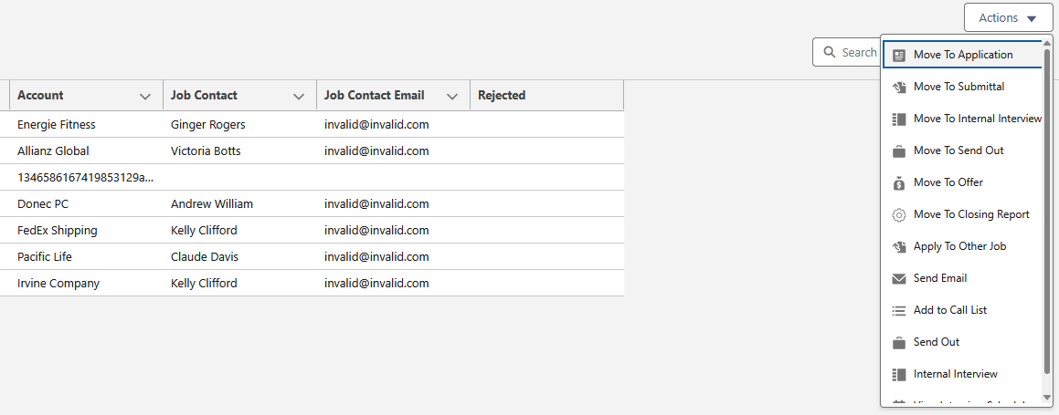
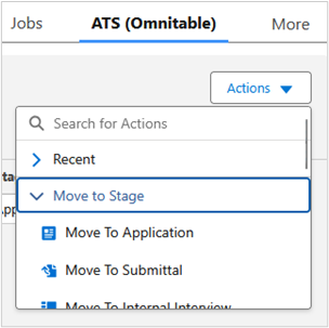
Actions
In Omnitable, Actions are added by wrapping them in Flows and then referencing the Flow in the configuration settings. As a result, both packaged and custom actions are supported.
To offer parity with our core package ATS, we ship the most used ATS actions with the product and once an Omnitable is added to a Contact or Job record, users will see the familiar Action dropdown:
Omnitable Actions: Display as Nested Menus
Instead of using the OOTB Actions dropdown, it is possible to display the actions using a nested menus structure. Actions need to be separated into categories for this to work.
When nested menus are enabled and configured, the actions dropdown will contain the specified categories of actions and a list of actions used recently (under Recent). Recently used actions are suggested first in the categories. These are stored in the user's browser session, for each omnitable.
Omnitable Row Actions
Edit/Delete Row Actions
With configuration you can have Edit/Delete actions as row actions in Omnitable. These row actions look and behave much like the Salesforce List Views Edit/Row actions.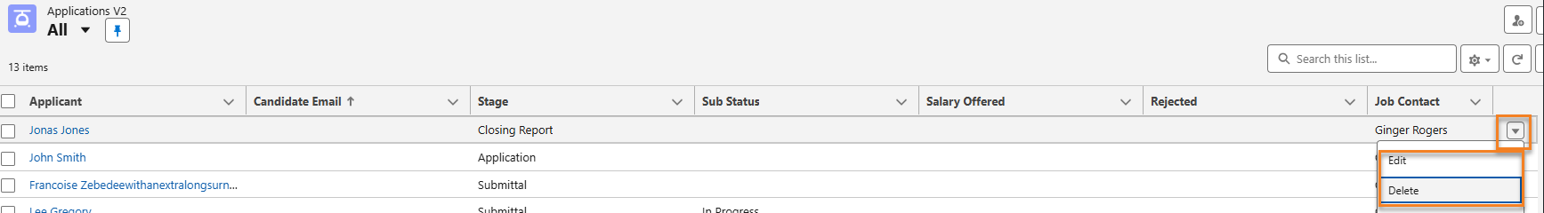
The Edit action functions like the standard list view Edit button, presenting an Edit Record modal by default. If a Visualforce override is configured, the user will be redirected.
The Delete action mirrors the standard list view Delete button, showing a confirmation dialog followed by a success toast indicating the record's deletion. Any errors will appear in a follow-up toast.
User’s permissions are respected:
- Only the actions the user has permission to do are shown.
- If the user has Edit, but not Delete, permission then only Edit is shown.
- If the user has no permissions to either, the whole column is missing (unless there are other row level actions configured)
Packaged/Custom Row Actions
Configuration settings allow admins to decide if an action should be displayed under the Action dropdown or as an icon on the toolbar.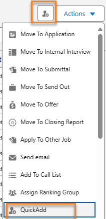
In addition, any action configured for Omnitable (packaged or custom) can be displayed as a Row Action.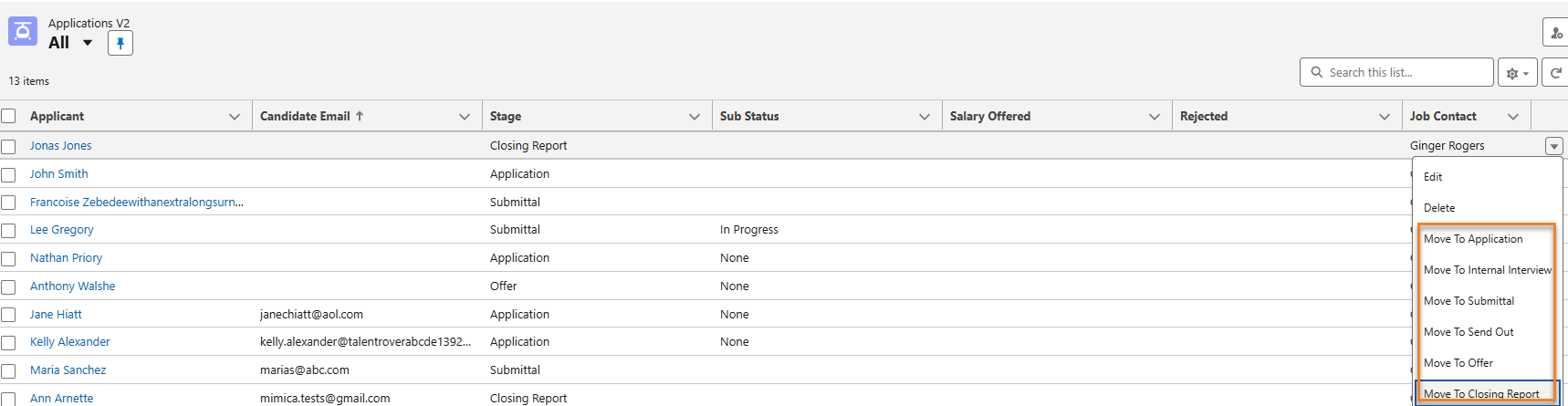
Contextual Data Viewer
Contextual Data Viewer can be configured to be added to any Omnitable. For more information on this feature, please see Contextual Data Viewer for ATS Customization.
Named Views
Omnitable Named Views allow users to save a combination of customised column sets and filter criteria, similar to what’s available for Salesforce’s List Views.
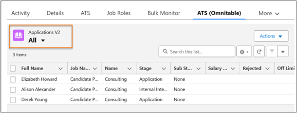
Before creating any new Named View, the Named Views dropdown will show the All View (all records for that Omnitable instance are included).
The All View is not editable and no filters can be applied to it.
Create a Named View
To create a Named View, the logged in user clicks on the New View button (top right of the Omnitable)
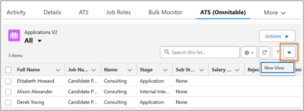
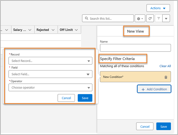
This opens the screen that allows the configuration of the filter for that particular named view:
Once the view is saved under a name, that name appears in the Named Views dropdown list on the top left of the screen.
There is currently no option to share or control visibility of saved views; users will only see the ones they created or edited.
Edit a Named View
Users can edit any of the views they created: this is done by selecting the view they want to edit and then clicking on the Filter icon:
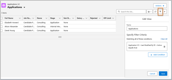
You can just edit the name, or the filter criteria, or the filter logic, or any combination of the three. (Just be aware that the filter logic will only display if two or more conditions are added)
When you save a Named View (through Create or Edit action), you automatically also save the current column configuration along with the filter you created or updated. You can have:
-
Multiple Named Views each having a different combination of column configuration + filter
-
Multiple Named Views with same column configuration but different filters
-
Multiple Named Views with same filters but different column configurations
Named Views Filters
When creating a filter for Named Views, the Specify Filter Criteria UI shows the following out-of-the-box:
-
Record: This is a list of all records and related records (lookups) you have access to. these records are dependent on the Omnitable context objects.
-
If you are on an Applications Omnitable, in the Record picklist you will be able to choose either an Application record, or a record from an object that is related to Applications via lookup relationship (EX: Job). So you might have Record = Application v2 > Job.
-
-
Field: Once a record is selected from the Record picklist, the Field dropdown will show all the fields from that record.
-
Continuing with the example above, if Record = Application v2 > Job, then in the Field dropdown you will be able to choose any Job field.
-
The Filter Criteria UI input lets you select:
- a record
- a field
- an operator
- a value
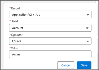
The Record UI input is a picklist that allows you to select the records and related records that you have access to depending on the Omnitable context objects. The picklist value will show the relations that you can use as the basis for your filter and specify which object they come from.
Operator and Value are based on the field type of the selected field.
If a text field is selected, the operator would give you more options such as Contains, and the value becomes a free text input: in this case it’s important that the user enters the correct value (which could be a RecordID or an email etc) for the filter to be correctly configured.
It is possible through configuration to control which fields are shown in the Record/Filter dropdown. Please refer to the Omnitable Configuration Guide for more details.
How to Set a Default Named View
It’s possible to mark a Named View as the default view for an Omnitable (i.e. the view displayed every time the user launches or goes back to that Omnitable).
-
On first launching the Omnitable (until a different Named View is pinned), the All Named View is pinned by default.
-
To pin a Named View as the default view, click on the Pin icon next to the name.
Outcome: The Pin icon is set. When you come back to the Omnitable, that one will be the view displayed.Note: The only way to unpin a view is to set a different view as the default view.
You can change view while working on the page even with a different pinned view.
Date Filtering
When creating a Date/Date Time based filter, you can choose to build your filter on:
-
Specific Date
-
Date Range (From /To)
-
Relative Dates - these are the values available out of the box:
-
Today
-
Last Week
-
This Week
-
Last Month
-
This Month
-
Last[x]Days
-
Last[x]Weeks
-
Last[x]Months
-
These are the supported operators and data input for each tab ('Date Range' tab only visible if Equals/Not Equals operator is chosen).
| Filters | Supported Operators | Data Input |
|---|---|---|
|
Specific Date |
Equals/Not Equals/Less Than/Greater Than/Less or Equal/Greater or Equal/Is Blank/Is not Blank |
Date and Time pickers |
|
Date Range |
Equals/Not Equals |
‘From' Date/Time 'To' Date/Time |
|
Relative Dates |
Equals/Not Equals/Less Than/Greater Than/Less or Equal/Greater or Equal/Is Blank/Is not Blank |
Out of the box picklist with a selection of relative dates |
When using the ‘Equals/Not Equals' operator for a Date Time field, a ‘specific date’ search will only return an exact match for Date and Time (down to the minutes and seconds). It is not an efficient filter and it is recommended that Date Range or Relative Dates options are explored instead.
Filters Based on Blank/Null Values
When you create a filter for Named Views, you will see these two options in the Operator’s dropdown:
-
Is Blank
-
Is Not Blank
When selecting either operator, the ‘Value’ input field is hidden.
Some configuration might be needed to make the Is Blank/Is Not Blank operators available if you are upgrading to package release 2025.10 or higher and you already have Omnitables configured in your Org. See the Omnitable Configuration Guide for more details
Next Steps
For detailed steps on how to configure any of the features, please see Omnitable Configuration Guide.