| Edition: Enterprise | Audience: All Users |
Example Trend: Averages Per Head
To get a real sense of performance for activity and revenue metrics, averages per head are a great way to get an indication of how much activity the average recruiter is creating. This becomes even helpful when comparing teams of different sizes, as it removes the element of heads from the comparison.
What this Trend Does
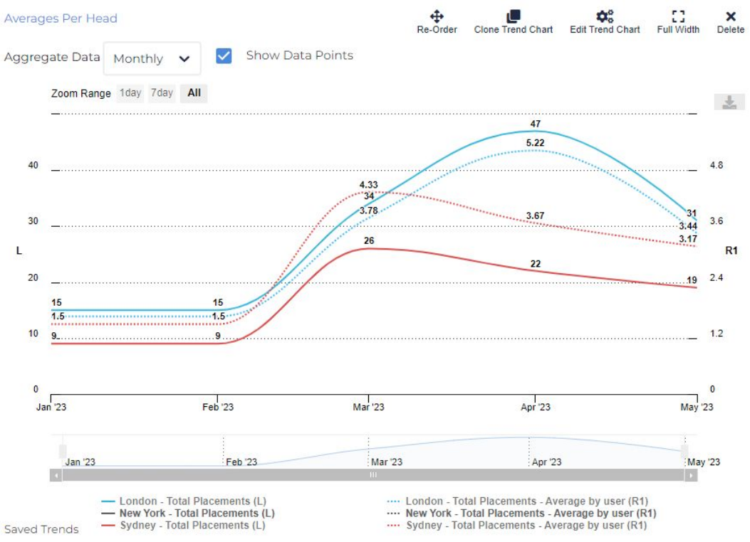
This trend is designed to illustrate the value of average per head, by plotting it against the actual metric value to observe the impact of group size on the calculation.
When interpreting this graph, it’s easy to see that different group sizes can lead to misleading results. The solid lines might suggest that Sydney performed worse than London due to fewer placements; but Sydney is a smaller team and so on a per head basis they created more placements. This means that Sydney actually outperformed London in March.
Features Used
- Average Per Head: The most important feature of this trend. In fact, the metric values are surplus to requirement on this particular visualisation - it’s most useful to compare average performance.
- Data Groups: The first data group was created by adding Total Placements twice, adjusting design options and setting one to have a What to Plot of Average by User. Then, the page was duplicated twice, with the teams adjusted to have three data groups with almost entirely the same configuration.
- Data Group Filters: There are three teams accessible on this report, but six lines can be overwhelming. In this case, New York was filtered out, but it’s easy to switch between teams or metrics you want to compare.
- Design Options: Dotted lines were used to distinguish averages, and colours to distinguish metrics.