| Edition: Enterprise | Audience: All Users |
Example Trend: Cumulative Target Attainment
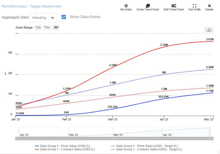
Trends are a fantastic way to visualise attainment against target. This can be done either cumulatively to show overall performance against final target (as shown below), or non-cumulatively to show peaks and troughs compared to what it usually a persistent target line.
What this Trend Does
This trend returns the revenue figures for Perm Sales and Contract Sales, but it also shows the targets for each metric for the selected group (in this case the whole company).
This was achieved using a single data group and four metric rows. As the trend calculates over a single timeframe and group, there was no need for additional data groups in this instance.
It’s crucial to remember that you don’t just have to plot the metric value itself; there are other options to create an engaging trend. In this case, the metrics were measured against their own targets to give the user easy visibility over performance to target.
Features Used
- Targets: Each sales metric was added twice, with the second of each having its What To Plot setting set to target.
- Cumulative Metric: Rather than plotting activity as it fluctuates each month, this option presents the metrics and targets cumulatively, to give a sense of how the attainment for the whole timeframe shapes up. This is a metric option alongside What To Plot.
- Design Options: This trend displays four lines in total, but for two different metrics and two different What to plot options. To achieve crystal clarity the colours for the metrics were kept consistent, and targets were depicted with dots rather than solid lines to indicate the aim, compared with the reality depicted with a solid line.