Using the Email Builder
The Bullhorn Automation Email Builder allows you to design professional, engaging emails for recruitment campaigns, client updates, and other essential communications. With its intuitive drag-and-drop interface, you can create polished emails without HTML knowledge, ensuring your designs automatically adapt to different screen sizes, including smartphones.
Navigating the Email Builder
The Email Builder interface is divided into two main sections, the Message Editing Stage and the Properties Panel.
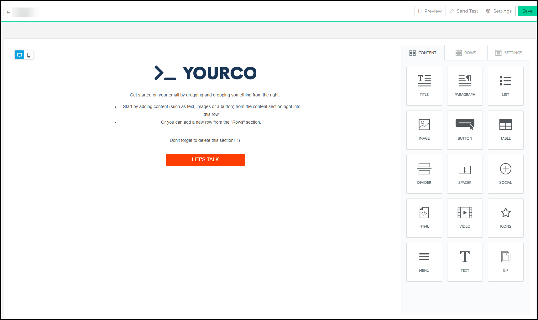
Message Editing Stage (Left Panel)
The Message Editing Stage is your workspace for designing emails. Drag and drop content elements into the stage, and use the toggle feature to preview your design in both desktop and mobile views, ensuring optimal responsiveness.
Properties Panel (Right Panel)
The Properties Panel is your control center for fine-tuning elements. It is divided into three tabs:
- Content: Choose and customize specific elements such as buttons, images, and text blocks.
- Rows: Select structural elements (e.g., single-column vs. multi-column rows) to organize your content.
- Settings: Define global settings for the entire email, such as the default font family or link colors.
Properties Panel Overview
The Properties Panel is your control center for fine-tuning and customizing email elements. Divided into three tabs, Content, Rows, and Settings.
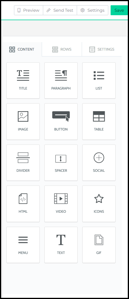
Content Tab
The Content tab offers a variety of elements to enhance your email templates. Drag and drop any of these into the Message Editing Stage. Elements that can be used on this tab include:
| Interactive Elements | Visual Elements | Text Elements |
|---|---|---|
|
Button |
Image | Title |
| Menu | Icons | Paragraph |
| Social | Divider | ListText |
| Video | Spacer | |
| HTML | Gifs | |
| Table |
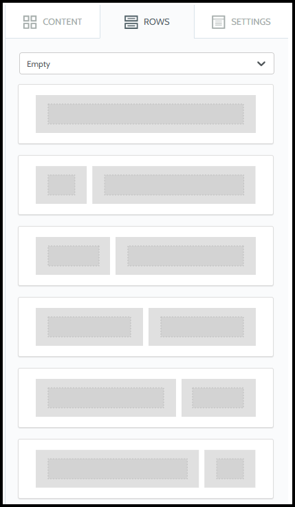
Rows Tab
Rows act as containers that structure your email layout. Use them to create dynamic designs, such as a single-column image or multi-column job listings. When you click on a row, the Properties Panel allows you to adjust background colors, padding, and borders for individual columns within the row.
Working with Columns in Rows
Rows can contain one or more columns, giving you flexibility to create dynamic layouts. Each column within a row can have its own settings, allowing for granular control over design..
Selecting Rows and Content
When you mouse over the message in the Message Editing area of the editor (the stage), it shows you an icon on the right side that allows you to drag that block of content elsewhere.
When you click on a block of content, the editor will:
- Show you two icons on the stage, which allow you to remove or clone that block of content.
- When you click on a row the Properties section on the right side of the editor will display a series of properties that you can set for that block of content.
When you mouse over an area that is free of content, e.g. the row in which the content is located, the editor will highlight it and show you an icon that allows you to drag that entire row elsewhere on the stage.
When you click on a row, the editor will:
- Deselect any block of content that had been previously selected.
- Select the row, and show you two icons that allow you to remove or clone the entire row and all its content.
- Change the properties section on the right side of the editor to display a series of properties that apply to that column within the row. A row can contain more than one column.
To learn how to save rows, view this article.
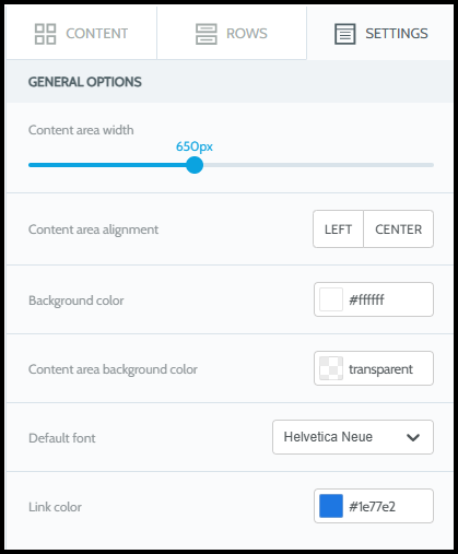
SettingsTab
The Settings tab provides global settings that define the overall appearance of your message. These settings ensure consistency across your email while maintaining flexibility for individual elements. These options include:
- Content area width: The width of the area where content blocks are dropped. According to email marketing best practices, this should typically be set to 600px or less, as this is the maximum width that will be used on larger devices. When the device’s screen is smaller, the message will adjust automatically to it.
- Background color: The message background color. This setting is effective only for rows and columns where a color has not been specified. Otherwise, the background color specified for that content structure will be used.
- Content area background color: The background color for the content area. This setting is effective only for rows and columns where a color has not been specified.
- Default font: The default font that will be used when another font family has not been specified. This setting affects all text set to use the "Global Font".
- Link color: The color of links in the message. As above, this setting affects all text links set to use the default color.
Editing Properties of Placed Elements
Customize the properties of your email elements to fit your design and communication goals. Each element offers unique settings for precise control.
Accessing Element Properties
To configure the properties of an element you’ve added to the Message Editing Stage, simply click on the element.
Hover over an element to see its type, making it easier to identify and select the right one.
When you click on an element, its specific settings will appear in the corresponding tab of the Properties Panel on the right side of the interface. This allows you to make adjustments tailored to the selected element.
Here are descriptions of some of the most frequently used ones:
- Padding: Padding settings can be configured both for all sides of the selected element or separately for each side (by clicking More Options).
- Spacers: Spacers help create visual separation between design elements. They can be transparent or visible. Here too, granular control on padding provides great design flexibility.
- Color memory: As you pick colors for fonts, background colors, etc., the editor will learn and remember them, making them quickly accessible to style future content elements.