| Edition: Enterprise | Audience: All Users |
Dashboard Panel Options
This guide provides a comprehensive breakdown of the different panel types you can add to a Dashboard. By understanding what each panel does, you can build more effective and insightful dashboards.
See Creating Dashboards and Editing Dashboards for full instructions
Choosing the Right Dashboard Panel
Use this table to quickly identify the best panel for your goal. The available panel options are grouped by Metrics, Grids, Charts, and Layouts.
| Panel Category | Panel Name | Best Used for... | Key Features |
|---|---|---|---|
|
Gamification |
Leaderboard Panel |
Identifying high achievers and performance gaps in your team |
Display ranking by value or percentage; Visual crown indicator to highlight top performer |
| Metrics
|
Metric Panel | Displaying a single KPI total (e.g., total placements) with optional comparison against another metric or a prior period. |
Color-coded target tracking; optional progress bar display when a target is set; optional comparison against another metric or the equivalent prior period, with a percentage change indicator. |
| Ratio Panel | Use a Ratio Panel to show the efficiency between two metrics (e.g., interviews to placements). | Multiple display formats (percentage, 5:1, etc.); optional comparison against the equivalent previous period, with a percentage change indicator. | |
| Ratio Comparison Panel | Use a Ratio Comparison Panel to compare several ratios side-by-side. | Mini trendlines to spot changes. | |
| Impact Comparison Panel |
Compares multiple metrics side by side. Measure impact by comparing two groups across multiple KPIs, or monitor performance over time. |
Comparison bars or bar chart display; percentage change badges; compare two metric groups side by side or each metric against its prior period. |
|
| Grids | Performance Snapshot Grid | Use a Performance Snapshot Grid to compare team or user performance across many metrics. | Target attainment visuals and pivot-table style. |
| Small Data Grid | Use a Small Data Grid to explore and visualizing smaller datasets. | Built-in charting, filtering, and pivot options; auto-color chart legends (32-color palette). | |
| Big Data Grid | Use a Big Data Grid to report on very large datasets without charts. |
Handling large datasets, such as financial or Middle Office data, for reporting or exporting. |
|
| Charts | Trend Chart Panel | Visualizing how metrics change over time. | Grouping data by day, week, month, etc. |
| Layout | Text & Image Panel | Organizing your dashboard into clear sections. | Custom titles, borders, and background images. |
Gamification Panel: For User Performance
Leaderboard Panel
The Leaderboard Panel showcases user performance rankings based on either value or percentage. You can choose to display these rankings in ascending or descending order, and it includes a visual crown indicator to highlight the top performer.
.png)
You can filter out entries with a value of zero by checking the Filter out zero values? box.
Metric Panels: For At-A-Glance Numbers
Metric Panel
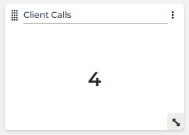
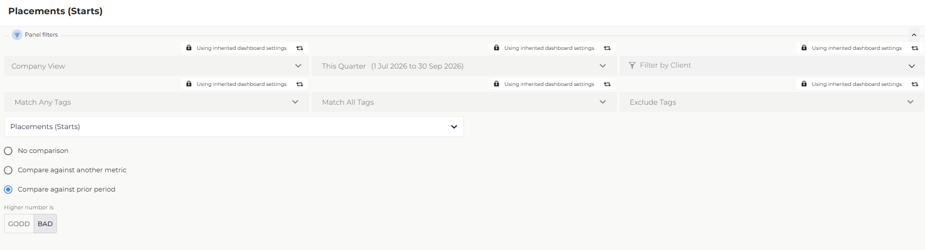
The Metric Panel displays a single metric as a number or currency. By default, No comparison is selected and the panel shows the metric value on its own. You can optionally compare the value against another metric or a prior period.
If the metric has a target, the panel’s color will automatically indicate performance:
-
Green: 100% or more of the target.
-
Yellow: 50-99% of the target.
-
Red: 0-49% of the target.
When a target is configured, the progress bar is displayed by default. To hide it, open the tile configuration and disable the Show Progress Bar toggle. This gives you a number-only layout while keeping your target configuration intact. Existing dashboard configurations are unaffected.
If no target is applied, the value is displayed as a number or in currency format.
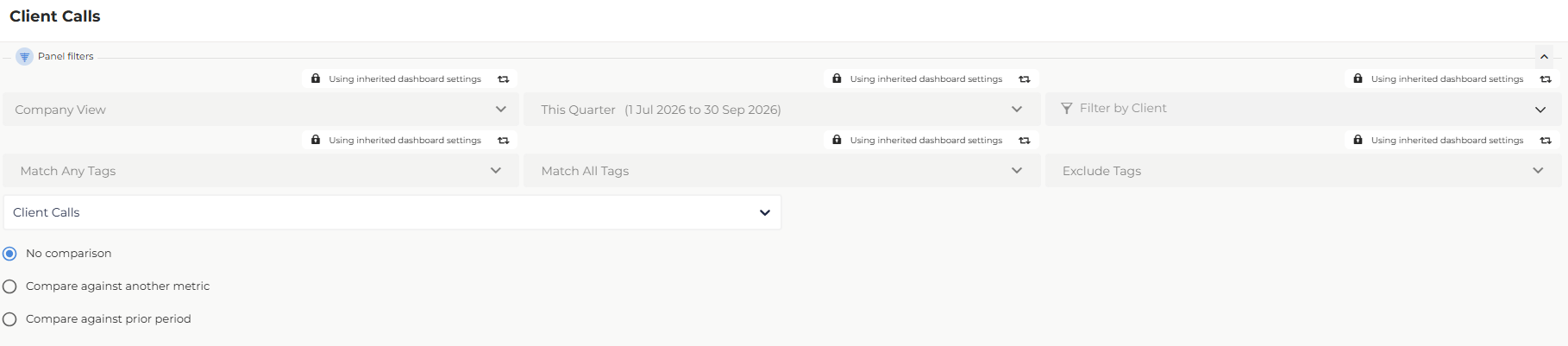
Compare Against Another Metric
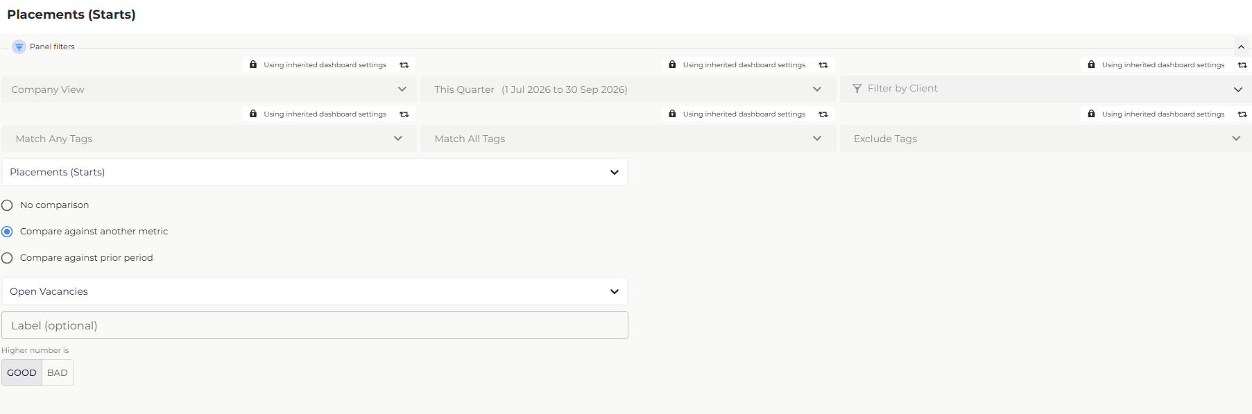
The Compare against another metric option displays a second metric alongside the primary metric value. Use this to show relative performance between two related data points, such as placements made versus job orders received.
To configure the comparison:
- Open the editor for the Metric Panel you want to update.
- Select Compare against another metric.
- In the Comparison Metric dropdown, select the metric to compare against.
- In the Label field, enter a display name for the comparison metric. This field is optional.
- Under Higher number is, select Good or Bad to indicate whether an increase represents a positive or negative change.
- Click Apply.
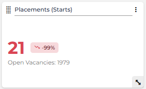
Reading the panel: The panel displays the primary metric value with a percentage change badge showing the difference between the two metrics. Below the primary value, the comparison metric value appears as [Label]: [value]. The badge color reflects whether the change is favorable based on the Higher number is setting: a decrease is shown in red when Good is selected.
A Metric Panel shows 21 Placements (Starts) against 1979 Open Vacancies. The primary value and -99% badge both appear in red because Higher number is is set to Good, indicating placements are significantly below the comparison metric.
Compare Against Prior Period
The Compare against prior period option displays the current period's metric value alongside the value from the equivalent prior period. The comparison is based on the dashboard's active timeframe and requires no additional configuration. Use this to track whether performance is improving or declining over time.
To configure the comparison:
- Open the editor for the Metric Panel you want to update.
- Select Compare against prior period.
- Under Higher number is, select Good or Bad to indicate whether an increase represents a positive or negative change.
- Click Apply.
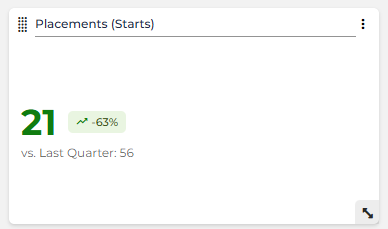
Reading the panel: The panel displays the current period's metric value with a percentage change badge. Below the primary value, the prior period value appears as vs. [Prior Period]: [value], where the prior period label is generated automatically from the active timeframe.
A Metric Panel configured for the current quarter shows 21 Placements (Starts). With Higher number is set to Bad, the primary value and +63% badge both appear in green. Below the primary value, the panel shows vs. Last Quarter: 56.
Ratio Panel
The Ratio Panel shows the relationship between two metrics to measure efficiency. You can select existing ratios or create new ones directly from the Add Panel screen.
New ratios created in the Add Panel screen won't automatically be added to Admin > Ratios settings.
You can display ratios in several formats including:
- Percentage: Shows the ratio as a percentage. The percentage is expressed as a fraction of 100, rounded to the nearest whole number. For example, 2 placements from 10 interviews is 20%.
- Normalized: Shows the ratio with the lower value converted to 1 and adjusts the other accordingly. For example, 10 interviews to 2 placements is 5:1.
- Fraction: Displays the ratio as a fraction with the lowest common denominator. For example, 24 placements from 80 interviews is 10/3 or 23 placements from 80 1st Interviews is 80/23.
- Decimal: Divides the first metric by the second and displays it as a decimal amount. This value is rounded to a maximum of two decimal places. For example, 10 first interviews to 2 placements is 0.2.
- Absolute: Shows the actual values of both metrics. For example, 10 first interviews to 2 placements becomes 10:2.
Compare Against Previous Period
The Compare against previous period option displays the current period's ratio value alongside the equivalent ratio from the prior period. The comparison is based on the dashboard's active timeframe and requires no additional configuration. Use this to track whether your conversion efficiency is improving or declining over time.
To configure the comparison:
- Open the editor for the Ratio Panel you want to update.
- Select Compare against previous period.
- Under Higher number is, select Good or Bad to indicate whether an increase represents a positive or negative change.
- Click Apply.
Reading the panel: The panel displays the current period's ratio with a percentage change badge. Below the primary value, the prior period ratio appears as vs. [Prior Period]: [value], where the prior period label is generated automatically from the active timeframe. The panel's default height increases when a comparison is selected to accommodate larger ratio values.
Ratio Comparison Panel
The Ratio Comparison Panel allows you to monitor multiple ratios in one place. Each ratio includes a small trend line, making it easy to spot changes in performance over your chosen timeframe. This option is useful for comparing multiple related ratios in a particular workflow, such as the Connected Recruiting funnel ratios.
Impact Comparison Panel
The Impact Comparison Panel compares multiple metrics side by side. Use it to measure the impact of a strategy or initiative by comparing two groups across multiple KPIs, or to monitor whether performance is improving or declining over time.
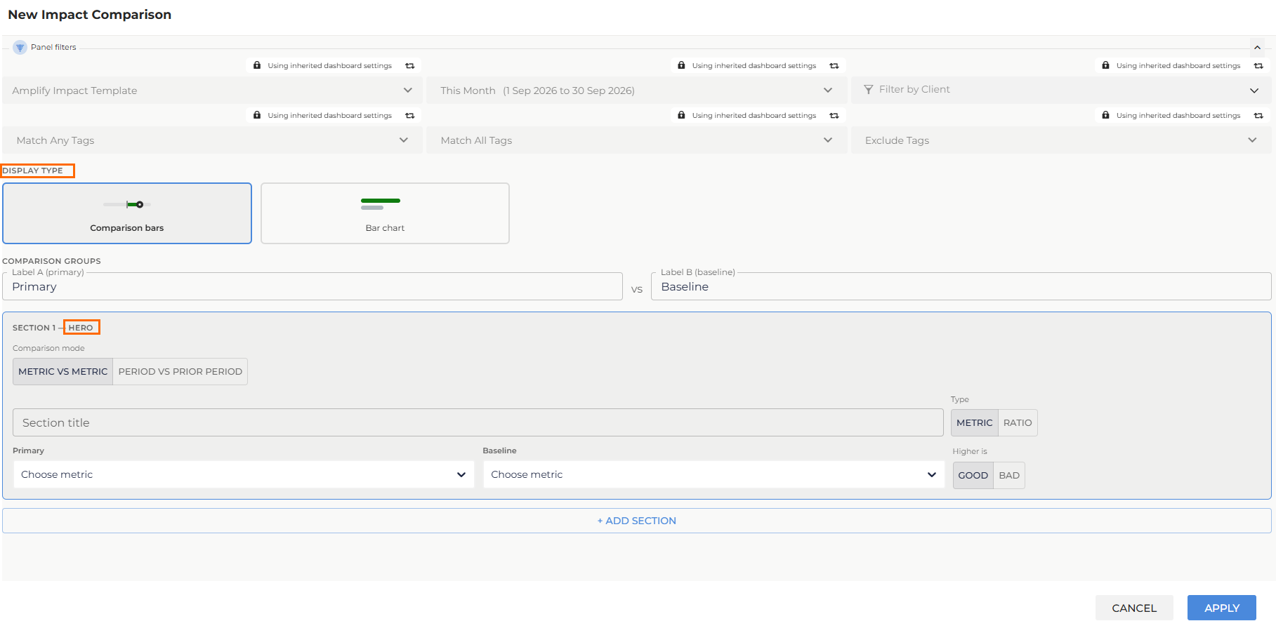
Display Type
When adding or editing the panel, select how you want to view the comparison under Display Type:
- Comparison bars: Displays a hero (large number) section for the first metric, followed by horizontal bar sections with percentage badges for each additional metric.
- Bar chart: Displays all metrics as a standard bar chart comparison.
Configuring Comparison Groups
This only applies when using Metric vs Metric comparison. In Period vs Prior Period , the primary and baseline labels are generated automatically from the dashboard's active timeframe.
Under Comparison Groups, enter a name for each group:
- Label A (primary): The primary group whose performance you are highlighting, e.g. AI. Default: Primary.
- Label B (baseline): The reference group you are comparing against, e.g. Non-Al. Default: Baseline.
These labels appear in the percentage badges and throughout the panel. Keep labels concise to avoid display issues.
Actionable Insights in Metric vs Metric comparisons
Metric vs Metric works best when Label A and Label B represent two mutually exclusive segments of the same activity, such as placements influenced by AI versus placements with no AI involvement. These paired metrics are usually Actionable Insight Metrics, since Actionable Insights are built to compare an outcome across two defined conditions, for example placement occurred with an AI event in the prior 6 months vs. placement occurred with no AI event in the prior 6 months. You can use standard metrics in Metric vs Metric mode too, but Actionable Insights are the primary source for this comparison type.
Adding Sections
Each section represents one comparison in the panel. Add multiple sections to compare several metrics or ratios at once.
- Click + Add Section.
- Under Comparison mode, select your
comparison type:
- Metric vs Metric: Compares two defined groups of metrics side by side. When using Metric vs Metric, configure your group labels under Configuring Comparison Groups.
- Period vs Prior period: Compares each metric against the equivalent prior period.
- Enter a Section title.
- Select Metric or Ratio under Type.
- Select your metric or ratio:
- If using Metric vs Metric: choose values from the Primary and Baseline dropdowns.
- If using Period vs Prior Period: choose a single value from the Metric dropdown. The current period is used as the primary value and the prior period as the baseline automatically.
- Select Good or Bad under Higher is to control badge color.
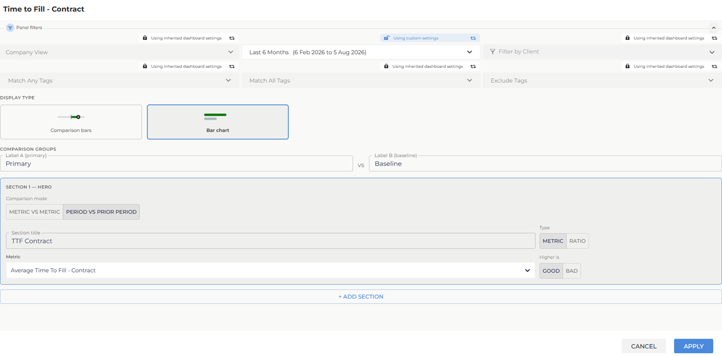
Each section in the panel can use a different comparison mode, so you can mix group and period comparisons in a single panel.
You can delete a section using the delete icon on the section card. The delete icon is hidden when only one section remains.
The panel title defaults to New Impact Comparison. To rename it, enter edit mode on your dashboard and select the title text on the panel to update it directly.
Reading the Panel
The panel displays differently depending on the display type selected.
Comparison bars
- Hero section: The Label A (primary) value displays large on the left, with the Label B (baseline) value alongside it in gray. The Primary value displays in green when it is performing better than Baseline, and red when it is performing worse. A badge in the top-right corner shows the percentage difference. When Metric vs Metric is selected, the badge shows ▲ +n% vs. Baseline (green, ahead) or ▼ -n% vs. Baseline (red, behind), using your configured group label. When Period vs Prior Period is selected, the prior period label is generated automatically, for example ▼ -42% vs. Previous 6 Months.
- Bar sections: A horizontal track shows both values on a shared scale, with a dot marking the Label A position. The fill displays in green when Primary is performing better than Baseline, and red when it is performing worse. When Period vs Prior Period is selected, the bars use the timeframe labels instead of group labels, for example Last 6 Months and Previous 6 Months. Values show as N/A when no data is available.
Percentage formula is ((Label A - Label B) / Label B) x 100, rounded to a whole number. The displayed sign reflects whether the change is favorable based on the Higher is setting, not the raw arithmetic sign.
Comparison bars:
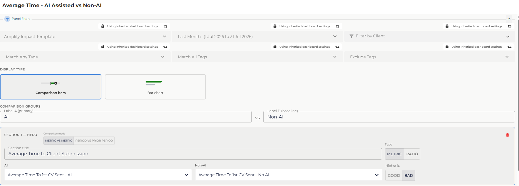
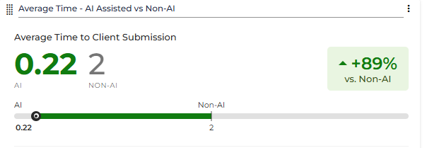
Metric vs Metric:An Impact Comparison Panel is configured to compare AI-assisted and non-AI activity. The Comparison Groups are named AI (Label A, primary) and Non-AI (Label B, baseline). The hero section is configured with Average Time To 1st CV Sent - AI as the Primary metric and Average Time To 1st CV Sent - No AI as the Baseline, with Higher is set to Bad and the timeframe set to Last Month. The hero section displays the AI value (0.22) in green and the Non-AI value (2) in gray, alongside a green +89% vs. Non-AI badge. Because Higher is set to Bad, a lower value indicates better performance. The Primary value and badge display in green when AI is performing better than Non-AI, and red when it is performing worse.
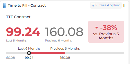
Period vs Prior Period: An Impact Comparison Panel is configured with Average Time To Fill - Contract as the metric, with Higher is set to Good. The timeframe is set to Last 6 Months. The hero section displays the current period value (99.24) in red (Last 6 Months) and the prior period value (160.08) in gray Previous 6 Months, alongside a red -38% vs. Previous 6 Months badge. Because Higher is is set to Good, a lower current period value indicates worse performance. The current period value and badge display in green when the current period is performing better than the prior period, and red when it is performing worse than the prior period.
Bar Chart
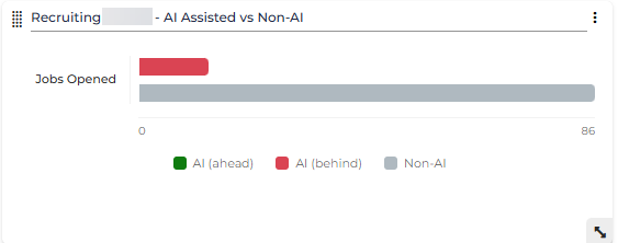
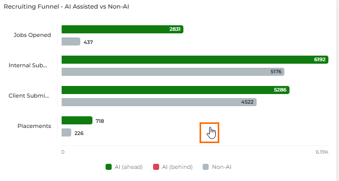
Each section displays as a pair of horizontal bars on a shared scale. The Label A (primary) bar displays in green when it is performing better than Baseline, and red when it is performing worse. The Label B (baseline) bar is gray. When Period vs Prior Period is selected, the bars use the timeframe labels instead of group labels, for example Last 6 Months and Previous 6 Months.
- A legend below the chart shows your configured group labels, for example: AI (ahead), AI (behind), and Non-AI
Bar Chart:
Metric vs Metric: An Impact Comparison Panel is configured to compare AI-assisted and non-AI activity. The Comparison Groups are named AI (Label A, primary) and Non-AI (Label B, baseline). The section is configured with Jobs Added - AI as the Primary metric and Jobs Added - No AI as the Baseline, with Higher is set to Good and the timeframe set to Last Month. The Primary value is 14 and the Baseline value is 22. The panel displays the AI bar in red and the Non-AI bar in gray. Because Higher is set to Good, a lower Primary value indicates worse performance, so the AI bar displays in red. The Primary bar displays in green when AI is performing better than Non-AI, and red when it is performing worse.
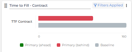
Period vs Prior Period: An Impact Comparison Panel is configured with Average Time To Fill - Contract as the metric, with Higher is set to Good. The timeframe is set to Last 6 Months. The panel displays the current period value as a colored horizontal bar against the prior period (Baseline) in gray. Green bars indicate where Primary is performing better than Baseline and red bars indicate where Primary is performing worse than Baseline.
The panel respects the dashboard-level timeframe and filters. Both groups always use the same timeframe and filter context.
Impact Comparison Panel Clickthrough Navigation
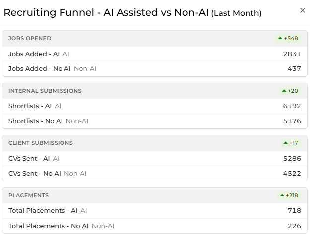
Clicking anywhere on an Impact Comparison panel in a dashboard opens a grouped view of all the panel's metrics. A pointer cursor appears when you hover over the panel to indicate it's clickable. Metrics are organized by category, with a percentage change badge shown for each group. If a panel has more metrics than fit on screen, the popup scrolls.
See Dashboard Metric Clickthroughs and Deeplinking for how this grouped view differs from a standard metric clickthrough.
Grid Panels: For Comparison & Details
Performance Snapshot (aka Mini Onpoint) Grid Panel
The Performance Snapshot Grid lets you compare the performance of multiple users and teams across various metrics and ratios, including target attainment. When viewing a group, you can expand it to see the performance of its members.
When looking at a group, any sub-groups of that group show first, and then any users directly in that group show next. Sub-groups are collapsed by default but can be expanded. Data displays in the component incrementally as it's loaded, starting at the top left row-wise. Expanding a sub-group causes that group's members to be loaded in.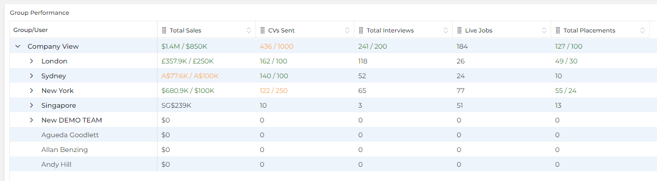
Performance Snapshot Features
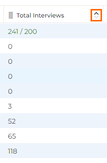
Sort: Click the
 icon in any column header to sort in ascending or descending order.
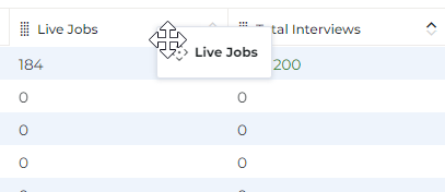
Rearrange: Click the
 icon on the left side of the column header and drag it into position. Note: our column arrangement is automatically saved with the dashboard and restored the next time you open it.
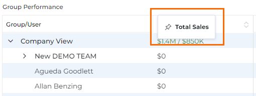
Pin: Pin important columns to the left or right side of the grid by dragging it until the pin icon displays.
Small Data Grid Panel
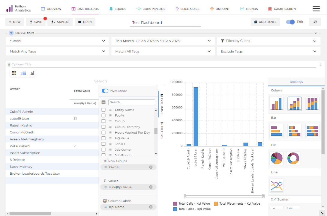
The Small Data Grid allows you to view multiple metrics associated with a user or group in a table view and is perfect for exploring and visualizing datasets. Unlike the Big Data Grid, it has powerful built-in charting capabilities.
Small Data Grid Features
Display Modes: Show your data as a grid only, a chart only, or a side-by-side grid and chart.
When you select the grid and chart option, the grid always displays on the left side of the panel, and the chart shows on the right side.
When you select the chart-only option, the grid will be hidden, and the chart will take up the whole panel size.
Pivot Data: Drag and drop columns and add aggregations, like summing the total sales amount by the user (similar to a pivot table in Excel).
Note: When adding a Value field to a Small Data Grid in Dashboards, the aggregation type will default to Count Unique. This setting ensures only unique (not duplicated records) are counted.
Filter Results: Easily filter the data displayed in the grid by switching from Columns to Filters in pivot mode.
Chart Types: Includes column, bar, line, scatter, area, histogram, or combination.
Chart Legends: Charts in the Small Data Grid display a legend that identifies each data series by color. Colors are automatically assigned in a fixed sequence from a built-in 32-color palette and cannot be manually changed. Colors render consistently in both light and dark themes. For more information, see Chart Legends and Color Palette.
Download: Export the data by clicking the three-dot menu and selecting Download.
You can download this panel by clicking the three dots and selecting Download.
Big Data Grid Panel
The Big Data grid panel is designed to support larger data sets, such as Middle Office data, for reporting things like Gross Margin. Big Data grid doesn't offer charting options.
You can download this panel by clicking the three dots and selecting Download.
Chart Panels: For Visualizing Trends
Trend Chart Panel
The Trend Chart panel lets you track how multiple metrics or ratios perform over time. You can aggregate data by day, week, month, quarter, or year to spot patterns and trends:
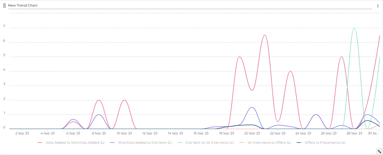
You can download this panel by clicking the three dots and selecting Download.
Ratios must already exist in Admin > Ratios to select them in the drop-down list. For more information, see Ratios Admin.
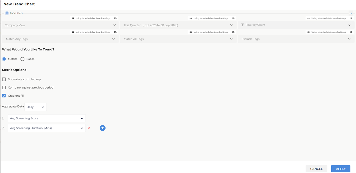
Trend Chart Metric Options
Show data cumulatively: Select to display aggregated totals for each time period in the chart.
Compare against previous period: Select to display the current period alongside the equivalent prior period (for example, This Quarter compared to Last Quarter).
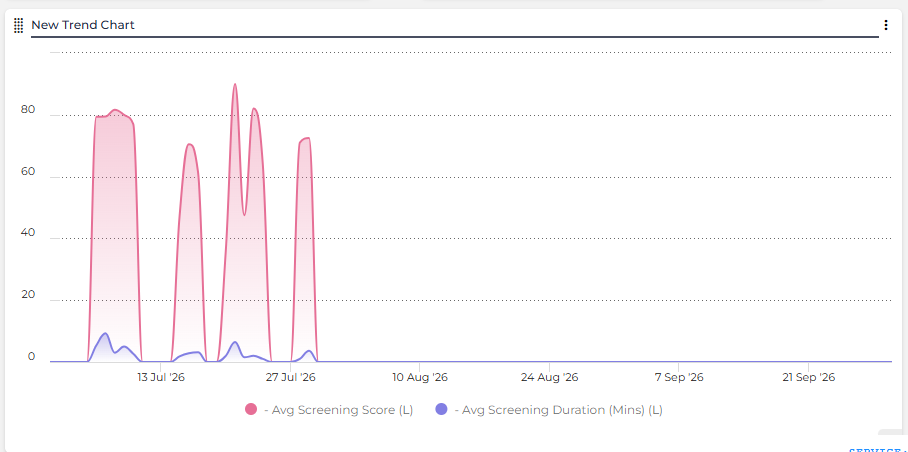
Gradient fill: Select to add a shaded gradient area beneath each trend line. The gradient fades from the line color to transparent, making it easier to distinguish multiple metrics on the same chart.
Chart Legends: When multiple metrics are displayed on a Trend Chart, a legend appears that identifies each metric by color. Colors are automatically assigned in a fixed sequence from a built-in 32-color palette and cannot be manually changed. For more information, see Chart Legends and Color Palette.
Layout Panels: For a Clear Structure
Text & Image Layout Panel
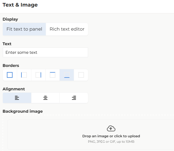
The Text & Image panel is a versatile layout option that allows users to combine styled text content with background images. Users can choose between two rendering modes and customize the appearance with background images and formatting options.
Rendering Modes:
Fit text to panel: Preserves the familiar text-only behavior of the legacy Heading panel. The text will auto-size on the page.
Rich text editor: Provides WYSIWYG formatting options for more advanced text styling and content creation.
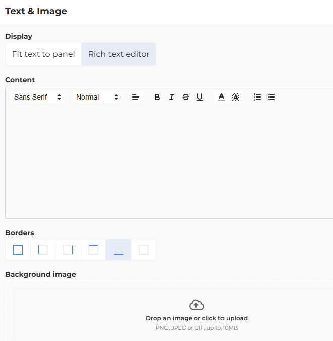
Formatting and Image Options:
Text formatting (bold, italic, font size, alignment, etc. in Rich text editor mode)
Text alignment (left, center, right)
Borders
Background image upload
Background image display options:
Fill: Scales the image to fill the entire panel while maintaining aspect ratio
Contain: scales the image to fit within the panel without cropping
Existing Heading panels have been automatically converted to Text & Image panels in "Fit text to panel" mode to preserve their current appearance and behavior.
FAQ
What types of panels can I add to a Dashboard?
You can add Gamification, Metric, Grid, Chart, and Layout panels. Each type serves a different purpose, from showing key values and comparing data to visualizing trends and organizing your dashboard.
What’s the difference between a Small Data Grid and a Big Data Grid?
A Small Data Grid is for smaller datasets and includes powerful options to pivot, filter, and create charts. A Big Data Grid is built for handling larger datasets for reporting purposes and does not have charting features.
How do Ratio Panels work, and what formats can I use?
Ratio Panels compare two metrics to measure efficiency. They can be displayed in various formats, including percentage (20%), normalized (5:1), fraction (10/3), decimal (0.2), or absolute (10:2). You can also compare a ratio against the equivalent prior period to track efficiency changes over time.
Why can’t I download data from the data details in Excel?
"Export to File" is a user permission and you would need to request this from your Bullhorn Analytics administrator.
What is the difference between the Impact Comparison panel and a Metric panel?
The Impact Comparison panel compares multiple metrics or ratios at once, either as two defined groups side by side (such as AI-assisted activity versus non-AI activity) or as each metric against its own prior period. A Metric panel displays a single KPI value, with the option to compare it against another metric or its prior period. Use the Impact Comparison panel when you need to evaluate several metrics in one view; use a Metric panel when you only need to highlight one.
What does the Higher number is setting do on a Metric panel?
The Higher number is setting tells the panel whether an increase represents a positive or negative change. Select Good if a higher value is favorable (for example, more placements) or Bad if a higher value is unfavorable (for example, more open vacancies). This controls the badge and value color on the panel.
How does the Compare against prior period option calculate the prior period?
The panel automatically uses the equivalent prior period based on the dashboard's active timeframe. For example, if the dashboard is set to show the current week, the panel compares against the previous week. No separate period selection is required.