| Edition: Enterprise | Audience: All Users |
Dashboard Clickthrough Features - Slice & Dice
This feature is only visible if you have the Slice & Dice App permission. If you do not have access to Slice & Dice but would like access, please contact the Bullhorn Analytics administrator in your business.
The Slice & Dice clickthrough feature is a simplified version of the main Slice & Dice App that focuses on selected metric, time frame, and user/group. It allows you to report over different components of the data and create different visualisations to fit your requirements. Slice & Dice presents the different components (we call them Variables, Blue Pills or Fields, depending on who you talk to!) associated to the selected metric, and allows you to drag and drop them into either the Rows or Columns in the desired order to create the report you want.
You can create standard table-based reports, heat maps, or graph-based visuals over the selected data. If you have the permissions, you can also launch the full Slice & Dice module and pull your report into it for a more expansive array of options, or download your report as a CSV file.
Using Slice & Dice
To access the Slice & Dice clickthrough feature, click into your desired Dashboard metric and select Slice & Dice along the top of the clickthrough window.
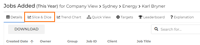
The top of the window displays the metric, timeframe, and user / group data available for the Slice & Dice report. This is based on the filters set on the Dashboard.
Click Edit in Slice & Dice App to open the main Slice & Dice module and pull through your current report.

Click Download to download the current report into a CSV file.
Reporting Options
On the left of the window are two dropdowns where you can choose how to report over the data.
The first dropdown lets you select from the available visualisation options for your report:
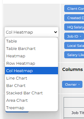
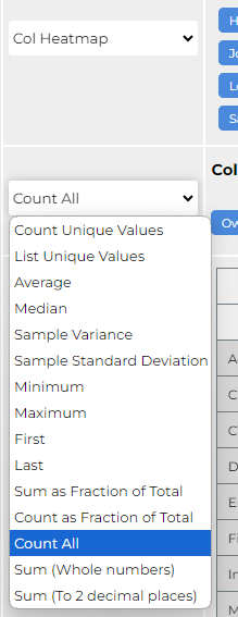
The second dropdown is where you can select from different ways to present the data. Count All is the standard selection for showing how many times a certain activity has occurred, the Sum options for financials, and List Unique Values for lists of results such as Candidate Names:
Metric Variables
At the top of the window you'll see all the different components that can be used to refine the data and create a report. Drag and drop them into either Columns or Rows.
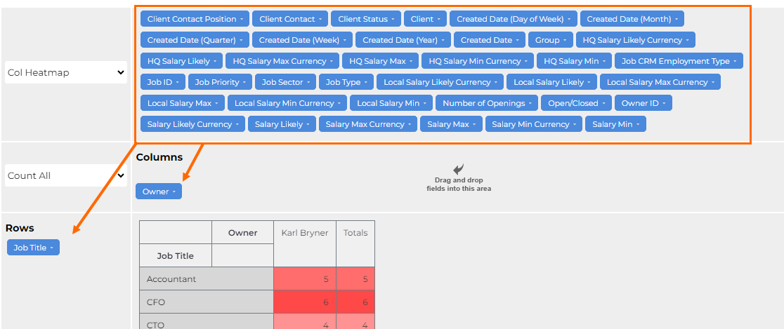
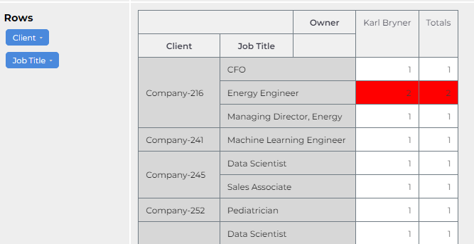
The order of the variables in Rows or Columns will change the report presentation. For example, If you pull Client into Rows above Job Title, then the Client will occupy the first row and the Job Titles that have come from that client will be associated with it (see example below):
Report Results
Report results will update dynamically as you make changes. Clicking on a results cell will open the data details page.
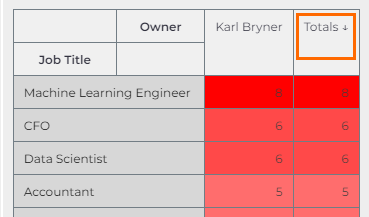
Click on a results column header to sort the results by ascending or descending.
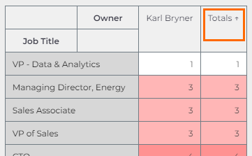
Example
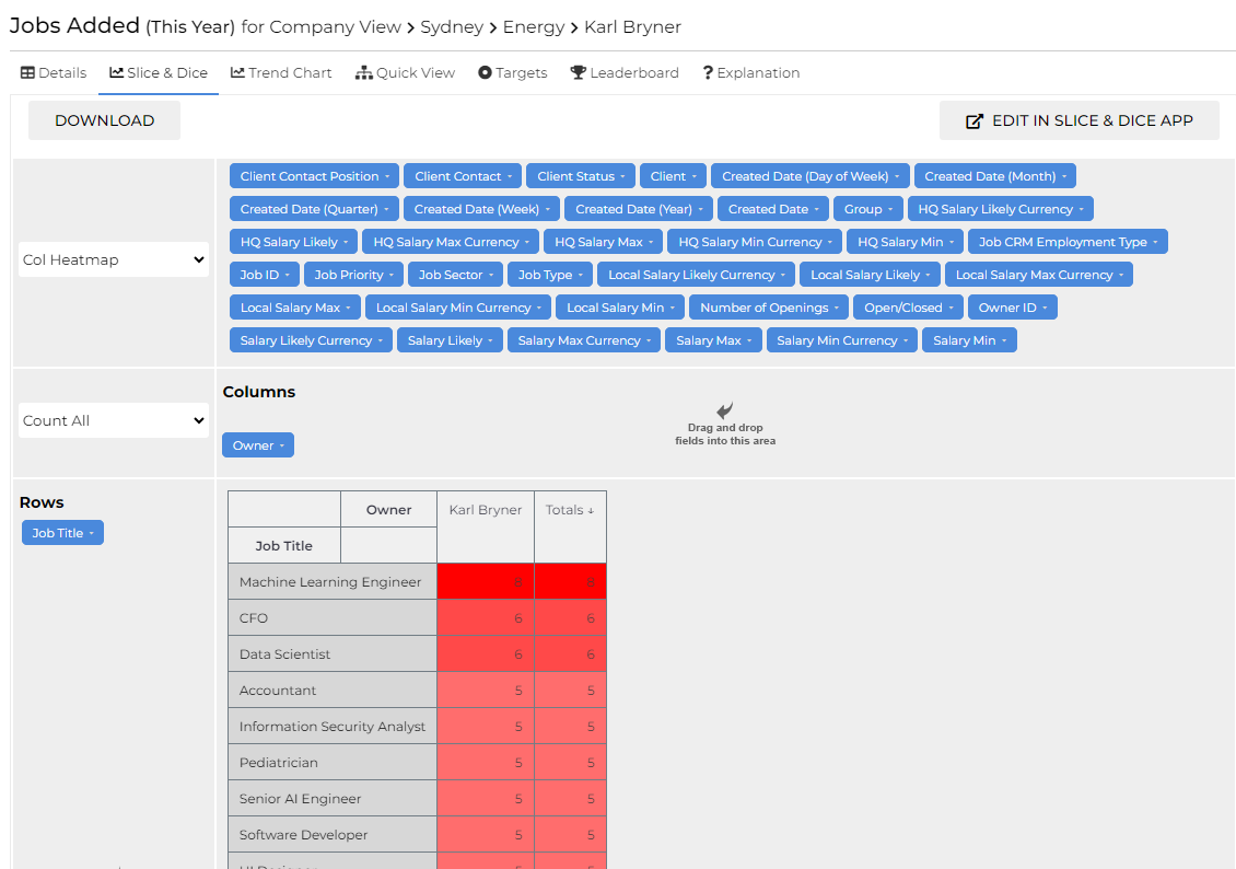
In the example below, we are looking at Jobs Added for Karl Bryner using This Year as the timeframe. The only Variable being used is Job Title, which has been dragged from the Variable array into Rows. This is displaying all of the different Job Titles that Karl has worked this year, and shows that he has focused primarily on AI focused roles. Useful to know! The visualisation chosen is a Column Heatmap, which highlights the highest values in a darker red.