| Edition: Starter, Enterprise | Audience: All Users |
AI Assistant Dashboard
The prebuilt AI Assistant Dashboard integrates with your application, allowing you to view metrics related to your AI Assistant prompt usage. For details on the definition of each metric see AI Assistant Metrics Dictionary.
You'll only see this dashboard if you have access to Bullhorn AI Assistant and have AI Assistant data in your system. If either is missing, the dashboard doesn't appear in your Dashboards list.
General Navigation and Filters
-
Log into Bullhorn Analytics and select the Dashboards module at the top of the Bullhorn Analytics screen.
-
Select
 Open in the sidebar to see the Dashboards available to you.
 -
Select AI Assistant Dashboard.
Dashboard Toolbar
The dashboard toolbar contains options for filtering, refreshing data:
-
Refresh: Select the circular arrow icon
 in the top right to update all panels with the most current data from your
Bullhorn system.
in the top right to update all panels with the most current data from your
Bullhorn system. -
Filter: Select the filter icon
 to display or hide the dashboard top-level filters.
Group / User Filter
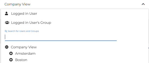
Use your company view dropdown to search or filter by user or group. Only the data for the user profile or group selected will be displayed.
Client Filter
Use the Filter by Client dropdown to search for or select a specific client.
Client Filter is not available to Starter Edition users.
Timeframe Filter
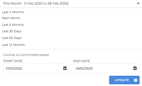
Use the date picker to select a timeframe or choose a custom date range.
AI Assistant Dashboard Panels
The AI Assistant Dashboard contains the following sections:
AI Assistant Overview
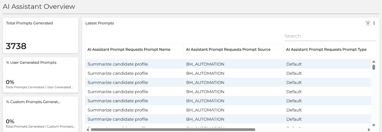
The overview section displays a list view of all the latest prompts showing the source of the prompt, the primary and secondary entity types and the time and date they were requested.
The small panels display the Total Prompts Generated for the timeframe selected, along with the following rations:
-
% User Generated Prompts = User Generated Prompts / Total Prompts Generated
-
% Custom Prompts Generated = Custom Prompts Generated / Total Prompts Generated
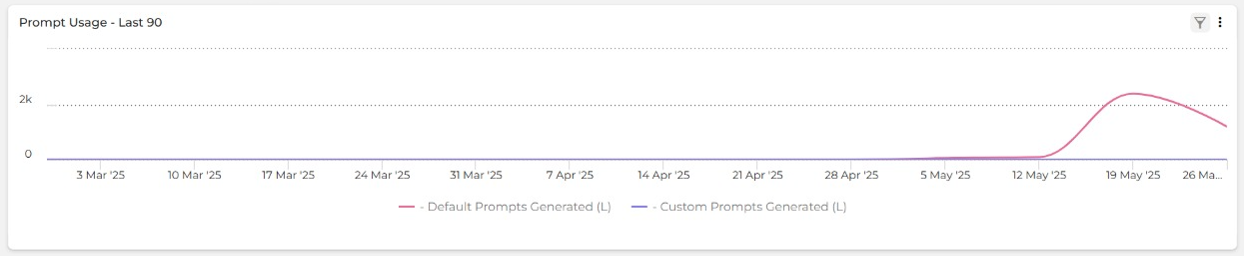
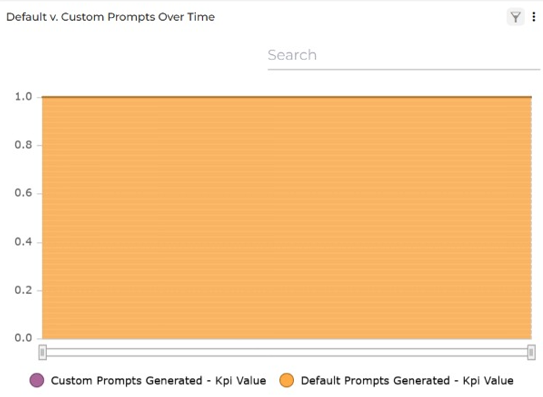
The trend chart clearly shows the differentiation between Default Prompts Generated and Custom Prompts Generated over the last 90 days.
User Snapshot
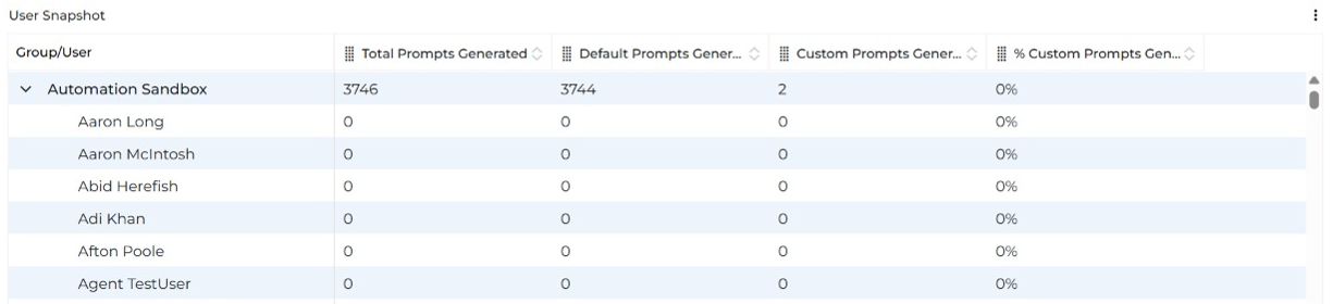
The User Snapshot performance panel displays all users and lists their prompt usage and % Custom Prompts Generated.
Prompt Usage by Entity
The pie chart shows the prompt usage by entity. Use the search bar to search for individual entity usage.
Default v. Custom Prompts Over Time
This trend chart shows the total for Default and Custom Prompts for this corporation over time. Use the search bar to search the underlying data.
-
Use your User Snapshot to understand how your users are adopting prompt usage.
-
Leverage data from the Default v. Custom Prompts Over Time trend chart and Prompt Usage by Entity to evaluate effectiveness and guide your users in improving their AI Assistant interactions.
Metric Clickthroughs
You can click on any single metric in the Dashboard to view the underlying data details over the selected time period. The data is presented as a set of predefined columns containing relevant information such as Created Date and Candidate Name. Every column is sortable, and there is a search bar at the top of the page.
Deeplinking
Once you access the data details in the Metric Clickthrough, you’ll see that some of the data in the columns presented are hyperlinked. Clicking these links will take you to the relevant record in your Bullhorn ATS in a new tab.