| Edition: All Editions | Audience: Amplify Users |
Amplify Digital Worker Activity Tracking Dashboard
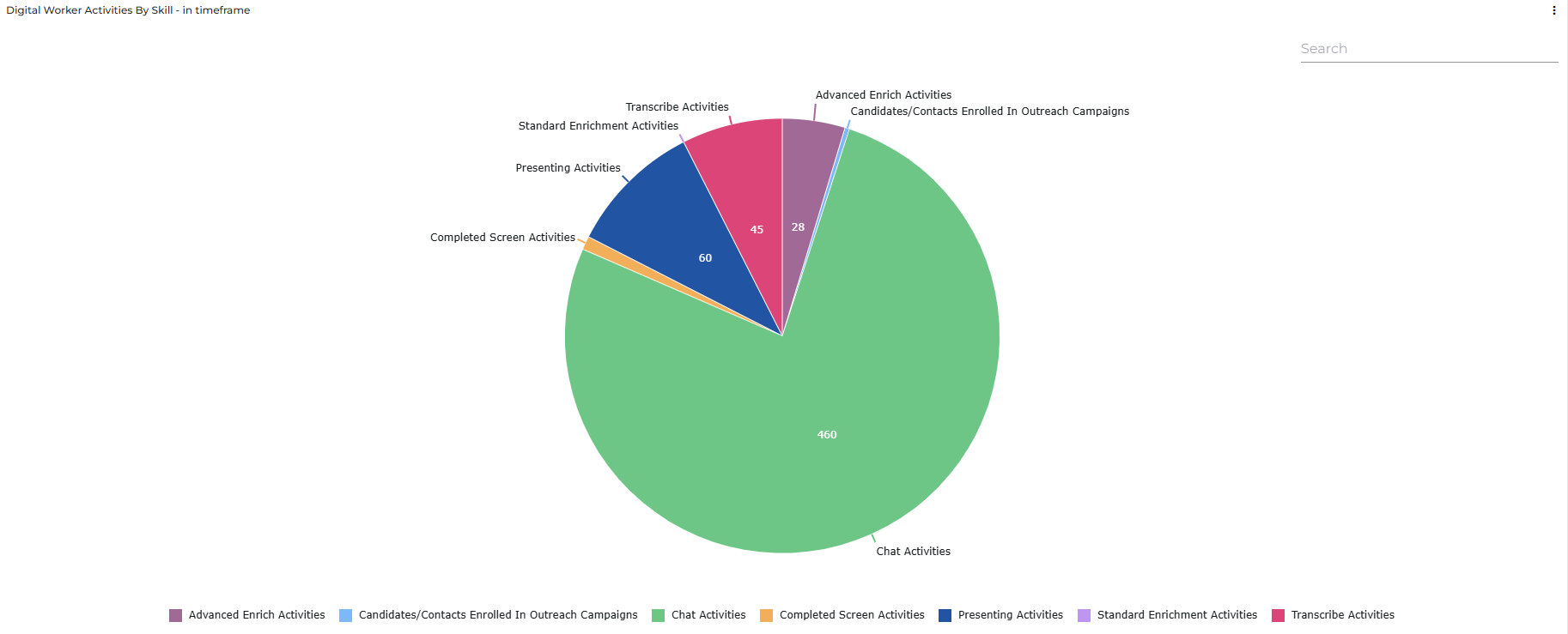
The Digital Worker Activity Tracking Dashboard provides a pre-built view of your Digital Worker activity usage in Bullhorn Analytics. Use it to track activity counts across your organization within a specific time frame. A pie chart breaks down activity by skill, so you can see at a glance which skills being used most. Use the date picker to explore your data. For full definitions of each Activity metric, see Amplify Digital Worker Activity Metrics
You'll only see this dashboard if you have access to Amplify Activities and have activity data in your system. If either is missing, the dashboard doesn't appear in your Dashboards list.
Accessing the Dashboard
To access the Amplify Digital Worker Activity Tracking Dashboard:
-
Log in to Bullhorn Analytics.
-
Select the Dashboards module at the top of the screen.
-
Select
 Open in the sidebar to view available dashboards.
 -
Select Digital Worker Activity Tracking.
Filters and Toolbar
Use the toolbar and filters to control which data is displayed on the dashboard.
Dashboard Toolbar
The dashboard toolbar contains options for filtering, refreshing data:
-
Refresh: Select the circular arrow icon
 in the top right to update all panels with the most current data from your
Bullhorn system.
in the top right to update all panels with the most current data from your
Bullhorn system. -
Filter: Select the filter icon
 to display or hide the dashboard top-level filters.
Timeframe Filter
Use the date picker to select a preset or custom date range.
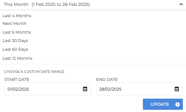
By default, the metrics show data for the current month This Month across your whole company. Each metric tile displays a comparison to the previous month beneath the current count, alongside a percentage change indicator. A green arrow indicates an increase in activity; a red arrow indicates a decrease.
Activities in Timeframe by Skill
The left side of the dashboard shows activity counts for the selected timeframe, broken down by skill. Each tile displays the total for the period, along with a comparison to the equivalent previous period. By default this is the previous month, but it updates to match whichever timeframe you select.
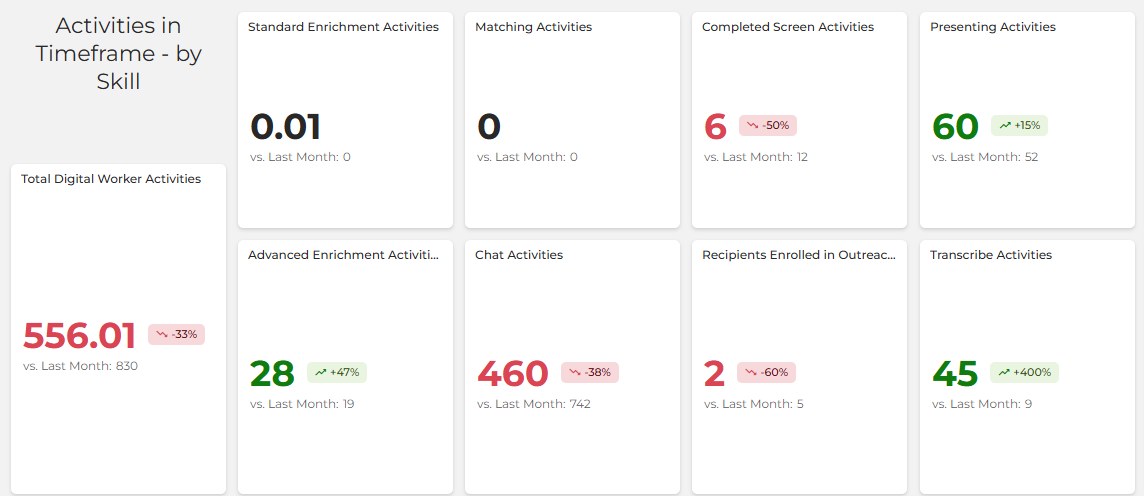
Digital Worker Activities have been correctly tracked since 1 April 2026. Data before this date may be incomplete or inaccurate.
For details on how Digital Worker Activities are calculated, see Amplify Activities. For full definitions of each Activity metric, see Amplify Digital Worker Activity Metrics
Activities in Timeframe Pie Chart
This pie chart shows total activity counts for each Amplify skill. Use it to see which skills account for the most and least activity in the selected timeframe.
Metric Clickthroughs
You can click on any single metric in the dashboard to view the underlying data details over the selected time period. The data is presented as a set of predefined columns containing relevant information such as Created Date and Candidate Name. Every column is sortable, and there is a search bar at the top of the page.
Deeplinking
Once you access the data details in the Metric Clickthrough, you’ll see that some of the data in the columns presented are hyperlinked. Clicking these links will take you to the relevant record in your Bullhorn ATS in a new tab.