October 2025 Release: Omnitable Features & Enhancements
October 2025 (2025.10 GA Release - Package Version 9.21)
Omnitable Column Filtering: Ability To Filter Based On Blank/Null Values
We have improved the user experience for Omnitable Column filtering by enabling users to filter a column to only show records that either have a value or records that don't have a value.
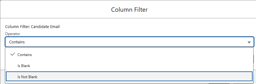
As well as the available operator(s), you will see two new options in the Column Filter modal:
- Is Blank
- Is Not Blank
This applies to text fields (strings). For picklist fields, use the None value to filter blank entries. Checkbox fields cannot be blank.
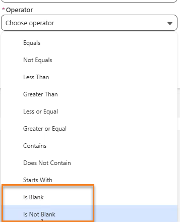
Omnitable Named Views: Ability To Filter Based On Null/Blank Values
We have improved the user experience for Omnitable Named Views filtering by adding support for filters that result in displaying either only the records where the specified field is populated or is not populated.
When you create a filter for Named Views, you will see two new options in the Operator's dropdown:
- Is Blank
- Is Not Blank
When selecting either operator, the Value input field is hidden.
Configuration
The new operators have to be added manually to the Operator picklist:
- Go to Setup > Object Manager > Filter Condition (TR1__Filter_Condition__c).
- Go to Fields & Relationships > Operator (TR1__Operator__c).
- Go to the Values section for this picklist, click on New and add "is blank" and "is not blank" values (must be in lower case).
- Click Save.
Omnitable Named Views: Add Support for Relative Date Filters
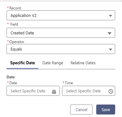
The Named Views filter UI has been enhanced for Date and Date Time based filtering. You can now choose to build your filter on:
- Specific Date: Select a single date using the date picker
- Date Range: Select a start and end date (From/To)
- Relative Dates - Choose from preset options:
- Today
- Last Week
- This Week
- Last Month
- This Month
- Last[x]Days
- Last[x]Weeks
- Last[x]Months
Supported Operators
Below are the supported operators and data input for each tab.
The Date Range tab is only visible when using Equals or Not Equals operators.
| Tab | Supported Operators | Data Input |
|---|---|---|
| Specific Date | Equals/Not Equals/Less Than/Greater Than/Less or Equal/Greater or Equal/Is Blank/Is not Blank | Date and Time pickers |
| Date Range | Equals/Not Equals | 'From' Date/Time 'To' Date/Time |
| Relative Dates | Equals/Not Equals/Less Than/Greater Than/Less or Equal/Greater or Equal/Is Blank/Is not Blank | Out of the box picklist with a selection of relative dates |
Best Practice: Avoid using Equals/Not Equals for Date Time fields, as they require exact second-by-second matches. Use Date Range or Relative Dates for more effective filtering.
Omnitable Column Filtering: Add Support for Relative Date Filters
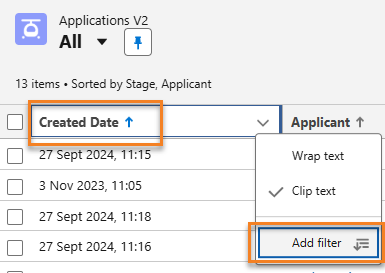
We have added support for Column filtering on Date/Date Time fields. Now the Add filter option is available for Date/Date Time columns and it opens a modal with the following options.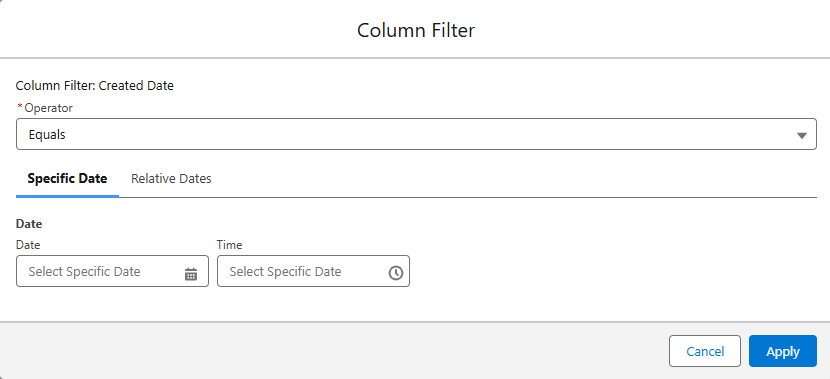
The Operator dropdown offers: Equals/Not Equals/Less Than/Greater Than/Less or Equal/Greater or Equal/Is Blank/Is not Blank and there are two data inputs for Date:
- Specific Date: Select a single date using the date picker
- Relative Dates - Choose from preset options:
- Today
- Last Week
- This Week
- Last Month
- This Month
- Last[x]Days
- Last[x]Weeks
- Last[x]Months
Best Practice: Avoid using Equals/Not Equals for Date Time fields, as they require exact second-by-second matches. Use Date Range or Relative Dates for more effective filtering.
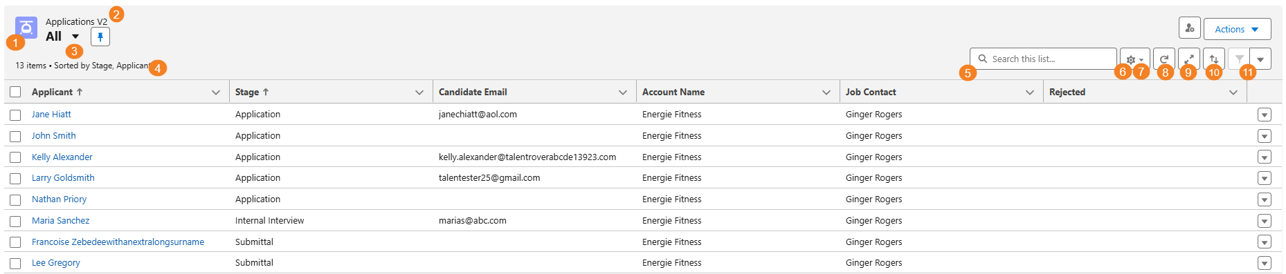
Enable Omnitable Multi-Column Sorting
With this release we have added a new control to the Omnitable header: the multi-column sort icon (↑↓).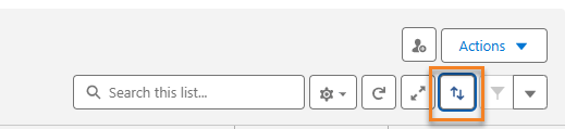
This button allows users to sort Omnitable data using multiple columns instead of just one. Here's how it works:
- Click on the ↑↓ icon.
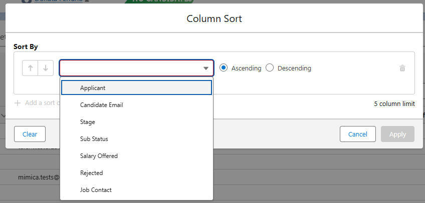
- In the Column Sort popup window, use the + Add a sort column button to add fields to your sorting criteria.
- Select the desired field (EX: Applicant) from the dropdown menu.
- Choose the sort order (Ascending or Descending) for each column.
- Click Apply when you have completed your selection.
There is a five column limit to this configuration.
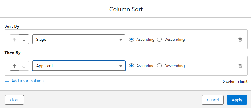
Example: You might have ordered your table based on the Candidate stage, but now you want to have the Candidates in each stage shown in alphabetical order. With this new feature, just add the Applicant column to the multi-column sort configuration.
Behaviors
Configuration Persistence
- Sort settings are saved per user and per Named View
- Your configuration persists across page refreshes and navigation
Modifying Your Sort
- Click the ↑↓ icon to add or remove columns using the trash can icon
- To restore defaults, click the Cog icon and select Reset Column Sorting
Hiding the Feature
Multi-column sorting is enabled by default.
To hide the ↑↓ icon, set hideColumnSortButton field to true in the Omnitable JSON headerVisibilitySettings.
Add Configuration Option To Display/Remove Omnitable UI Items
The Omnitable UI offers various configuration options to tailor it to user preferences.
Customize the Omnitable interface by hiding unnecessary UI elements. Each element can be hidden using its corresponding JSON parameter:
| UI Element | JSON Parameter |
|---|---|
| Object Icon | hideObjectIcon |
| Object Label | hideObjectLabel |
| Named View dropdown (with pin) | hideNamedViewSelector |
| Record sorting/selection text | hideInfoText |
| Quick search field | hideQuickSearch |
| Customize Columns menu item | hideCustomizeColumnsMenuItem |
| Reset Sort menu item | hideResetSortMenuItem |
| Refresh button | hideRefreshButton |
| Full Screen button | hideFullscreenButton |
| Multi-column sorting button | hideColumnSortButton |
| Filter controls | hideFilterControls |
Configuration
- Go to Setup > Custom metadata types > Named Settings > Manage Records and Edit the Named Setting record for the Omnitable you want to apply the changes to.
- In the JSON configuration field, add the "visibilitySettings" attribute and the name of each of the UI items followed by "true" or "false":
-
Copy
"visibilitySettings": {
            "headerVisibilitySettings": {
            "hideObjectIcon" : true,
            "hideObjectLabel" : true,
            "hideNamedViewSelector" : true,
            "hideInfoText" : true,
            "hideQuickSearch" : true,
            "hideCustomizeColumnsMenuItem" : true,
            "hideRefreshButton" : true,
            "hideFullscreenButton" : true,
            "hideFilterControls" : true,
            "hideResetSortMenuItem" : true,
            "hideColumnSortButton" : true
            }
        }
Omnitable Named Views: Support Fieldsets To Customize Record/Fields Displayed In Filters
By default, when creating a filter for an Omnitable Named View, the Record and Filter dropdowns display all accessible records, related lookups, and fields. This can result in very long lists with duplicate values, depending on your org's data structure.
Admin users have required the ability to 'control' what is shown in the Record and Field dropdowns: this is now possible by leveraging field sets.
Configuration
There are two parts to the configuration:
- Create a field set
- Add reference to that fieldset to the relevant Omnitable JSON configuration
Once you have created a fieldset and have it populated as required, update the Omnitable JSON:
- Go to Setup > Custom metadata types > Named Settings > Manage Records and Edit the Named Setting record for the Omnitable you want to apply the changes to.
- In the JSON configuration field, add the "filterableFields" attribute followed by the fieldset API name
Example:
"filterableFields": "Omnitable_view_filter"
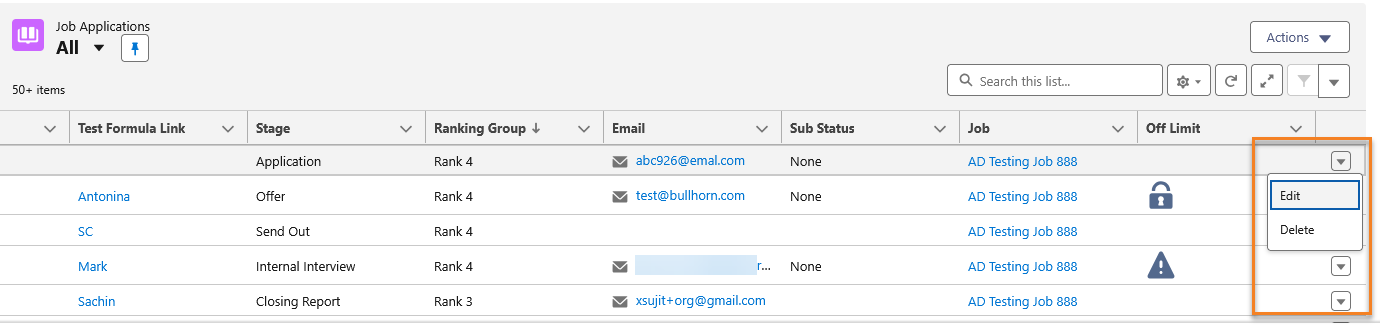
Enable Edit/Delete as Row Actions in Omnitable
We have added the option to use Edit and Delete as row actions in Omnitable, similar to standard Salesforce List Views.
The Edit action opens the standard Edit record modal, and the Delete action shows a confirmation dialog before deleting. User permissions for editing and deleting are respected.
Configuration
- Go to Setup > Custom metadata types > Named Settings > Manage Records and edit the desired Omnitable configuration.
- In the JSON configuration field, add: rowActions: ['standard_edit', 'standard_delete'].
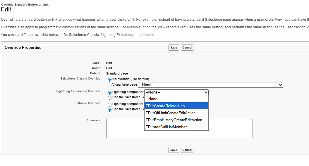
Optionally, you can also override the standard Edit record modal and configure your own:
- Go to Setup > Object Manager > Object > Buttons, Links, and Actions.
- Click Edit in the dropdown menu for the Edit row, and select a lightning component for the lightning experience override.
Enable Packaged/Custom Single Actions as Row Actions
In addition to the main Actions dropdown and toolbar, you can now configure single-record actions to appear directly on each row. This allows users to take key actions like "Add To Call List" or "Apply To Job" without first selecting the record checkbox.
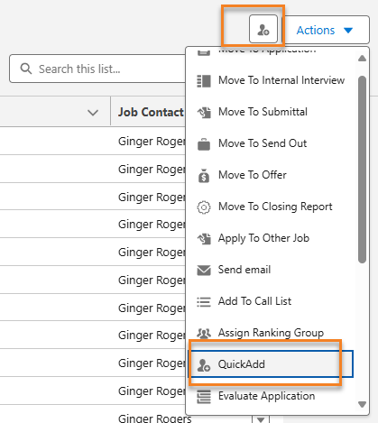
Multi-selection is not supported.
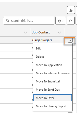
Configuration
- Go to Setup > Custom metadata types > Named Settings > Manage Records and edit the desired Omnitable configuration.
- In the JSON configuration field, add the following: rowActions: ["Move To Application", "Move To Internal Interview", "Move To Submittal", "Move To Send Out", "Move To Offer", "Move To Closing Report", "Apply To Other Job", "Send Email"].
Important Note: In order to simplify the configuration of the Actions 'positions' we have added three new Json attributes: rowActions, toolbarDropdownActions, and toolbarPinnedActions. Use them followed by the list of Actions (in square brackets) you want to see in the respective position. Please note that the name of the Action should match the action's name used when the action's properties were configured in the JSON under actions. This will not affect your current configuration as the 'old' format to position an Action either under the Action dropdown or as an icon on the toolbar is still supported. However if you use the new toolbarDropdownActions and toolbarPinnedActions that configuration will override the existing one.
Configure if blank values are displayed first or last on a sorted column
By default, Omnitable sorts columns with blank (NULL) values to the top, regardless of sort direction. We now offer the ability for admins to configure a column so that NULL values are always sorted to the bottom. This configuration is set per column and cannot be changed by the end user.
Configuration
To have empty (NULL) values displayed last on sorting of a column you need to set sortNullsLast attribute to 'true' in the columnOverrides section of the related JSON configuration.
- Go to Setup > Custom metadata types > Named Settings > Manage Records and edit the Named Setting record for the Omnitable you want to apply the changes to.
- In the JSON configuration field, find or add columnOverrides section (array).
- Find or create a Column Override entry for the field you want to make changes to.
- In this Column Override entry set sortNullsLast attribute to 'true'. It should look like this: "sortNullsLast": true
Example:
"columnOverrides": [
			{"fieldName": "TR1__Salary_Offered__c",
			"sortNullsLast" : true
		},
Known Limitations
- Picklist sorting is defined by the picklist sort determined during setup, and there are no null values but empty strings.
- Boolean fields also don't have null values.
- Multi-select picklist, rich text area, long text area, encrypted (if enabled), and data category group reference type fields are not sortable at all.
- On relationship fields, null values always return at the top.
Update visual indicator for selected row
When the Contextual Data Viewer (CDV) is opened from an Omnitable or ATSv2 list, the selected records are now clearly highlighted. This makes it easier for users to see which record is selected while viewing its details. The highlighting for the CDV does not conflict with highlighting for records selected via checkbox for bulk actions.
Add ability to hide filtering/sorting option for an Omnitable column
Omnitable's sorting and filtering capabilities are based on Salesforce field data, not displayed data, meaning custom column renderers cannot be sorted or filtered. To address this, isSortable and isFilterable attributes have been added to the configuration JSON, allowing administrators to hide these options for unsupported columns. This functionality is specific to column sorting and filtering and does not impact filtering in Named Views.
Configuration
The JSON Schema has been updated, and these two new attributes added to the Column Configuration element:
- disableSorting: When true, sorting will be disabled for this column
- disableFiltering: When true, filtering will be disabled for this column
Market Intelligence Flow Conversion
The Market Intelligence LWC has been converted to Flow (excluding Role and Stage creation), offering enhanced configurability and seamless integration with Omnitable workflows.
Ability to pin a default Omnitable 'Named view'
This release introduces the ability to set a Named View as the default for an Omnitable. This means the chosen view will be displayed every time the user accesses that Omnitable.
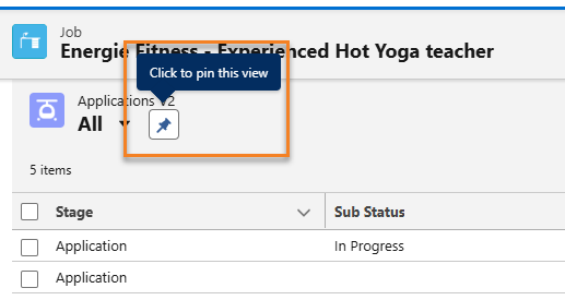
To pin a Named View as the default:
- Click the "pin" icon next to the view's name. The tooltip will display "Click to pin this view."
- Once pinned, the icon will indicate "This view is pinned." This view will persist as the default even if you navigate away and return to the Omnitable.
- You can choose to display a different view temporarily or set it as the new default.
- To unpin a view, simply set a different view as the default.
- Upon initial launch of an Omnitable, the "All" Named View is the default until another view is explicitly pinned.
No configuration is required for this feature.
Omnitable filter field Override
Omnitable is limited in its ability to sort or filter columns containing formulas, custom renderers, or non-text data because it only processes information from the Salesforce database. To resolve this, you can now use field overrides in the JSON configuration to specify a sortable alternative field for Omnitable to use internally while still displaying the original column data.
Example:
- You have a column showing candidate rankings as images (Excellent, Good, Mediocre), which you need to sort /filter
- Create a second formula field that converts these to sortable values (A, B, C)
- Set up an override in your JSON config pointing to this second field
- Users see the images but can sort/filter the column alphabetically
- The displayed content stays the same, but sorting and filtering now work using the alternative field's values.
Sort Field Override Behavior:
- When set, sorting uses the specified field instead of the default column
- Sorting is disabled if the sort field doesn't exist, isn't accessible, or isn't sortable
Filter Field Override Behavior:
- When set, filtering uses the specified field instead of the default column
- Only works for column filtering and quick search (not named views)
- Filtering is disabled if the filter field doesn't exist or isn't accessible
- If the filter field doesn't support column/quick search, the override works but those specific features won't be available
Configuration
You can now set a filterField in columnOverrides. The JSON Schema has been updated, and customSortField is now correctly named sortField.
JSON Example: For a formula field displaying an image URL that you want to filter/sort by its text value instead:
"columnOverrides": [{
			"fieldName": "TR1__SomeFormulaField__c",
			"filterField": "TR1__SomeFormulaFieldValue__c",
			"sortField": "TR1__SomeFormulaFieldValue__c"
		}]
Display Omnitable in "Full Page" Mode
We have added a new "Full Page" control to the Omnitable UI, so that users can take advantage of the full page display of their Omnitable instead of working from the related list space.
If the Contextual Data Viewer is configured for an Omnitable, on opening the Omnitable in full page mode, the Contextual Data Viewer will also be available.
Behaviors
- When moving to Full Page mode, Omnitable will be re-launched (selections and data will not be retained).
- To exit the Full Page View option, close it with the X.
- Once the Full Page view is opened, you are not able to toggle between the related list view and Full Page view.
- In Full Page mode, the header with the context record name is shown.
- When switching to Full Page, users might need to to resize columns (due to the difference in available space).
- After users resize the columns for Full View, the resizing will be remembered.
Off Limit Icon and Ranking Pop-Over in Omnitable
To enhance the user experience when viewing Off Limit contacts within the context of a job, the behavior of the Off Limit icon has been improved.
Previously, users could only see the highest-ranking Off Limit policy, which often duplicated the policy already associated with the current job and provided little additional value.
With this update:
- The Off Limit icon now takes the current job record into account.
- When hovering over the icon, users will see the next most relevant Off Limit line item in a pop-up, offering clearer context and more actionable information.
This change ensures users have better visibility into applicable Off Limit policies without unnecessary duplication.
For details, see Off Limit Icon and Ranking Pop-Over in Omnitable.