Amplify Impact Dashboard
The Bullhorn Analytics prebuilt Amplify Impact Dashboard gives you a ready-made view of how Amplify AI activity is affecting your recruitment performance. Use it to compare AI-assisted and non-AI activity across your recruiting funnel, track placement outcomes by Amplify skill, and identify which teams and recruiters are driving AI-assisted results.
This dashboard is only available to Bullhorn Analytics customers using Amplify Activities.
For definitions of each metric used in this dashboard, see Amplify Impact Metrics Dictionary.
Accessing the Dashboard
-
Log in to Bullhorn Analytics.
-
Select the Dashboards module at the top of the screen.
-
Select
 Open in the sidebar to view available dashboards.
 - Select Amplify Impact under the Shared Dashboards section.
Dashboard Toolbar
The dashboard toolbar contains options for filtering and refreshing data:
- Refresh: Select the circular arrow icon
 in the top right to update all panels with the most current data from your Bullhorn system.
 - Filter: Select the filter icon
 to display or hide the dashboard top-level filters.
Top-Level Filters
All panels use inherited dashboard settings. The following filters apply across the dashboard.
Company View Filter
The company view filter controls whose data the dashboard displays by default. Select Logged in User to view your own data. If you save the dashboard with this filter active, it becomes your default view each time you open it. Select Logged in User's Group to view your team's data. This shows data for all users in your group.
Timeframe Filter
Use the date picker to select a timeframe or choose a custom date range. The default for this dashboard is Last Month.
Client Filter
Use the Filter by Client dropdown to search for or select a specific client.
Dashboard Panels
Overview Metrics
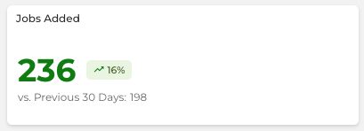
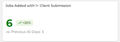
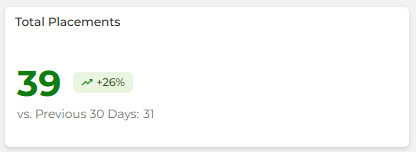
The top row provides a snapshot of key recruitment activity for the selected timeframe, each comparing against the equivalent prior period:
- Jobs Added: The total number of new jobs or vacancies added in the timeframe, compared against the prior period.
- Jobs Added with 1+ Client Submission: The total number of new jobs or vacancies that received at least one client submission in the timeframe, compared against the prior period.
- Total Placements: The total number of placements created in the timeframe, compared against the prior period.
Sub to Placement Rate
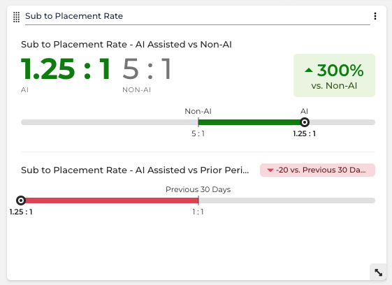
An Impact Comparison Panel that uses comparison bars to compare the submission-to-placement rate for AI-assisted and non-AI activity. The hero section shows the current AI vs. Non-AI rate side by side, and a second section tracks the AI-assisted rate against its prior period so you can monitor whether performance is improving over time.
Clicking anywhere on this panel opens a grouped view of all the panel's metrics, organized by category with a percentage change badge shown for each group. See Impact Comparison Panel Clickthrough Navigation for details.
The panel tracks the following rates:
- Sub to Placement Rate - AI-Assisted vs Non-AI: A Metric vs Metric comparison for CVs Sent - AI - with Placements and CVs Sent - No AI - with Placements.
- Sub to Placement Rate - AI-Assisted vs Prior Period: A Period vs Prior Period comparison for CVs Sent - AI - with Placements.
Recruiting Funnel - AI-Assisted vs Non-AI
An Impact Comparison Panel that uses a bar chart to compare AI-assisted and non-AI activity across four stages of the recruiting funnel: Jobs Opened, Internal Submissions, Client Submissions, and Placements. Each bar shows AI activity against non-AI activity for the same metric, so you can see where Amplify is having the most impact across your pipeline.
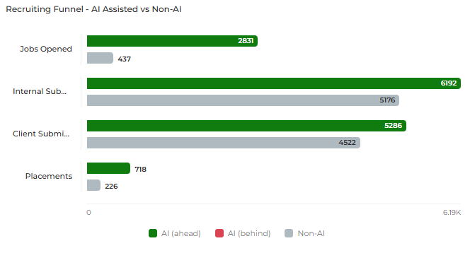
Clicking anywhere on this panel opens a grouped view of all the panel's metrics, organized by category with a percentage change badge shown for each group. See Impact Comparison Panel Clickthrough Navigation for details.
Each bar corresponds to the following metrics:
- Jobs Opened: A Metric vs Metric comparison for Jobs Added - AI and Jobs Added - No AI.
- Internal Submissions: A Metric vs Metric comparison for Shortlists - AI and Shortlists - No AI.
- Client Submissions: A Metric vs Metric comparison for CVs Sent - AI and CVs Sent - No AI.
- Placements: A Metric vs Metric comparison for Total Placements - AI and Total Placements - No AI.
Average Time - AI-Assisted vs Non-AI
An Impact Comparison Panel that uses comparison bars to compare the average time at three key stages of the recruiting process for AI-assisted and non-AI activity. Lower values indicate better performance. Green indicates AI is performing better than non-AI; red indicates it is performing worse.
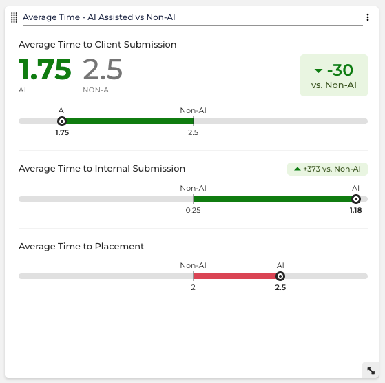
Clicking anywhere on this panel opens a grouped view of all the panel's metrics, organized by category with a percentage change badge shown for each group. See Impact Comparison Panel Clickthrough Navigation for details.
The panel tracks the following time measures:
- Average Time to Client Submission: A Metric vs Metric comparison for Average Time To 1st CV Sent - AI and Average Time To 1st CV Sent - No AI.
- Average Time to Internal Submission: A Metric vs Metric comparison for Average Time To 1st Shortlist - AI and Average Time To 1st Shortlist - No AI.
- Average Time to Placement: A Metric vs Metric comparison for Average Time To 1st Placement - AI and Average Time To 1st Placement - No AI.
Average Time measures represent the number of calendar days from a job being opened to the first relevant activity being added.
Total Client Submissions AI-Assisted vs Non-AI
A trend chart that tracks client submissions over time, broken down into total CVs sent with placements, AI-assisted CVs sent with placements, and non-AI CVs sent with placements. Data is aggregated weekly with gradient fill enabled. The panel trends the following metrics: CVs Sent with Placements, CVs Sent - AI - with Placements, and CVs Sent - No AI - with Placements.
Total Placements AI-Assisted vs Non-AI
A trend chart that tracks total placements over time, broken down into overall placements, AI-assisted placements, and non-AI placements. Data is aggregated weekly with gradient fill enabled. The panel trends the following metrics: Total Placements, Total Placements - AI, and Total Placements - No AI.
Amplify Skill Placement Impact
A ratio comparison panel that shows the placement impact of each Amplify skill as a percentage. Use this panel to understand which skills are contributing most to placement outcomes. The panel displays the following impact ratios:
- Chat Impact
- Outreach Impact
- Screen Impact
- Present Impact
- Standard Enrich Impact
- Advanced Enrich Impact
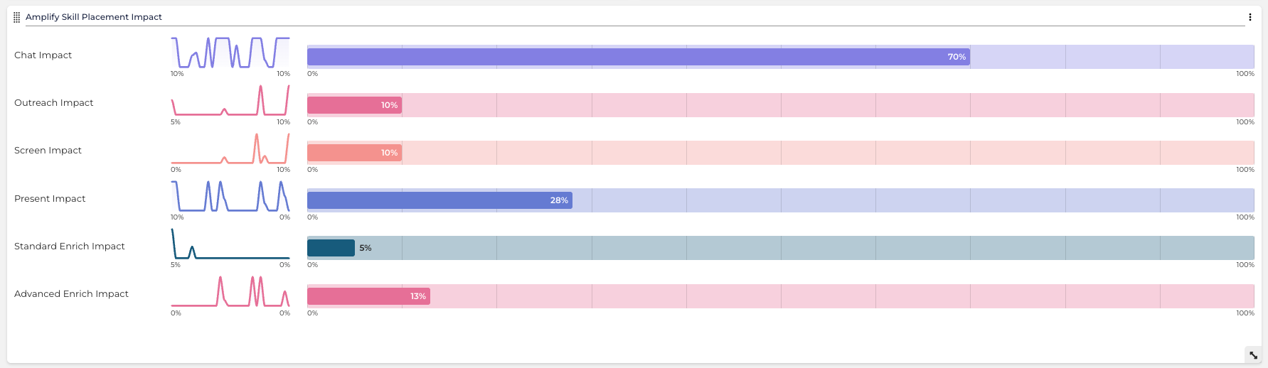
For ratio definitions, see the Amplify Impact Metrics Dictionary section of the Amplify Impact Metrics Dictionary.
Total Placements Leaderboard
A leaderboard ranked by total placements in descending order. Use this to identify your top-performing recruiters by overall placement volume for the selected timeframe. Ranked by: Total Placements.
Total Placements - AI Leaderboard
A leaderboard ranked by AI-assisted placements in descending order. Use this to identify which recruiters are driving the most AI-assisted placement outcomes. Ranked by: Total Placements - AI.
Group Placements - AI
A data grid and chart comparing AI-assisted placements (Total Placements - AI) and non-AI placements (Total Placements - No AI) by group. Use this to assess how AI adoption is affecting placement performance across different teams or business units.